Add another
Status: OfficialHow to use ‘official’ components
Contents
Overview
The ‘Add another’ component allows users to add more than 1 instance of related information to a page. It does this by reproducing the field labels without reloading the page.
When to use
This component works best in a shallow layout for users to enter a small amount of information, ideally only a few times.
The information (or ‘items’) that people add could be:
- dates
- the names of people, programmes, events, or offences
- numbers, for example payments and their amounts
When not to use
Do not use the ‘Add another’ component to collect lengthy or complex data. This is because:
- the items are only saved when the user submits the page (so they’ll lose the data if they refresh or close the page)
- users may find it hard to check what they’ve entered, for example against a paper form or spreadsheet
- very long pages can cause performance issues
Use the ‘add to a list’ pattern to help users add similar information many times.
Choosing a layout
The ‘Add another’ component has 2 layouts:
View guidance on choosing a layout.
Similar or linked components
There’s also the ‘add to a list’ pattern.
Choosing a layout
The ‘Add another’ component has 2 layouts:
Stacked layout
<form method="post" action="#">
  <div class="moj-add-another" data-module="moj-add-another" data-item-label="Participant">
    <div class="moj-add-another__items">
      <div class="moj-add-another__item">
        <fieldset class="govuk-fieldset moj-add-another__fieldset ">
          <legend class="govuk-fieldset__legend moj-add-another__item-title govuk-fieldset__legend--m">
            Participant 1
          </legend>
          <div class="moj-add-another__item-container">
            <div class="govuk-form-group">
              <label class="govuk-label" for="participant[0][full_name]">
                Full name <span class="govuk-visually-hidden moj-add-another__label-suffix">for participant 1</span>
              </label>
              <input class="govuk-input" id="participant[0][full_name]" name="participant[0][full_name]" type="text" data-name="participant[%index%][full_name]" data-id="participant[%index%][full_name]" data-label="Full name">
            </div>
            <div class="govuk-form-group">
              <fieldset class="govuk-fieldset" role="group" aria-describedby="date-of-birth-hint" data-legend="Date of birth">
                <legend class="govuk-fieldset__legend">
                  Date of birth <span class="govuk-visually-hidden moj-add-another__label-suffix">for participant 1</span>
                </legend>
                <div id="date-of-birth-hint" class="govuk-hint">
                  For example, 31 7 1980
                </div>
                <div class="govuk-date-input" id="date-of-birth">
                  <div class="govuk-date-input__item">
                    <div class="govuk-form-group">
                      <label class="govuk-label govuk-date-input__label" for="participant[0][dob][day]">
                        Day
                      </label>
                      <input class="govuk-input govuk-date-input__input govuk-input--width-2" id="participant[0][dob][day]" name="participant[0][dob][day]" type="text" inputmode="numeric" data-name="participant[%index%][dob][day]" data-id="participant[%index%][dob][day]">
                    </div>
                  </div>
                  <div class="govuk-date-input__item">
                    <div class="govuk-form-group">
                      <label class="govuk-label govuk-date-input__label" for="participant[0][dob][month]">
                        Month
                      </label>
                      <input class="govuk-input govuk-date-input__input govuk-input--width-2" id="participant[0][dob][month]" name="participant[0][dob][month]" type="text" inputmode="numeric" data-name="participant[%index%][dob][month]" data-id="participant[%index%][dob][month]">
                    </div>
                  </div>
                  <div class="govuk-date-input__item">
                    <div class="govuk-form-group">
                      <label class="govuk-label govuk-date-input__label" for="participant[0][dob][year]">
                        Year
                      </label>
                      <input class="govuk-input govuk-date-input__input govuk-input--width-4" id="participant[0][dob][year]" name="participant[0][dob][year]" type="text" inputmode="numeric" data-name="participant[%index%][dob][year]" data-id="participant[%index%][dob][year]">
                    </div>
                  </div>
                </div>
              </fieldset>
            </div>
            <div class="moj-add-another__remove-button-container">
            </div>
          </div>
        </fieldset>
      </div>
    </div>
    <div class="moj-add-another__add-button-container">
      <button type="submit" class="govuk-button govuk-button--secondary moj-add-another__add-button" data-module="govuk-button">
        Add another participant
      </button>
    </div>
  </div>
</form>
Nunjucks macro options
| Name | Type | Required | Description |
|---|---|---|---|
| id | string | Yes | The ID of the input. |
| itemLabel | string | Yes | The label for each item. Should be title case. Defaults to ‘Item’. |
| items | array | Yes | The items within the ‘add another’ component. See macro options for items. |
| layout | string | No | Can be ‘stacked’ or ‘inline’. Defaults to stacked. |
| classes | string | No | Classes to add to the container. |
| attributes | object | No | HTML attributes (for example data attributes) to add to the container. |
| addAnotherButtonText | string | No | Text label for the add another button. The component will replace the %{itemLabel} placeholder with the value of the itemLabel parameter. |
| itemLegendText | object | No | Text label for the item legend. The component will replace the %{itemLabel} placeholder with the value of the itemLabel parameter. The %{number} placeholder will be replaced with the item number, and the %{count} placeholder will be replaced with the total number of items. GOV.UK pluralisation rules apply to this macro option. |
| removeButtonText | string | No | Text label for the remove button. Defaults to 'Remove' |
| removeButtonSuffixText | string | No | Text appended to the removeButtonText. This is visually hidden in the inline layout. The component will replace the %{itemLabel} placeholder with the value of the itemLabel parameter. The %{number} placeholder will be replaced with the item number. |
| fieldLabelSuffixText | string | No | Visually hidden text appended to the field labels. The component will replace the %{itemLabel} placeholder with the value of the itemLabel parameter. The %{number} placeholder will be replaced with the item number. |
| newItemSuffixText | string | No | Visually hidden text appended to the legend of a newly added item. |
items
| Name | Type | Required | Description |
|---|---|---|---|
| fieldset | object | Yes | See macro options for fieldset. |
| errorMessage | object | No | Used to display errors for the ‘inline’ layout. See options for errorMessage. |
| removeButton | object | No | See options for removeButton. |
| classes | string | No | Classes to add to the item container. |
errorMessage
| Name | Type | Required | Description |
|---|---|---|---|
| text | string | Yes | If html is set, this is not required. Text to use within the error message. If html is provided, the text option will be ignored. |
| html | string | Yes | If text is set, this is not required. HTML to use within the error message. If html is provided, the text option will be ignored. |
| classes | string | No | Classes to add to the error message ‘<p>’ tag. |
| attributes | object | No | HTML attributes (for example data attributes) to add to the error message ‘<p>’ tag. |
| visuallyHiddenText | string | No | A visually hidden prefix used before the error message. Defaults to ‘Error’. |
removeButton
| Name | Type | Required | Description |
|---|---|---|---|
| name | string | Yes | Name of the button, sent when a form is submitted. |
| value | string | Yes | Value of the button, sent when a form is submitted. |
fieldset
| Name | Type | Required | Description |
|---|---|---|---|
| legend | object | Yes | The title for the item. See macro options for legend. |
| html | string | Yes | HTML to use or render within the fieldset element. |
| classes | string | No | Classes to add to the fieldset container. |
| attributes | string | No | HTML attributes (for example data attributes) to add to the fieldset container. |
| role | string | No | Optional ARIA role attribute. |
| describedBy | string | No | One or more element IDs to add to the aria-describedby attribute, used to provide additional descriptive information for screen reader users. |
legend
| Name | Type | Required | Description |
|---|---|---|---|
| text | string | Yes | If html is set, this is not required. Text to use within the legend. If html is provided, the text option will be ignored. |
| html | string | Yes | If text is set, this is not required. HTML to use within the legend. If html is provided, the text option will be ignored. |
| classes | string | No | Classes to add to the legend. |
{%- from "govuk/components/button/macro.njk" import govukButton -%}
{%- from "govuk/components/input/macro.njk" import govukInput -%}
{%- from "govuk/components/date-input/macro.njk" import govukDateInput -%}
{%- from "moj/components/add-another/macro.njk" import mojAddAnother -%}
{%- from "govuk/components/fieldset/macro.njk" import govukFieldset -%}

{% set itemHtml %}
  {{ govukInput({
    id: "participant[0][full_name]",
    name: "participant[0][full_name]",
    label: {
      html: "Full name <span class=\"govuk-visually-hidden moj-add-another__label-suffix\">for participant 1</span>"
    },
    attributes: {
      "data-name": "participant[%index%][full_name]",
      "data-id": "participant[%index%][full_name]",
      "data-label": "Full name"
    }
  }) }}

  {{ govukDateInput({
    id: "date-of-birth",
    fieldset: {
      legend: {
        html: "Date of birth <span class=\"govuk-visually-hidden moj-add-another__label-suffix\">for participant 1</span>"
      },
      attributes: {
        "data-legend": "Date of birth"
      }
    },
    hint: {
      text: "For example, 31 7 1980"
    },
    items: [
      {
        id: "participant[0][dob][day]",
        name: "participant[0][dob][day]",
        label: "Day",
        classes: "govuk-input--width-2",
        attributes: {
          "data-name": "participant[%index%][dob][day]",
          "data-id": "participant[%index%][dob][day]"
        }
      },
      {
        id: "participant[0][dob][month]",
        name: "participant[0][dob][month]",
        label: "Month",
        classes: "govuk-input--width-2",
        attributes: {
          "data-name": "participant[%index%][dob][month]",
          "data-id": "participant[%index%][dob][month]"
        }
      },
      {
        id: "participant[0][dob][year]",
        name: "participant[0][dob][year]",
        label: "Year",
        classes: "govuk-input--width-4",
        attributes: {
          "data-name": "participant[%index%][dob][year]",
          "data-id": "participant[%index%][dob][year]"
        }
      }
    ]
  }) }}
{% endset %}

<form method="post" action="#">
  {{ mojAddAnother({
    itemLabel: "Participant",
    items: [
      {
        fieldset: {
          html: itemHtml
        }
      }
    ]
  }) }}
</form>
This component is in the ‘Assets’ tab in the MOJ Figma Kit.
If you work for MOJ, you can view this component in the MOJ Figma Kit.
If you work outside MOJ, read the guidance on setting up Figma prototypes for non-MOJ staff.
The stacked (or vertical) layout is the default for this component. It can be used to collect information:
- from a small number of fields
- using a wider range of components than the inline layout, for example with the GOV.UK date input and GOV.UK radios
View how to use the stacked layout.
Inline layout
<h2 class="govuk-heading-m govuk-label-wrapper" id="accounts-title">Add account funds</h2>
<p class="govuk-hint" id="accounts-hint">Provide details of any funds in UK bank accounts.</p>
<form method="post">
  <div id="add-accounts" class="moj-add-another" data-module="moj-add-another" data-item-label="Account" data-layout="inline">
    <div class="moj-add-another__items">
      <div class="moj-add-another__item moj-add-another__item--inline">
        <fieldset class="govuk-fieldset moj-add-another__fieldset ">
          <legend class="govuk-fieldset__legend moj-add-another__item-title govuk-fieldset__legend--m">
            Account 1
          </legend>
          <div class="moj-add-another__item-container">
            <div class="moj-add-another__item-row">
              <div class="govuk-grid-row">
                <div class="govuk-grid-column-two-thirds">
                  <div class="govuk-form-group">
                    <label class="govuk-label" for="accounts[0][bank-name]">
                      Bank name <span class="govuk-visually-hidden moj-add-another__label-suffix">for account
                        1</span>
                    </label>
                    <input class="govuk-input" id="accounts[0][bank-name]" name="accounts[0][bank-name]" type="text" data-name="accounts[%index%][bank-name]" data-id="accounts[%index%][bank-name]" data-label="Bank name">
                  </div>
                </div>
                <div class="govuk-grid-column-one-third">
                  <div class="govuk-form-group">
                    <label class="govuk-label" for="accounts[0][funds]">
                      Funds<span class="govuk-visually-hidden moj-add-another__label-suffix">for account 1</span><span class="govuk-visually-hidden">(in pounds)</span>
                    </label>
                    <div class="govuk-input__wrapper">
                      <div class="govuk-input__prefix" aria-hidden="true" aria-hidden="true">£</div>
                      <input class="govuk-input govuk-input--width-5" id="accounts[0][funds]" name="accounts[0][funds]" type="text" data-name="accounts[%index%][funds]" data-id="accounts[%index%][funds]" data-label="Funds">
                    </div>
                  </div>
                </div>
              </div>
            </div>
            <div class="moj-add-another__remove-button-container">
            </div>
          </div>
        </fieldset>
      </div>
    </div>
    <div class="moj-add-another__add-button-container">
      <button type="submit" value="add-another-account" name="add-accounts-add-another" class="govuk-button govuk-button--secondary moj-add-another__add-button" data-module="govuk-button" id="add-accounts-add-another-button">
        Add another account
      </button>
    </div>
  </div>
</form>
Nunjucks macro options
| Name | Type | Required | Description |
|---|---|---|---|
| id | string | Yes | The ID of the input. |
| itemLabel | string | Yes | The label for each item. Should be title case. Defaults to ‘Item’. |
| items | array | Yes | The items within the ‘add another’ component. See macro options for items. |
| layout | string | No | Can be ‘stacked’ or ‘inline’. Defaults to stacked. |
| classes | string | No | Classes to add to the container. |
| attributes | object | No | HTML attributes (for example data attributes) to add to the container. |
| addAnotherButtonText | string | No | Text label for the add another button. The component will replace the %{itemLabel} placeholder with the value of the itemLabel parameter. |
| itemLegendText | object | No | Text label for the item legend. The component will replace the %{itemLabel} placeholder with the value of the itemLabel parameter. The %{number} placeholder will be replaced with the item number, and the %{count} placeholder will be replaced with the total number of items. GOV.UK pluralisation rules apply to this macro option. |
| removeButtonText | string | No | Text label for the remove button. Defaults to 'Remove' |
| removeButtonSuffixText | string | No | Text appended to the removeButtonText. This is visually hidden in the inline layout. The component will replace the %{itemLabel} placeholder with the value of the itemLabel parameter. The %{number} placeholder will be replaced with the item number. |
| fieldLabelSuffixText | string | No | Visually hidden text appended to the field labels. The component will replace the %{itemLabel} placeholder with the value of the itemLabel parameter. The %{number} placeholder will be replaced with the item number. |
| newItemSuffixText | string | No | Visually hidden text appended to the legend of a newly added item. |
items
| Name | Type | Required | Description |
|---|---|---|---|
| fieldset | object | Yes | See macro options for fieldset. |
| errorMessage | object | No | Used to display errors for the ‘inline’ layout. See options for errorMessage. |
| removeButton | object | No | See options for removeButton. |
| classes | string | No | Classes to add to the item container. |
errorMessage
| Name | Type | Required | Description |
|---|---|---|---|
| text | string | Yes | If html is set, this is not required. Text to use within the error message. If html is provided, the text option will be ignored. |
| html | string | Yes | If text is set, this is not required. HTML to use within the error message. If html is provided, the text option will be ignored. |
| classes | string | No | Classes to add to the error message ‘<p>’ tag. |
| attributes | object | No | HTML attributes (for example data attributes) to add to the error message ‘<p>’ tag. |
| visuallyHiddenText | string | No | A visually hidden prefix used before the error message. Defaults to ‘Error’. |
removeButton
| Name | Type | Required | Description |
|---|---|---|---|
| name | string | Yes | Name of the button, sent when a form is submitted. |
| value | string | Yes | Value of the button, sent when a form is submitted. |
fieldset
| Name | Type | Required | Description |
|---|---|---|---|
| legend | object | Yes | The title for the item. See macro options for legend. |
| html | string | Yes | HTML to use or render within the fieldset element. |
| classes | string | No | Classes to add to the fieldset container. |
| attributes | string | No | HTML attributes (for example data attributes) to add to the fieldset container. |
| role | string | No | Optional ARIA role attribute. |
| describedBy | string | No | One or more element IDs to add to the aria-describedby attribute, used to provide additional descriptive information for screen reader users. |
legend
| Name | Type | Required | Description |
|---|---|---|---|
| text | string | Yes | If html is set, this is not required. Text to use within the legend. If html is provided, the text option will be ignored. |
| html | string | Yes | If text is set, this is not required. HTML to use within the legend. If html is provided, the text option will be ignored. |
| classes | string | No | Classes to add to the legend. |
{%- from "moj/components/add-another/macro.njk" import mojAddAnother -%}
{%- from "govuk/components/input/macro.njk" import govukInput -%}
{%- from "govuk/components/button/macro.njk" import govukButton -%}

{% set itemHtml -%}
<div class="govuk-grid-row">
  <div class="govuk-grid-column-two-thirds">
    {{ govukInput({
      id: "accounts[0][bank-name]",
      name: "accounts[0][bank-name]",
      label: {
        html: "Bank name <span class=\"govuk-visually-hidden moj-add-another__label-suffix\">for account
      1</span>"
      },
      attributes: {
        "data-name": "accounts[%index%][bank-name]",
        "data-id": "accounts[%index%][bank-name]",
        "data-label": "Bank name"
      }
    }) }}
  </div>
  <div class="govuk-grid-column-one-third">
    {{ govukInput({
      id: "accounts[0][funds]",
      name: "accounts[0][funds]",
      label: {
        html: "Funds<span class=\"govuk-visually-hidden moj-add-another__label-suffix\">for account 1</span><span class=\"govuk-visually-hidden\">(in pounds)</span>"
      },
      prefix: {
        text: "£",
        attributes: {
          "aria-hidden": "true"
        }
      },
      attributes: {
        "data-name": "accounts[%index%][funds]",
        "data-id": "accounts[%index%][funds]",
        "data-label": "Funds"
      },
      classes: "govuk-input--width-5"
    }) }}
    </div>
    </div>
{% endset %}

<h2 class="govuk-heading-m govuk-label-wrapper" id="accounts-title">Add account funds</h2>
<p class="govuk-hint" id="accounts-hint">Provide details of any funds in UK bank accounts.</p>
<form method="post">
  {{ mojAddAnother({
    id: "add-accounts",
    itemLabel: "Account",
    layout: 'inline',
    items: [
      {
        fieldset: {
          html: itemHtml
        }
      }
    ]
  }) }}
</form>
This component is in the ‘Assets’ tab in the MOJ Figma Kit.
If you work for MOJ, you can view this component in the MOJ Figma Kit.
If you work outside MOJ, read the guidance on setting up Figma prototypes for non-MOJ staff.
The inline (or horizontal) layout is a lean design for up to 3 fields. Use this layout:
- if users need to select ‘add another’ many times
- to save vertical space on the page
- if you need to collect more than 1 set of items from a page (you’re placing the component on the page more than once)
- if it’ll help users to view their items in rows and columns
The fields will stack vertically on smaller screens.
Setting up the stacked layout
The stacked (or vertical) layout is the default for this component. It helps users to enter more information than the other layout (inline), for example from a more varied range of components.
<form method="post" action="#">
  <div class="moj-add-another" data-module="moj-add-another" data-item-label="Participant">
    <div class="moj-add-another__items">
      <div class="moj-add-another__item">
        <fieldset class="govuk-fieldset moj-add-another__fieldset ">
          <legend class="govuk-fieldset__legend moj-add-another__item-title govuk-fieldset__legend--m">
            Participant 1
          </legend>
          <div class="moj-add-another__item-container">
            <div class="govuk-form-group">
              <label class="govuk-label" for="participant[0][full_name]">
                Full name <span class="govuk-visually-hidden moj-add-another__label-suffix">for participant 1</span>
              </label>
              <input class="govuk-input" id="participant[0][full_name]" name="participant[0][full_name]" type="text" data-name="participant[%index%][full_name]" data-id="participant[%index%][full_name]" data-label="Full name">
            </div>
            <div class="govuk-form-group">
              <fieldset class="govuk-fieldset" role="group" aria-describedby="date-of-birth-hint" data-legend="Date of birth">
                <legend class="govuk-fieldset__legend">
                  Date of birth <span class="govuk-visually-hidden moj-add-another__label-suffix">for participant 1</span>
                </legend>
                <div id="date-of-birth-hint" class="govuk-hint">
                  For example, 31 7 1980
                </div>
                <div class="govuk-date-input" id="date-of-birth">
                  <div class="govuk-date-input__item">
                    <div class="govuk-form-group">
                      <label class="govuk-label govuk-date-input__label" for="participant[0][dob][day]">
                        Day
                      </label>
                      <input class="govuk-input govuk-date-input__input govuk-input--width-2" id="participant[0][dob][day]" name="participant[0][dob][day]" type="text" inputmode="numeric" data-name="participant[%index%][dob][day]" data-id="participant[%index%][dob][day]">
                    </div>
                  </div>
                  <div class="govuk-date-input__item">
                    <div class="govuk-form-group">
                      <label class="govuk-label govuk-date-input__label" for="participant[0][dob][month]">
                        Month
                      </label>
                      <input class="govuk-input govuk-date-input__input govuk-input--width-2" id="participant[0][dob][month]" name="participant[0][dob][month]" type="text" inputmode="numeric" data-name="participant[%index%][dob][month]" data-id="participant[%index%][dob][month]">
                    </div>
                  </div>
                  <div class="govuk-date-input__item">
                    <div class="govuk-form-group">
                      <label class="govuk-label govuk-date-input__label" for="participant[0][dob][year]">
                        Year
                      </label>
                      <input class="govuk-input govuk-date-input__input govuk-input--width-4" id="participant[0][dob][year]" name="participant[0][dob][year]" type="text" inputmode="numeric" data-name="participant[%index%][dob][year]" data-id="participant[%index%][dob][year]">
                    </div>
                  </div>
                </div>
              </fieldset>
            </div>
            <div class="moj-add-another__remove-button-container">
            </div>
          </div>
        </fieldset>
      </div>
    </div>
    <div class="moj-add-another__add-button-container">
      <button type="submit" class="govuk-button govuk-button--secondary moj-add-another__add-button" data-module="govuk-button">
        Add another participant
      </button>
    </div>
  </div>
</form>
Nunjucks macro options
| Name | Type | Required | Description |
|---|---|---|---|
| id | string | Yes | The ID of the input. |
| itemLabel | string | Yes | The label for each item. Should be title case. Defaults to ‘Item’. |
| items | array | Yes | The items within the ‘add another’ component. See macro options for items. |
| layout | string | No | Can be ‘stacked’ or ‘inline’. Defaults to stacked. |
| classes | string | No | Classes to add to the container. |
| attributes | object | No | HTML attributes (for example data attributes) to add to the container. |
| addAnotherButtonText | string | No | Text label for the add another button. The component will replace the %{itemLabel} placeholder with the value of the itemLabel parameter. |
| itemLegendText | object | No | Text label for the item legend. The component will replace the %{itemLabel} placeholder with the value of the itemLabel parameter. The %{number} placeholder will be replaced with the item number, and the %{count} placeholder will be replaced with the total number of items. GOV.UK pluralisation rules apply to this macro option. |
| removeButtonText | string | No | Text label for the remove button. Defaults to 'Remove' |
| removeButtonSuffixText | string | No | Text appended to the removeButtonText. This is visually hidden in the inline layout. The component will replace the %{itemLabel} placeholder with the value of the itemLabel parameter. The %{number} placeholder will be replaced with the item number. |
| fieldLabelSuffixText | string | No | Visually hidden text appended to the field labels. The component will replace the %{itemLabel} placeholder with the value of the itemLabel parameter. The %{number} placeholder will be replaced with the item number. |
| newItemSuffixText | string | No | Visually hidden text appended to the legend of a newly added item. |
items
| Name | Type | Required | Description |
|---|---|---|---|
| fieldset | object | Yes | See macro options for fieldset. |
| errorMessage | object | No | Used to display errors for the ‘inline’ layout. See options for errorMessage. |
| removeButton | object | No | See options for removeButton. |
| classes | string | No | Classes to add to the item container. |
errorMessage
| Name | Type | Required | Description |
|---|---|---|---|
| text | string | Yes | If html is set, this is not required. Text to use within the error message. If html is provided, the text option will be ignored. |
| html | string | Yes | If text is set, this is not required. HTML to use within the error message. If html is provided, the text option will be ignored. |
| classes | string | No | Classes to add to the error message ‘<p>’ tag. |
| attributes | object | No | HTML attributes (for example data attributes) to add to the error message ‘<p>’ tag. |
| visuallyHiddenText | string | No | A visually hidden prefix used before the error message. Defaults to ‘Error’. |
removeButton
| Name | Type | Required | Description |
|---|---|---|---|
| name | string | Yes | Name of the button, sent when a form is submitted. |
| value | string | Yes | Value of the button, sent when a form is submitted. |
fieldset
| Name | Type | Required | Description |
|---|---|---|---|
| legend | object | Yes | The title for the item. See macro options for legend. |
| html | string | Yes | HTML to use or render within the fieldset element. |
| classes | string | No | Classes to add to the fieldset container. |
| attributes | string | No | HTML attributes (for example data attributes) to add to the fieldset container. |
| role | string | No | Optional ARIA role attribute. |
| describedBy | string | No | One or more element IDs to add to the aria-describedby attribute, used to provide additional descriptive information for screen reader users. |
legend
| Name | Type | Required | Description |
|---|---|---|---|
| text | string | Yes | If html is set, this is not required. Text to use within the legend. If html is provided, the text option will be ignored. |
| html | string | Yes | If text is set, this is not required. HTML to use within the legend. If html is provided, the text option will be ignored. |
| classes | string | No | Classes to add to the legend. |
{%- from "govuk/components/button/macro.njk" import govukButton -%}
{%- from "govuk/components/input/macro.njk" import govukInput -%}
{%- from "govuk/components/date-input/macro.njk" import govukDateInput -%}
{%- from "moj/components/add-another/macro.njk" import mojAddAnother -%}
{%- from "govuk/components/fieldset/macro.njk" import govukFieldset -%}

{% set itemHtml %}
  {{ govukInput({
    id: "participant[0][full_name]",
    name: "participant[0][full_name]",
    label: {
      html: "Full name <span class=\"govuk-visually-hidden moj-add-another__label-suffix\">for participant 1</span>"
    },
    attributes: {
      "data-name": "participant[%index%][full_name]",
      "data-id": "participant[%index%][full_name]",
      "data-label": "Full name"
    }
  }) }}

  {{ govukDateInput({
    id: "date-of-birth",
    fieldset: {
      legend: {
        html: "Date of birth <span class=\"govuk-visually-hidden moj-add-another__label-suffix\">for participant 1</span>"
      },
      attributes: {
        "data-legend": "Date of birth"
      }
    },
    hint: {
      text: "For example, 31 7 1980"
    },
    items: [
      {
        id: "participant[0][dob][day]",
        name: "participant[0][dob][day]",
        label: "Day",
        classes: "govuk-input--width-2",
        attributes: {
          "data-name": "participant[%index%][dob][day]",
          "data-id": "participant[%index%][dob][day]"
        }
      },
      {
        id: "participant[0][dob][month]",
        name: "participant[0][dob][month]",
        label: "Month",
        classes: "govuk-input--width-2",
        attributes: {
          "data-name": "participant[%index%][dob][month]",
          "data-id": "participant[%index%][dob][month]"
        }
      },
      {
        id: "participant[0][dob][year]",
        name: "participant[0][dob][year]",
        label: "Year",
        classes: "govuk-input--width-4",
        attributes: {
          "data-name": "participant[%index%][dob][year]",
          "data-id": "participant[%index%][dob][year]"
        }
      }
    ]
  }) }}
{% endset %}

<form method="post" action="#">
  {{ mojAddAnother({
    itemLabel: "Participant",
    items: [
      {
        fieldset: {
          html: itemHtml
        }
      }
    ]
  }) }}
</form>
This component is in the ‘Assets’ tab in the MOJ Figma Kit.
If you work for MOJ, you can view this component in the MOJ Figma Kit.
If you work outside MOJ, read the guidance on setting up Figma prototypes for non-MOJ staff.
- Create an item name
- Choose what to put in your ‘add another’ component
- Write and size the form field labels
- Write and implement error messages
- Set up for use without JavaScript
You can also view:
- guidance on designing the page and onward journey
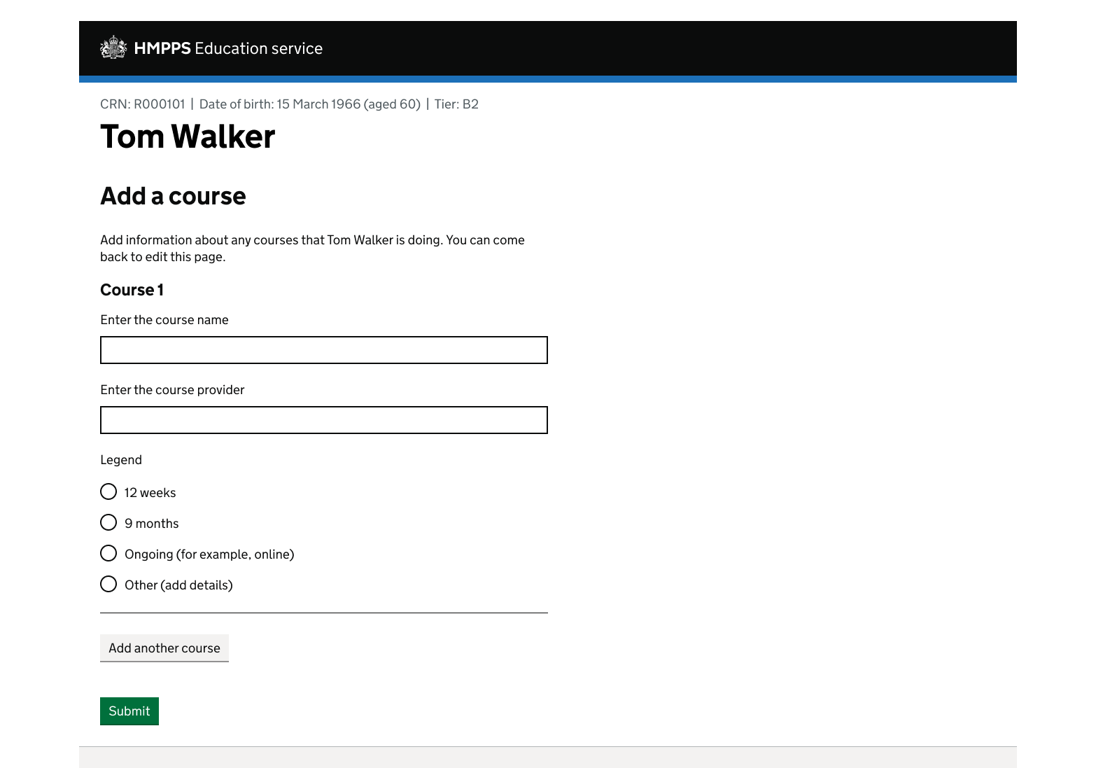
- an example of the stacked layout with radio buttons
Create an item name
Give each component a short and succinct item name. For example ‘person’, ‘offence’, ‘income’, ‘application’ or ‘session’. The item name will be used in the following visible parts of the component:
- item legend (in sentence case)
- button labels (in lower case)
- error messages (in lower case)
The item names are numbered 1, 2, 3 and so on.
Choose what to put in your ‘add another’ component
Add a small number of fields to the stacked layout, from the following 6 components. These are called the ‘preferred instances’ in Figma:
You can view GOV.UK guidance on sizing text inputs.
The component works best in a shallow layout, for example with the heading and ‘add another’ button on the same screen. This may also help users to check the data they’ve added to the component before submitting it.
Using Figma slots to add components to it
Each ‘add another’ component contains a ‘slot’ where you put the component’s contents. ‘Slots’ are a Figma feature, introduced in Spring 2026 to make components more flexible.
When you put a component into the slot, it might be too narrow or overflow the container. This is because the component that you’ve added keeps its default width rather than filling the space. To fix this, do one of the following:
- set all components to ‘Fill’ in Figma, so that they share the width evenly
- manually set the width of each component, following the GOV.UK grid system where possible
You should be able to do this without detaching the component from its instance.
Write and size the form field labels
How visually hidden text works
Visually hidden text is added to the end of the component labels. This is to help screen reader users know which item they are editing or removing. In the example, it adds the content in brackets to these field labels:
- full name (for participant 1)
- date of birth (for participant 1)
This visually hidden text is automatically added by JavaScript. If you add the text to the HTML template, the component will be accessible without JavaScript (progressive enhancement).
Write and implement error messages
Visually hidden text is added to the item name to help users find the error.
| Error state | Error message |
|---|---|
| No value is added to a field | Enter a name for participant 1 |
| No values are added to an item | Enter details for participant 1 |
Follow the GOV.UK guidance on error messages.
Handling multiple errors
- HTML (Add another stacked layout errors (example))
- Nunjucks (Add another stacked layout errors (example))
- Figma
<div class="govuk-error-summary" data-module="govuk-error-summary">
  <div role="alert">
    <h2 class="govuk-error-summary__title">
      There is a problem
    </h2>
    <div class="govuk-error-summary__body">
      <ul class="govuk-list govuk-error-summary__list">
        <li>
          <a href="#participant[0][dob][year]">Date of birth for participant 1 must include a year</a>
        </li>
      </ul>
    </div>
  </div>
</div>
<form method="post" action="#">
  <div class="moj-add-another" data-module="moj-add-another" data-item-label="Participant">
    <div class="moj-add-another__items">
      <div class="moj-add-another__item">
        <fieldset class="govuk-fieldset moj-add-another__fieldset ">
          <legend class="govuk-fieldset__legend moj-add-another__item-title govuk-fieldset__legend--m">
            Participant 1
          </legend>
          <div class="moj-add-another__item-container">
            <div class="govuk-form-group">
              <label class="govuk-label" for="participant[0][full_name]">
                Full name <span class="govuk-visually-hidden moj-add-another__label-suffix">for participant 1</span>
              </label>
              <input class="govuk-input" id="participant[0][full_name]" name="participant[0][full_name]" type="text" value="Sara Williams-Jones" data-name="participant[%index%][full_name]" data-id="participant[%index%][full_name]" data-label="Full name">
            </div>
            <div class="govuk-form-group govuk-form-group--error">
              <fieldset class="govuk-fieldset" role="group" aria-describedby="date-of-birth-hint date-of-birth-error" data-legend="Date of birth">
                <legend class="govuk-fieldset__legend">
                  Date of birth <span class="govuk-visually-hidden moj-add-another__label-suffix">for participant 1</span>
                </legend>
                <div id="date-of-birth-hint" class="govuk-hint">
                  For example, 31 3 1980
                </div>
                <p id="date-of-birth-error" class="govuk-error-message">
                  <span class="govuk-visually-hidden">Error:</span> Date of birth must include a year
                </p>
                <div class="govuk-date-input" id="date-of-birth">
                  <div class="govuk-date-input__item">
                    <div class="govuk-form-group">
                      <label class="govuk-label govuk-date-input__label" for="participant[0][dob][day]">
                        Day
                      </label>
                      <input class="govuk-input govuk-date-input__input govuk-input--width-2" id="participant[0][dob][day]" name="participant[0][dob][day]" type="text" value="21" inputmode="numeric" data-name="participant[%index%][dob][day]" data-id="participant[%index%][dob][day]">
                    </div>
                  </div>
                  <div class="govuk-date-input__item">
                    <div class="govuk-form-group">
                      <label class="govuk-label govuk-date-input__label" for="participant[0][dob][month]">
                        Month
                      </label>
                      <input class="govuk-input govuk-date-input__input govuk-input--width-2" id="participant[0][dob][month]" name="participant[0][dob][month]" type="text" value="3" inputmode="numeric" data-name="participant[%index%][dob][month]" data-id="participant[%index%][dob][month]">
                    </div>
                  </div>
                  <div class="govuk-date-input__item">
                    <div class="govuk-form-group">
                      <label class="govuk-label govuk-date-input__label" for="participant[0][dob][year]">
                        Year
                      </label>
                      <input class="govuk-input govuk-date-input__input govuk-input--width-4  govuk-input--error" id="participant[0][dob][year]" name="participant[0][dob][year]" type="text" value="" inputmode="numeric" data-name="participant[%index%][dob][year]" data-id="participant[%index%][dob][year]">
                    </div>
                  </div>
                </div>
              </fieldset>
            </div>
            <div class="moj-add-another__remove-button-container">
              <button type="submit" name="remove" class="govuk-button govuk-button--secondary moj-add-another__remove-button" data-module="govuk-button">
                Remove participant 1
              </button>
            </div>
          </div>
        </fieldset>
      </div>
      <div class="moj-add-another__item">
        <fieldset class="govuk-fieldset moj-add-another__fieldset ">
          <legend class="govuk-fieldset__legend moj-add-another__item-title govuk-fieldset__legend--m">
            Participant 2
          </legend>
          <div class="moj-add-another__item-container">
            <div class="govuk-form-group">
              <label class="govuk-label" for="participant[1][full_name]">
                Full name <span class="govuk-visually-hidden moj-add-another__label-suffix">for participant 2</span>
              </label>
              <input class="govuk-input" id="participant[1][full_name]" name="participant[1][full_name]" type="text" data-name="participant[%index%][full_name]" data-id="participant[%index%][full_name]" data-label="Full name">
            </div>
            <div class="govuk-form-group">
              <fieldset class="govuk-fieldset" role="group" aria-describedby="date-of-birth-hint" data-legend="Date of birth">
                <legend class="govuk-fieldset__legend">
                  Date of birth <span class="govuk-visually-hidden moj-add-another__label-suffix">for participant 2</span>
                </legend>
                <div id="date-of-birth-hint" class="govuk-hint">
                  For example, 31 3 1980
                </div>
                <div class="govuk-date-input" id="date-of-birth">
                  <div class="govuk-date-input__item">
                    <div class="govuk-form-group">
                      <label class="govuk-label govuk-date-input__label" for="participant[1][dob][day]">
                        Day
                      </label>
                      <input class="govuk-input govuk-date-input__input govuk-input--width-2" id="participant[1][dob][day]" name="participant[1][dob][day]" type="text" value="15" inputmode="numeric" data-name="participant[%index%][dob][day]" data-id="participant[%index%][dob][day]">
                    </div>
                  </div>
                  <div class="govuk-date-input__item">
                    <div class="govuk-form-group">
                      <label class="govuk-label govuk-date-input__label" for="participant[1][dob][month]">
                        Month
                      </label>
                      <input class="govuk-input govuk-date-input__input govuk-input--width-2" id="participant[1][dob][month]" name="participant[1][dob][month]" type="text" value="7" inputmode="numeric" data-name="participant[%index%][dob][month]" data-id="participant[%index%][dob][month]">
                    </div>
                  </div>
                  <div class="govuk-date-input__item">
                    <div class="govuk-form-group">
                      <label class="govuk-label govuk-date-input__label" for="participant[1][dob][year]">
                        Year
                      </label>
                      <input class="govuk-input govuk-date-input__input govuk-input--width-4" id="participant[1][dob][year]" name="participant[1][dob][year]" type="text" value="1992" inputmode="numeric" data-name="participant[%index%][dob][year]" data-id="participant[%index%][dob][year]">
                    </div>
                  </div>
                </div>
              </fieldset>
            </div>
            <div class="moj-add-another__remove-button-container">
              <button type="submit" value="1" name="remove" class="govuk-button govuk-button--secondary moj-add-another__remove-button" data-module="govuk-button">
                Remove participant 2
              </button>
            </div>
          </div>
        </fieldset>
      </div>
    </div>
    <div class="moj-add-another__add-button-container">
      <button type="submit" class="govuk-button govuk-button--secondary moj-add-another__add-button" data-module="govuk-button">
        Add another participant
      </button>
    </div>
  </div>
</form>
Nunjucks macro options
| Name | Type | Required | Description |
|---|---|---|---|
| id | string | Yes | The ID of the input. |
| itemLabel | string | Yes | The label for each item. Should be title case. Defaults to ‘Item’. |
| items | array | Yes | The items within the ‘add another’ component. See macro options for items. |
| layout | string | No | Can be ‘stacked’ or ‘inline’. Defaults to stacked. |
| classes | string | No | Classes to add to the container. |
| attributes | object | No | HTML attributes (for example data attributes) to add to the container. |
| addAnotherButtonText | string | No | Text label for the add another button. The component will replace the %{itemLabel} placeholder with the value of the itemLabel parameter. |
| itemLegendText | object | No | Text label for the item legend. The component will replace the %{itemLabel} placeholder with the value of the itemLabel parameter. The %{number} placeholder will be replaced with the item number, and the %{count} placeholder will be replaced with the total number of items. GOV.UK pluralisation rules apply to this macro option. |
| removeButtonText | string | No | Text label for the remove button. Defaults to 'Remove' |
| removeButtonSuffixText | string | No | Text appended to the removeButtonText. This is visually hidden in the inline layout. The component will replace the %{itemLabel} placeholder with the value of the itemLabel parameter. The %{number} placeholder will be replaced with the item number. |
| fieldLabelSuffixText | string | No | Visually hidden text appended to the field labels. The component will replace the %{itemLabel} placeholder with the value of the itemLabel parameter. The %{number} placeholder will be replaced with the item number. |
| newItemSuffixText | string | No | Visually hidden text appended to the legend of a newly added item. |
items
| Name | Type | Required | Description |
|---|---|---|---|
| fieldset | object | Yes | See macro options for fieldset. |
| errorMessage | object | No | Used to display errors for the ‘inline’ layout. See options for errorMessage. |
| removeButton | object | No | See options for removeButton. |
| classes | string | No | Classes to add to the item container. |
errorMessage
| Name | Type | Required | Description |
|---|---|---|---|
| text | string | Yes | If html is set, this is not required. Text to use within the error message. If html is provided, the text option will be ignored. |
| html | string | Yes | If text is set, this is not required. HTML to use within the error message. If html is provided, the text option will be ignored. |
| classes | string | No | Classes to add to the error message ‘<p>’ tag. |
| attributes | object | No | HTML attributes (for example data attributes) to add to the error message ‘<p>’ tag. |
| visuallyHiddenText | string | No | A visually hidden prefix used before the error message. Defaults to ‘Error’. |
removeButton
| Name | Type | Required | Description |
|---|---|---|---|
| name | string | Yes | Name of the button, sent when a form is submitted. |
| value | string | Yes | Value of the button, sent when a form is submitted. |
fieldset
| Name | Type | Required | Description |
|---|---|---|---|
| legend | object | Yes | The title for the item. See macro options for legend. |
| html | string | Yes | HTML to use or render within the fieldset element. |
| classes | string | No | Classes to add to the fieldset container. |
| attributes | string | No | HTML attributes (for example data attributes) to add to the fieldset container. |
| role | string | No | Optional ARIA role attribute. |
| describedBy | string | No | One or more element IDs to add to the aria-describedby attribute, used to provide additional descriptive information for screen reader users. |
legend
| Name | Type | Required | Description |
|---|---|---|---|
| text | string | Yes | If html is set, this is not required. Text to use within the legend. If html is provided, the text option will be ignored. |
| html | string | Yes | If text is set, this is not required. HTML to use within the legend. If html is provided, the text option will be ignored. |
| classes | string | No | Classes to add to the legend. |
{%- from "govuk/components/button/macro.njk" import govukButton -%}
{%- from "govuk/components/input/macro.njk" import govukInput -%}
{%- from "govuk/components/date-input/macro.njk" import govukDateInput -%}
{%- from "moj/components/add-another/macro.njk" import mojAddAnother -%}
{%- from "govuk/components/fieldset/macro.njk" import govukFieldset -%}
{% from "govuk/components/error-summary/macro.njk" import govukErrorSummary %}

{% set firstItemHtml %}
  {{ govukInput({
    id: "participant[0][full_name]",
    name: "participant[0][full_name]",
    value: "Sara Williams-Jones",
    label: {
      html: "Full name <span class=\"govuk-visually-hidden moj-add-another__label-suffix\">for participant 1</span>"
    },
    attributes: {
      "data-name": "participant[%index%][full_name]",
      "data-id": "participant[%index%][full_name]",
      "data-label": "Full name"
    }
  }) }}


  {{ govukDateInput({
    id: "date-of-birth",
    fieldset: {
      legend: {
        html: "Date of birth <span class=\"govuk-visually-hidden moj-add-another__label-suffix\">for participant 1</span>"
      },
      attributes: {
        "data-legend": "Date of birth"
      }
    },
    hint: {
      text: "For example, 31 3 1980"
    },
    errorMessage: {
      text: "Date of birth must include a year"
    },
    items: [
      {
        id: "participant[0][dob][day]",
        name: "participant[0][dob][day]",
        label: "Day",
        value: "21",
        classes: "govuk-input--width-2",
        attributes: {
          "data-name": "participant[%index%][dob][day]",
          "data-id": "participant[%index%][dob][day]"
        }
      },
      {
        id: "participant[0][dob][month]",
        name: "participant[0][dob][month]",
        label: "Month",
        value: "3",
        classes: "govuk-input--width-2",
        attributes: {
          "data-name": "participant[%index%][dob][month]",
          "data-id": "participant[%index%][dob][month]"
        }
      },
      {
        id: "participant[0][dob][year]",
        name: "participant[0][dob][year]",
        label: "Year",
        value: "",
        classes: "govuk-input--width-4  govuk-input--error",
        attributes: {
          "data-name": "participant[%index%][dob][year]",
          "data-id": "participant[%index%][dob][year]"
        }
      }
    ]
  }) }}
{% endset %}

{% set secondItemHtml %}
  {{ govukInput({
    id: "participant[1][full_name]",
    name: "participant[1][full_name]",
    label: {
      html: "Full name <span class=\"govuk-visually-hidden moj-add-another__label-suffix\">for participant 2</span>"
    },
    attributes: {
      "data-name": "participant[%index%][full_name]",
      "data-id": "participant[%index%][full_name]",
      "data-label": "Full name"
    }
  }) }}


  {{ govukDateInput({
    id: "date-of-birth",
    fieldset: {
      legend: {
        html: "Date of birth <span class=\"govuk-visually-hidden moj-add-another__label-suffix\">for participant 2</span>"
      },
      attributes: {
        "data-legend": "Date of birth"
      }
    },
    hint: {
      text: "For example, 31 3 1980"
    },
    items: [
      {
        id: "participant[1][dob][day]",
        name: "participant[1][dob][day]",
        label: "Day",
        value: "15",
        classes: "govuk-input--width-2",
        attributes: {
          "data-name": "participant[%index%][dob][day]",
          "data-id": "participant[%index%][dob][day]"
        }
      },
      {
        id: "participant[1][dob][month]",
        name: "participant[1][dob][month]",
        label: "Month",
        value: "7",
        classes: "govuk-input--width-2",
        attributes: {
          "data-name": "participant[%index%][dob][month]",
          "data-id": "participant[%index%][dob][month]"
        }
      },
      {
        id: "participant[1][dob][year]",
        name: "participant[1][dob][year]",
        label: "Year",
        value: "1992",
        classes: "govuk-input--width-4",
        attributes: {
          "data-name": "participant[%index%][dob][year]",
          "data-id": "participant[%index%][dob][year]"
        }
      }
    ]
  }) }}
{% endset %}

{{ govukErrorSummary({
  titleText: "There is a problem",
  errorList: [
    {
      text: "Date of birth for participant 1 must include a year",
      href: "#participant[0][dob][year]"
    }
  ]
}) }}
<form method="post" action="#">
  {{ mojAddAnother({
    itemLabel: "Participant",
    items: [
      {
        fieldset: {
          html: firstItemHtml
        }
      },
      {
        fieldset: {
          html: secondItemHtml
        }
      }
    ]
  }) }}
</form>
This component is in the ‘Assets’ tab in the MOJ Figma Kit.
If you work for MOJ, you can view this component in the MOJ Figma Kit.
If you work outside MOJ, read the guidance on setting up Figma prototypes for non-MOJ staff.
In the example, both items contain an error. In the first item, a year is missing from the date of birth field. In the second item, the ‘full name’ is missing.
Show errors for 1 item at a time using the GOV.UK error summary.
Once the user has resolved all the errors in the first item, display the errors for the next item. Do this until they’re all resolved. This ensures that users can identify errors when an item is added or removed.
Set up for use without JavaScript
This component relies on JavaScript. To make it work without JavaScript, you need to make sure that when the ‘Add another’ and ‘Remove’ buttons are selected, the form submits and the page reloads with the changes.
Designing the page and onward journey
Heading
Add a heading that describes the task, for example ‘Add a participant’. This is not part of the component.
Using multiple components on a page
Do not add the stacked layout:
- to a page more than once
- to a page with the inline layout already on it
- inside another ‘Add another’ component to create a subsection – screenreaders may not announce it, and it may make the page harder to use for everyone
The ‘Remove’ button
Do not change the button position, as this may make it harder for zoom users to use the component.
Other parts of the page
When users interact with this component, pages will get longer and more complex. Keep the rest of the page lean. This will also help users to identify – and recover from – errors.
Screens after the component
This component creates another item on the page. All the data remains on the page until the user submits it, for example with a ‘Save and continue’ button.
Use the GOV.UK ‘check answers’ pattern to enable users to edit their items after submitting them.
Example of the stacked layout with radio buttons
Setting up the inline layout
The inline (or horizontal) layout is a lean design for up to 3 fields.
<h2 class="govuk-heading-m govuk-label-wrapper" id="accounts-title">Add account funds</h2>
<p class="govuk-hint" id="accounts-hint">Provide details of any funds in UK bank accounts.</p>
<form method="post">
  <div id="add-accounts" class="moj-add-another" data-module="moj-add-another" data-item-label="Account" data-layout="inline">
    <div class="moj-add-another__items">
      <div class="moj-add-another__item moj-add-another__item--inline">
        <fieldset class="govuk-fieldset moj-add-another__fieldset ">
          <legend class="govuk-fieldset__legend moj-add-another__item-title govuk-fieldset__legend--m">
            Account 1
          </legend>
          <div class="moj-add-another__item-container">
            <div class="moj-add-another__item-row">
              <div class="govuk-grid-row">
                <div class="govuk-grid-column-two-thirds">
                  <div class="govuk-form-group">
                    <label class="govuk-label" for="accounts[0][bank-name]">
                      Bank name <span class="govuk-visually-hidden moj-add-another__label-suffix">for account
                        1</span>
                    </label>
                    <input class="govuk-input" id="accounts[0][bank-name]" name="accounts[0][bank-name]" type="text" data-name="accounts[%index%][bank-name]" data-id="accounts[%index%][bank-name]" data-label="Bank name">
                  </div>
                </div>
                <div class="govuk-grid-column-one-third">
                  <div class="govuk-form-group">
                    <label class="govuk-label" for="accounts[0][funds]">
                      Funds<span class="govuk-visually-hidden moj-add-another__label-suffix">for account 1</span><span class="govuk-visually-hidden">(in pounds)</span>
                    </label>
                    <div class="govuk-input__wrapper">
                      <div class="govuk-input__prefix" aria-hidden="true" aria-hidden="true">£</div>
                      <input class="govuk-input govuk-input--width-5" id="accounts[0][funds]" name="accounts[0][funds]" type="text" data-name="accounts[%index%][funds]" data-id="accounts[%index%][funds]" data-label="Funds">
                    </div>
                  </div>
                </div>
              </div>
            </div>
            <div class="moj-add-another__remove-button-container">
            </div>
          </div>
        </fieldset>
      </div>
    </div>
    <div class="moj-add-another__add-button-container">
      <button type="submit" value="add-another-account" name="add-accounts-add-another" class="govuk-button govuk-button--secondary moj-add-another__add-button" data-module="govuk-button" id="add-accounts-add-another-button">
        Add another account
      </button>
    </div>
  </div>
</form>
Nunjucks macro options
| Name | Type | Required | Description |
|---|---|---|---|
| id | string | Yes | The ID of the input. |
| itemLabel | string | Yes | The label for each item. Should be title case. Defaults to ‘Item’. |
| items | array | Yes | The items within the ‘add another’ component. See macro options for items. |
| layout | string | No | Can be ‘stacked’ or ‘inline’. Defaults to stacked. |
| classes | string | No | Classes to add to the container. |
| attributes | object | No | HTML attributes (for example data attributes) to add to the container. |
| addAnotherButtonText | string | No | Text label for the add another button. The component will replace the %{itemLabel} placeholder with the value of the itemLabel parameter. |
| itemLegendText | object | No | Text label for the item legend. The component will replace the %{itemLabel} placeholder with the value of the itemLabel parameter. The %{number} placeholder will be replaced with the item number, and the %{count} placeholder will be replaced with the total number of items. GOV.UK pluralisation rules apply to this macro option. |
| removeButtonText | string | No | Text label for the remove button. Defaults to 'Remove' |
| removeButtonSuffixText | string | No | Text appended to the removeButtonText. This is visually hidden in the inline layout. The component will replace the %{itemLabel} placeholder with the value of the itemLabel parameter. The %{number} placeholder will be replaced with the item number. |
| fieldLabelSuffixText | string | No | Visually hidden text appended to the field labels. The component will replace the %{itemLabel} placeholder with the value of the itemLabel parameter. The %{number} placeholder will be replaced with the item number. |
| newItemSuffixText | string | No | Visually hidden text appended to the legend of a newly added item. |
items
| Name | Type | Required | Description |
|---|---|---|---|
| fieldset | object | Yes | See macro options for fieldset. |
| errorMessage | object | No | Used to display errors for the ‘inline’ layout. See options for errorMessage. |
| removeButton | object | No | See options for removeButton. |
| classes | string | No | Classes to add to the item container. |
errorMessage
| Name | Type | Required | Description |
|---|---|---|---|
| text | string | Yes | If html is set, this is not required. Text to use within the error message. If html is provided, the text option will be ignored. |
| html | string | Yes | If text is set, this is not required. HTML to use within the error message. If html is provided, the text option will be ignored. |
| classes | string | No | Classes to add to the error message ‘<p>’ tag. |
| attributes | object | No | HTML attributes (for example data attributes) to add to the error message ‘<p>’ tag. |
| visuallyHiddenText | string | No | A visually hidden prefix used before the error message. Defaults to ‘Error’. |
removeButton
| Name | Type | Required | Description |
|---|---|---|---|
| name | string | Yes | Name of the button, sent when a form is submitted. |
| value | string | Yes | Value of the button, sent when a form is submitted. |
fieldset
| Name | Type | Required | Description |
|---|---|---|---|
| legend | object | Yes | The title for the item. See macro options for legend. |
| html | string | Yes | HTML to use or render within the fieldset element. |
| classes | string | No | Classes to add to the fieldset container. |
| attributes | string | No | HTML attributes (for example data attributes) to add to the fieldset container. |
| role | string | No | Optional ARIA role attribute. |
| describedBy | string | No | One or more element IDs to add to the aria-describedby attribute, used to provide additional descriptive information for screen reader users. |
legend
| Name | Type | Required | Description |
|---|---|---|---|
| text | string | Yes | If html is set, this is not required. Text to use within the legend. If html is provided, the text option will be ignored. |
| html | string | Yes | If text is set, this is not required. HTML to use within the legend. If html is provided, the text option will be ignored. |
| classes | string | No | Classes to add to the legend. |
{%- from "moj/components/add-another/macro.njk" import mojAddAnother -%}
{%- from "govuk/components/input/macro.njk" import govukInput -%}
{%- from "govuk/components/button/macro.njk" import govukButton -%}

{% set itemHtml -%}
<div class="govuk-grid-row">
  <div class="govuk-grid-column-two-thirds">
    {{ govukInput({
      id: "accounts[0][bank-name]",
      name: "accounts[0][bank-name]",
      label: {
        html: "Bank name <span class=\"govuk-visually-hidden moj-add-another__label-suffix\">for account
      1</span>"
      },
      attributes: {
        "data-name": "accounts[%index%][bank-name]",
        "data-id": "accounts[%index%][bank-name]",
        "data-label": "Bank name"
      }
    }) }}
  </div>
  <div class="govuk-grid-column-one-third">
    {{ govukInput({
      id: "accounts[0][funds]",
      name: "accounts[0][funds]",
      label: {
        html: "Funds<span class=\"govuk-visually-hidden moj-add-another__label-suffix\">for account 1</span><span class=\"govuk-visually-hidden\">(in pounds)</span>"
      },
      prefix: {
        text: "£",
        attributes: {
          "aria-hidden": "true"
        }
      },
      attributes: {
        "data-name": "accounts[%index%][funds]",
        "data-id": "accounts[%index%][funds]",
        "data-label": "Funds"
      },
      classes: "govuk-input--width-5"
    }) }}
    </div>
    </div>
{% endset %}

<h2 class="govuk-heading-m govuk-label-wrapper" id="accounts-title">Add account funds</h2>
<p class="govuk-hint" id="accounts-hint">Provide details of any funds in UK bank accounts.</p>
<form method="post">
  {{ mojAddAnother({
    id: "add-accounts",
    itemLabel: "Account",
    layout: 'inline',
    items: [
      {
        fieldset: {
          html: itemHtml
        }
      }
    ]
  }) }}
</form>
This component is in the ‘Assets’ tab in the MOJ Figma Kit.
If you work for MOJ, you can view this component in the MOJ Figma Kit.
If you work outside MOJ, read the guidance on setting up Figma prototypes for non-MOJ staff.
- Create an item name
- Choose what to put in your ‘add another’ component
- Write and size the form field labels
- Write and implement error messages
- Set up for use without JavaScript
You can also view:
Create an item name
Give each component a short and succinct item name. For example ‘person’, ‘offence’, ‘income’, ‘application’ or ‘session’. The item name in the example is ‘participant’.
The item names will be used in lower case in the button labels and error messages. They are numbered 1, 2, 3 and so on.
Choose what to put in your ‘add another’ component
You can add up to 3 fields from the following 2 components to the inline layout. These are called the ‘preferred instances’ in Figma:
All the items and field labels need to fit on 1 line. You can view GOV.UK guidance on sizing text inputs.
Using Figma ‘slots’ to add components to it
Each ‘add another’ component contains a ‘slot’ where you put the component’s contents. ‘Slots’ are a Figma feature, introduced in Spring 2026 to make components more flexible.
When you put a component into the slot, it might be too narrow or overflow the container. This is because the component that you’ve added keeps its default width rather than filling the space. To fix this, do one of the following:
- set all components to ‘Fill’ in Figma, so that they share the width evenly
- manually set the width of each component, following the GOV.UK grid system where possible
You should be able to do this without detaching the component from its instance.
Write and size the form field labels
Give the form field labels a clear and concise name.
How visually hidden text works
Visually hidden text is added to the end of the component labels. This is to help screen reader users know which item they’re editing or removing. In the example, it adds the content in brackets to these field labels:
- (account 1 of 3), for account 1
- funds (for account 1)
- remove (account 1), for the ‘Remove’ button
This visually hidden text is automatically added by JavaScript. If you add the text to the HTML template, the component will be accessible without JavaScript (progressive enhancement).
Write and implement error messages
- HTML (Add another inline layout errors (example))
- Nunjucks (Add another inline layout errors (example))
- Figma
<div class="govuk-error-summary" data-module="govuk-error-summary">
  <div role="alert">
    <h2 class="govuk-error-summary__title">
      There is a problem
    </h2>
    <div class="govuk-error-summary__body">
      <ul class="govuk-list govuk-error-summary__list">
        <li>
          <a href="#person[1][last_name]">Enter a last name for person 2</a>
        </li>
      </ul>
    </div>
  </div>
</div>
<h2 class="govuk-heading-m govuk-label-wrapper">Attendees</h2>
<p class="govuk-hint">Provide the names of all attendees</p>
<form method="post">
  <div id="add-attendees" class="moj-add-another" data-module="moj-add-another" data-item-label="Person" data-layout="inline">
    <div class="moj-add-another__items">
      <div class="moj-add-another__item moj-add-another__item--inline">
        <fieldset class="govuk-fieldset moj-add-another__fieldset ">
          <legend class="govuk-fieldset__legend moj-add-another__item-title govuk-fieldset__legend--m">
            Person 1
          </legend>
          <div class="moj-add-another__item-container">
            <div class="moj-add-another__item-row">
              <div class="govuk-grid-row">
                <div class="govuk-grid-column-one-half">
                  <div class="govuk-form-group">
                    <label class="govuk-label" for="person[0][first_name]">
                      First name <span class="govuk-visually-hidden moj-add-another__label-suffix">for person 1</span>
                    </label>
                    <input class="govuk-input" id="person[0][first_name]" name="person[0][first_name]" type="text" value="John" data-name="person[%index%][first_name]" data-id="person[%index%][first_name]" data-label="First name">
                  </div>
                </div>
                <div class="govuk-grid-column-one-half">
                  <div class="govuk-form-group">
                    <label class="govuk-label" for="person[0][last_name]">
                      Last name <span class="govuk-visually-hidden moj-add-another__label-suffix">for person 1</span>
                    </label>
                    <input class="govuk-input" id="person[0][last_name]" name="person[0][last_name]" type="text" value="Smith" data-name="person[%index%][last_name]" data-id="person[%index%][last_name]" data-label="Last name">
                  </div>
                </div>
              </div>
            </div>
            <div class="moj-add-another__remove-button-container">
              <button type="submit" name="remove" class="govuk-button govuk-button--secondary moj-add-another__remove-button" data-module="govuk-button">
                Remove person 1
              </button>
            </div>
          </div>
        </fieldset>
      </div>
      <div class="moj-add-another__item moj-add-another__item--inline moj-add-another__item--error">
        <fieldset class="govuk-fieldset moj-add-another__fieldset " aria-describedby="add-attendees2-error">
          <legend class="govuk-fieldset__legend moj-add-another__item-title govuk-fieldset__legend--m">
            Person 2
          </legend>
          <div class="moj-add-another__item-container">
            <div class="moj-add-another__item-row">
              <p id="add-attendees2-error" class="govuk-error-message">
                <span class="govuk-visually-hidden">Error:</span> Enter a last name for person 2
              </p>
              <div class="govuk-grid-row">
                <div class="govuk-grid-column-one-half">
                  <div class="govuk-form-group">
                    <label class="govuk-label" for="person[1][first_name]">
                      First name <span class="govuk-visually-hidden moj-add-another__label-suffix">for person 2</span>
                    </label>
                    <input class="govuk-input" id="person[1][first_name]" name="person[1][first_name]" type="text" data-name="person[%index%][first_name]" data-id="person[%index%][first_name]" data-label="First name">
                  </div>
                </div>
                <div class="govuk-grid-column-one-half">
                  <div class="govuk-form-group">
                    <label class="govuk-label" for="person[1][last_name]">
                      Last name <span class="govuk-visually-hidden moj-add-another__label-suffix">for person 2</span>
                    </label>
                    <input class="govuk-input govuk-input--error" id="person[1][last_name]" name="person[1][last_name]" type="text" data-name="person[%index%][last_name]" data-id="person[%index%][last_name]" data-label="Last name">
                  </div>
                </div>
              </div>
            </div>
            <div class="moj-add-another__remove-button-container">
              <button type="submit" value="1" name="remove" class="govuk-button govuk-button--secondary moj-add-another__remove-button" data-module="govuk-button">
                Remove person 2
              </button>
            </div>
          </div>
        </fieldset>
      </div>
      <div class="moj-add-another__item moj-add-another__item--inline">
        <fieldset class="govuk-fieldset moj-add-another__fieldset ">
          <legend class="govuk-fieldset__legend moj-add-another__item-title govuk-fieldset__legend--m">
            Person 3
          </legend>
          <div class="moj-add-another__item-container">
            <div class="moj-add-another__item-row">
              <div class="govuk-grid-row">
                <div class="govuk-grid-column-one-half">
                  <div class="govuk-form-group">
                    <label class="govuk-label" for="person[2][first_name]">
                      First name <span class="govuk-visually-hidden moj-add-another__label-suffix">for person 3</span>
                    </label>
                    <input class="govuk-input" id="person[2][first_name]" name="person[2][first_name]" type="text" data-name="person[%index%][first_name]" data-id="person[%index%][first_name]" data-label="First name">
                  </div>
                </div>
                <div class="govuk-grid-column-one-half">
                  <div class="govuk-form-group">
                    <label class="govuk-label" for="person[2][last_name]">
                      Last name <span class="govuk-visually-hidden moj-add-another__label-suffix">for person 3</span>
                    </label>
                    <input class="govuk-input" id="person[2][last_name]" name="person[2][last_name]" type="text" data-name="person[%index%][last_name]" data-id="person[%index%][last_name]" data-label="Last name">
                  </div>
                </div>
              </div>
            </div>
            <div class="moj-add-another__remove-button-container">
              <button type="submit" value="2" name="remove" class="govuk-button govuk-button--secondary moj-add-another__remove-button" data-module="govuk-button">
                Remove person 3
              </button>
            </div>
          </div>
        </fieldset>
      </div>
    </div>
    <div class="moj-add-another__add-button-container">
      <button type="submit" value="add-another-person" name="add-attendees-add-another" class="govuk-button govuk-button--secondary moj-add-another__add-button" data-module="govuk-button" id="add-attendees-add-another-button">
        Add another person
      </button>
    </div>
  </div>
</form>
Nunjucks macro options
| Name | Type | Required | Description |
|---|---|---|---|
| id | string | Yes | The ID of the input. |
| itemLabel | string | Yes | The label for each item. Should be title case. Defaults to ‘Item’. |
| items | array | Yes | The items within the ‘add another’ component. See macro options for items. |
| layout | string | No | Can be ‘stacked’ or ‘inline’. Defaults to stacked. |
| classes | string | No | Classes to add to the container. |
| attributes | object | No | HTML attributes (for example data attributes) to add to the container. |
| addAnotherButtonText | string | No | Text label for the add another button. The component will replace the %{itemLabel} placeholder with the value of the itemLabel parameter. |
| itemLegendText | object | No | Text label for the item legend. The component will replace the %{itemLabel} placeholder with the value of the itemLabel parameter. The %{number} placeholder will be replaced with the item number, and the %{count} placeholder will be replaced with the total number of items. GOV.UK pluralisation rules apply to this macro option. |
| removeButtonText | string | No | Text label for the remove button. Defaults to 'Remove' |
| removeButtonSuffixText | string | No | Text appended to the removeButtonText. This is visually hidden in the inline layout. The component will replace the %{itemLabel} placeholder with the value of the itemLabel parameter. The %{number} placeholder will be replaced with the item number. |
| fieldLabelSuffixText | string | No | Visually hidden text appended to the field labels. The component will replace the %{itemLabel} placeholder with the value of the itemLabel parameter. The %{number} placeholder will be replaced with the item number. |
| newItemSuffixText | string | No | Visually hidden text appended to the legend of a newly added item. |
items
| Name | Type | Required | Description |
|---|---|---|---|
| fieldset | object | Yes | See macro options for fieldset. |
| errorMessage | object | No | Used to display errors for the ‘inline’ layout. See options for errorMessage. |
| removeButton | object | No | See options for removeButton. |
| classes | string | No | Classes to add to the item container. |
errorMessage
| Name | Type | Required | Description |
|---|---|---|---|
| text | string | Yes | If html is set, this is not required. Text to use within the error message. If html is provided, the text option will be ignored. |
| html | string | Yes | If text is set, this is not required. HTML to use within the error message. If html is provided, the text option will be ignored. |
| classes | string | No | Classes to add to the error message ‘<p>’ tag. |
| attributes | object | No | HTML attributes (for example data attributes) to add to the error message ‘<p>’ tag. |
| visuallyHiddenText | string | No | A visually hidden prefix used before the error message. Defaults to ‘Error’. |
removeButton
| Name | Type | Required | Description |
|---|---|---|---|
| name | string | Yes | Name of the button, sent when a form is submitted. |
| value | string | Yes | Value of the button, sent when a form is submitted. |
fieldset
| Name | Type | Required | Description |
|---|---|---|---|
| legend | object | Yes | The title for the item. See macro options for legend. |
| html | string | Yes | HTML to use or render within the fieldset element. |
| classes | string | No | Classes to add to the fieldset container. |
| attributes | string | No | HTML attributes (for example data attributes) to add to the fieldset container. |
| role | string | No | Optional ARIA role attribute. |
| describedBy | string | No | One or more element IDs to add to the aria-describedby attribute, used to provide additional descriptive information for screen reader users. |
legend
| Name | Type | Required | Description |
|---|---|---|---|
| text | string | Yes | If html is set, this is not required. Text to use within the legend. If html is provided, the text option will be ignored. |
| html | string | Yes | If text is set, this is not required. HTML to use within the legend. If html is provided, the text option will be ignored. |
| classes | string | No | Classes to add to the legend. |
{%- from "govuk/components/button/macro.njk" import govukButton -%}
{%- from "govuk/components/input/macro.njk" import govukInput -%}
{%- from "govuk/components/date-input/macro.njk" import govukDateInput -%}
{%- from "moj/components/add-another/macro.njk" import mojAddAnother -%}
{%- from "govuk/components/fieldset/macro.njk" import govukFieldset -%}
{% from "govuk/components/error-summary/macro.njk" import govukErrorSummary %}

{{ govukErrorSummary({
  titleText: "There is a problem",
  errorList: [
    {
      text: "Enter a last name for person 2",
      href: "#person[1][last_name]"
    }
  ]
}) }}


{% set firstItemHtml -%}
<div class="govuk-grid-row">
  <div class="govuk-grid-column-one-half">
      {{ govukInput({
        id: "person[0][first_name]",
        name: "person[0][first_name]",
        label: {
          html: "First name <span class=\"govuk-visually-hidden moj-add-another__label-suffix\">for person 1</span>"
        },
        value: "John",
        attributes: {
          "data-name": "person[%index%][first_name]",
          "data-id": "person[%index%][first_name]",
          "data-label": "First name"
        }
      }) }}
  </div>

  <div class="govuk-grid-column-one-half">
      {{ govukInput({
        id: "person[0][last_name]",
        name: "person[0][last_name]",
        label: {
          html: "Last name <span class=\"govuk-visually-hidden moj-add-another__label-suffix\">for person 1</span>"
        },
        value: "Smith",
        attributes: {
          "data-name": "person[%index%][last_name]",
          "data-id": "person[%index%][last_name]",
          "data-label": "Last name"
        }
      }) }}
      </div>
      </div>
{% endset %}

{% set secondItemHtml -%}
  <div class="govuk-grid-row">
    <div class="govuk-grid-column-one-half">
      {{ govukInput({
        id: "person[1][first_name]",
        name: "person[1][first_name]",
        label: {
          html: "First name <span class=\"govuk-visually-hidden moj-add-another__label-suffix\">for person 2</span>"
        },
        attributes: {
          "data-name": "person[%index%][first_name]",
          "data-id": "person[%index%][first_name]",
          "data-label": "First name"
        }
      }) }}
      </div>

    <div class="govuk-grid-column-one-half">
      {{ govukInput({
        id: "person[1][last_name]",
        name: "person[1][last_name]",
        classes: "govuk-input--error",
        label: {
          html: "Last name <span class=\"govuk-visually-hidden moj-add-another__label-suffix\">for person 2</span>"
        },
        attributes: {
          "data-name": "person[%index%][last_name]",
          "data-id": "person[%index%][last_name]",
          "data-label": "Last name"
        }
      }) }}
      </div>
    </div>
{%- endset -%}

{%- set thirdItemHtml -%}
  <div class="govuk-grid-row">
    <div class="govuk-grid-column-one-half">
      {{ govukInput({
        id: "person[2][first_name]",
        name: "person[2][first_name]",
        label: {
          html: "First name <span class=\"govuk-visually-hidden moj-add-another__label-suffix\">for person 3</span>"
        },
        attributes: {
          "data-name": "person[%index%][first_name]",
          "data-id": "person[%index%][first_name]",
          "data-label": "First name"
        }
      }) }}
      </div>

    <div class="govuk-grid-column-one-half">
      {{ govukInput({
        id: "person[2][last_name]",
        name: "person[2][last_name]",
        label: {
          html: "Last name <span class=\"govuk-visually-hidden moj-add-another__label-suffix\">for person 3</span>"
        },
        attributes: {
          "data-name": "person[%index%][last_name]",
          "data-id": "person[%index%][last_name]",
          "data-label": "Last name"
        }
      }) }}
    </div>
  </div>
{%- endset -%}

<h2 class="govuk-heading-m govuk-label-wrapper">Attendees</h2>
<p class="govuk-hint">Provide the names of all attendees</p>
<form method="post">
  {{ mojAddAnother({
      id: "add-attendees",
      itemLabel: "Person",
      layout: 'inline',
      items: [
        {
          fieldset: {
            html: firstItemHtml
          }
        },
        {
          fieldset: {
            html: secondItemHtml
          },
          errorMessage: {
            text: "Enter a last name for person 2"
          }
        },
        {
          fieldset: {
            html: thirdItemHtml
          }
        }
      ]
    }) }}
</form>
This component is in the ‘Assets’ tab in the MOJ Figma Kit.
If you work for MOJ, you can view this component in the MOJ Figma Kit.
If you work outside MOJ, read the guidance on setting up Figma prototypes for non-MOJ staff.
Errors are shown with:
- a red error border that’s applied to the whole item
- visually hidden text that’s added to the item name
| Error state | Error message |
|---|---|
| No value is added to a field | Enter a sentence type for offence 1 |
| No values are added to an item | Enter details for offence 1 |
Follow the GOV.UK guidance on error messages.
Handling multiple errors
Show errors for 1 item at a time using the GOV.UK error summary.
Once the user has resolved errors in the first item, display the errors for the next item until they’re all resolved. This ensures that users can identify errors when an item is added or removed.
Set up for use without JavaScript
This component relies on JavaScript (progressive enhancement). To make it work without JavaScript, you need to make sure that when the ‘Add another’ and ‘Remove’ buttons are selected, the form submits and the page reloads with the changes.
Designing the page and onward journey
Heading
Add a heading that describes the task, for example ‘Add a participant’. This is not part of the component.
Placing multiple ‘add another‘ components on a page
You can place the inline layout on a page more than once, but be aware of how this will affect the page length and complexity. Users may lose their position on the page, enter data in the wrong place, or delete the wrong item.
Do not put the inline layout:
- on the same page as the stacked layout
- inside another ‘Add another’ component to create a subsection – screen readers may not announce this, and it may make the page harder to use for everyone
The ‘Remove’ button
Do not change the button position, as this may make it harder for zoom users to use the component.
Other parts of the page
When users interact with this component, pages will get longer and more complex. Therefore it’s best to keep the rest of the page fairly simple. A leaner page will also make it easier for users to identify – and recover from – errors.
Screens after the component
The ‘Add another’ component creates another item on the page. The data remains on the page until the user submits it, for example with a ‘Save and continue’ button.
Use the GOV.UK ‘check answers’ pattern to enable users to edit their items after submitting them.
Example of multiple inline layouts on a page
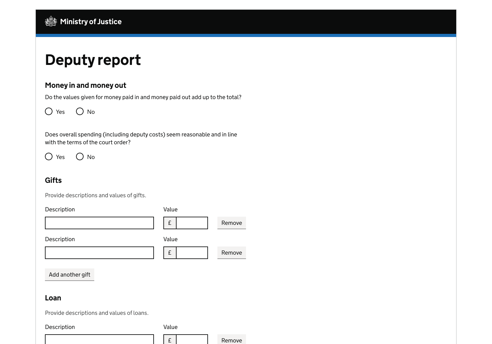
Get help and contribute
Get help
You can contact the MOJ Design System team for help or support using this component.
Help improve this component
The MOJ Design System team would like to hear:
- how you have used this component in your service
- any feedback you have about its usage, for example accessibility or ideas for improvement
Add these comments to the add another discussion on GitHub.