Search
Status: OfficialHow to use ‘official’ components
Contents
Overview
The search component enables users to look for an item using a word or phrase.
It has 2 layouts:
- inline
- stacked
There are 2 button types. You can view guidance on choosing a button.
Inline layout with the text button
The inline layout can be used with the GOV.UK primary or secondary button component.
<search class="moj-search moj-search">
  <form action="#" method="get">
    <div class="govuk-form-group">
      <label class="govuk-label moj-search__label " for="search">
        Find a person
      </label>
      <div id="search-hint" class="govuk-hint moj-search__hint ">
        You can search by name, date of birth or National Insurance number.
      </div>
      <div class="govuk-input__wrapper moj-search__input-wrapper">
        <input class="govuk-input moj-search__input " id="search" name="search" type="search" aria-describedby="search-hint">
        <button type="submit" class="govuk-button moj-search__button" data-module="govuk-button">
          Search
        </button>
      </div>
    </div>
  </form>
</search>
Nunjucks macro options
| Name | Type | Required | Description |
|---|---|---|---|
| action | string | Yes | The URL the form submits to. |
| method | string | No | The HTTP method used to submit the form. Defaults to get. |
| csrf | object | No | A CSRF token to include as a hidden input in the form. See options for csrf. |
| input | object | Yes | The search input. See options for input. |
| button | object | Yes | The search button. See options for button. |
| label | object | No | The label for the search input. See options for label. |
| hint | object | No | A hint for the search input. See options for hint. |
| layout | string | No | Set to stacked to place the button below the input. |
| iconButton | boolean | No | Set to true to render the button as an icon-only magnifying glass button. Accessible button text is set via button.text. If layout is set to stacked, the iconButton option will be ignored. |
| classes | string | No | Classes to add to the search container. |
| attributes | object | No | HTML attributes (for example data attributes) to add to the search element. |
Options for the input component
| Name | Type | Required | Description |
|---|---|---|---|
| id | string | Yes | The ID of the input. |
| name | string | Yes | The name of the input, submitted with the form data. Defaults to search. |
| type | string | No | Type of input control to render, for example text or search. Defaults to search. |
| value | string | No | Optional initial value of the input. |
| disabled | boolean | No | If true, input will be disabled. |
| describedBy | string | No | One or more element IDs to add to the aria-describedby attribute, used to provide additional descriptive information for screen reader users. |
| errorMessage | object | No | Can be used to add an error message to the text input component. The error message component will not display if you use a falsy value for errorMessage, for example false or null. |
| autocomplete | string | No | Attribute to identify input purpose, for example postal-code or username. See autofill for full list of values that can be used. |
| pattern | string | No | Attribute to provide a regular expression pattern, used to match allowed character combinations for the input value. |
| spellcheck | boolean | No | Optional field to enable or disable the spellcheck attribute on the input. |
| inputmode | string | No | Optional value for inputmode. This is a performance optimisation for virtual keyboards on touch devices; it is not a substitute for pattern, as inputmode can be overridden by the user's device settings. |
| classes | string | No | Classes to add to the input element. |
| attributes | object | No | HTML attributes (for example data attributes) to add to the input element. |
Options for the button component
| Name | Type | Required | Description |
|---|---|---|---|
| text | string | Yes | If html is set, this is not required. Text for the button. When iconButton is true, this text is visually hidden and used as the accessible label. If html is provided, the text option will be ignored. |
| html | string | Yes | If text is set, this is not required. HTML for the button. If html is provided, the text option will be ignored. If iconButton is true the html option will be ignored. |
| id | string | No | The ID of the button. |
| name | string | No | Name of the button, sent when a form is submitted. This has no effect if href is set. |
| value | string | No | Value of the button, sent when a form is submitted. This has no effect if href is set. |
| classes | string | No | Classes to add to the button. |
| attributes | object | No | HTML attributes (for example data attributes) to add to the button. |
| preventDoubleClick | boolean | No | Prevent accidental double clicks on submit buttons from submitting forms multiple times. |
Options for the label component
| Name | Type | Required | Description |
|---|---|---|---|
| text | string | Yes | If html is set, this is not required. Text to use within the label. If html is provided, the text option will be ignored. |
| html | string | Yes | If text is set, this is not required. HTML to use within the label. If html is provided, the text option will be ignored. |
| classes | string | No | Classes to add to the label tag. |
| attributes | object | No | HTML attributes (for example data attributes) to add to the label tag. |
Options for the hint component
| Name | Type | Required | Description |
|---|---|---|---|
| text | string | Yes | If html is set, this is not required. Text to use within the hint. If html is provided, the text option will be ignored. |
| html | string | Yes | If text is set, this is not required. HTML to use within the hint. If html is provided, the text option will be ignored. |
| id | string | No | Optional ID attribute to add to the hint span tag. |
| classes | string | No | Classes to add to the hint span tag. |
| attributes | object | No | HTML attributes (for example data attributes) to add to the hint span tag. |
Options for the csrf object
| Name | Type | Required | Description |
|---|---|---|---|
| value | string | Yes | The CSRF token value to include in the hidden input. |
| name | string | No | The name attribute for the hidden CSRF input. Defaults to 'csrf'. |
{%- from "moj/components/search/macro.njk" import mojSearch -%}

{{ mojSearch({
  action: "#",
  input: {
    id: "search",
    name: "search"
  },
  label: {
    text: "Find a person"
  },
  hint: {
    text: "You can search by name, date of birth or National Insurance number."
  },
  button: {
    text: "Search"
  }
}) }}
This component is in the ‘Assets’ tab in the MOJ Figma Kit.
If you work for MOJ, you can view this component in the MOJ Figma Kit.
If you work outside MOJ, read the guidance on setting up Figma prototypes for non-MOJ staff.
Inline layout with the icon button
<search class="moj-search moj-search">
  <form action="#" method="get">
    <div class="govuk-form-group">
      <label class="govuk-label moj-search__label " for="search">
        Find a person
      </label>
      <div id="search-hint" class="govuk-hint moj-search__hint ">
        You can search by name, date of birth or National Insurance number.
      </div>
      <div class="govuk-input__wrapper moj-search__input-wrapper">
        <input class="govuk-input moj-search__input " id="search" name="search" type="search" aria-describedby="search-hint">
        <button type="submit" class="govuk-button moj-search__button moj-search__button--icon" data-module="govuk-button">
          <svg width="20" height="20" viewBox="0 0 21 20" fill="none" aria-hidden="true" focusable="false" xmlns="http://www.w3.org/2000/svg">
            <path d="M8.90102 14.4683C12.385 14.4683 15.2093 11.644 15.2093 8.16005C15.2093 4.6761 12.385 1.85181 8.90102 1.85181C5.41707 1.85181 2.59277 4.6761 2.59277 8.16005C2.59277 11.644 5.41707 14.4683 8.90102 14.4683Z" stroke="currentColor" stroke-width="2.22222" />
            <path d="M13.2349 12.8584L19.5909 19.2144" stroke="currentColor" stroke-width="2.22222" />
          </svg>
          <span class="govuk-visually-hidden">Search</span>
        </button>
      </div>
    </div>
  </form>
</search>
Nunjucks macro options
| Name | Type | Required | Description |
|---|---|---|---|
| action | string | Yes | The URL the form submits to. |
| method | string | No | The HTTP method used to submit the form. Defaults to get. |
| csrf | object | No | A CSRF token to include as a hidden input in the form. See options for csrf. |
| input | object | Yes | The search input. See options for input. |
| button | object | Yes | The search button. See options for button. |
| label | object | No | The label for the search input. See options for label. |
| hint | object | No | A hint for the search input. See options for hint. |
| layout | string | No | Set to stacked to place the button below the input. |
| iconButton | boolean | No | Set to true to render the button as an icon-only magnifying glass button. Accessible button text is set via button.text. If layout is set to stacked, the iconButton option will be ignored. |
| classes | string | No | Classes to add to the search container. |
| attributes | object | No | HTML attributes (for example data attributes) to add to the search element. |
Options for the input component
| Name | Type | Required | Description |
|---|---|---|---|
| id | string | Yes | The ID of the input. |
| name | string | Yes | The name of the input, submitted with the form data. Defaults to search. |
| type | string | No | Type of input control to render, for example text or search. Defaults to search. |
| value | string | No | Optional initial value of the input. |
| disabled | boolean | No | If true, input will be disabled. |
| describedBy | string | No | One or more element IDs to add to the aria-describedby attribute, used to provide additional descriptive information for screen reader users. |
| errorMessage | object | No | Can be used to add an error message to the text input component. The error message component will not display if you use a falsy value for errorMessage, for example false or null. |
| autocomplete | string | No | Attribute to identify input purpose, for example postal-code or username. See autofill for full list of values that can be used. |
| pattern | string | No | Attribute to provide a regular expression pattern, used to match allowed character combinations for the input value. |
| spellcheck | boolean | No | Optional field to enable or disable the spellcheck attribute on the input. |
| inputmode | string | No | Optional value for inputmode. This is a performance optimisation for virtual keyboards on touch devices; it is not a substitute for pattern, as inputmode can be overridden by the user's device settings. |
| classes | string | No | Classes to add to the input element. |
| attributes | object | No | HTML attributes (for example data attributes) to add to the input element. |
Options for the button component
| Name | Type | Required | Description |
|---|---|---|---|
| text | string | Yes | If html is set, this is not required. Text for the button. When iconButton is true, this text is visually hidden and used as the accessible label. If html is provided, the text option will be ignored. |
| html | string | Yes | If text is set, this is not required. HTML for the button. If html is provided, the text option will be ignored. If iconButton is true the html option will be ignored. |
| id | string | No | The ID of the button. |
| name | string | No | Name of the button, sent when a form is submitted. This has no effect if href is set. |
| value | string | No | Value of the button, sent when a form is submitted. This has no effect if href is set. |
| classes | string | No | Classes to add to the button. |
| attributes | object | No | HTML attributes (for example data attributes) to add to the button. |
| preventDoubleClick | boolean | No | Prevent accidental double clicks on submit buttons from submitting forms multiple times. |
Options for the label component
| Name | Type | Required | Description |
|---|---|---|---|
| text | string | Yes | If html is set, this is not required. Text to use within the label. If html is provided, the text option will be ignored. |
| html | string | Yes | If text is set, this is not required. HTML to use within the label. If html is provided, the text option will be ignored. |
| classes | string | No | Classes to add to the label tag. |
| attributes | object | No | HTML attributes (for example data attributes) to add to the label tag. |
Options for the hint component
| Name | Type | Required | Description |
|---|---|---|---|
| text | string | Yes | If html is set, this is not required. Text to use within the hint. If html is provided, the text option will be ignored. |
| html | string | Yes | If text is set, this is not required. HTML to use within the hint. If html is provided, the text option will be ignored. |
| id | string | No | Optional ID attribute to add to the hint span tag. |
| classes | string | No | Classes to add to the hint span tag. |
| attributes | object | No | HTML attributes (for example data attributes) to add to the hint span tag. |
Options for the csrf object
| Name | Type | Required | Description |
|---|---|---|---|
| value | string | Yes | The CSRF token value to include in the hidden input. |
| name | string | No | The name attribute for the hidden CSRF input. Defaults to 'csrf'. |
{%- from "moj/components/search/macro.njk" import mojSearch -%}

{{ mojSearch({
  action: "#",
  iconButton: true,
  input: {
    id: "search",
    name: "search"
  },
  label: {
    text: "Find a person"
  },
  hint: {
    text: "You can search by name, date of birth or National Insurance number."
  },
  button: {
    text: "Search"
  }
}) }}
This component is in the ‘Assets’ tab in the MOJ Figma Kit.
If you work for MOJ, you can view this component in the MOJ Figma Kit.
If you work outside MOJ, read the guidance on setting up Figma prototypes for non-MOJ staff.
Stacked layout
<search class="moj-search moj-search moj-search--stacked">
  <form action="#" method="get">
    <div class="govuk-form-group">
      <label class="govuk-label moj-search__label " for="search">
        Find a person
      </label>
      <div id="search-hint" class="govuk-hint moj-search__hint ">
        You can search by name, date of birth or National Insurance number.
      </div>
      <input class="govuk-input moj-search__input " id="search" name="search" type="search" aria-describedby="search-hint">
    </div>
    <button type="submit" class="govuk-button moj-search__button" data-module="govuk-button">
      Search
    </button>
  </form>
</search>
Nunjucks macro options
| Name | Type | Required | Description |
|---|---|---|---|
| action | string | Yes | The URL the form submits to. |
| method | string | No | The HTTP method used to submit the form. Defaults to get. |
| csrf | object | No | A CSRF token to include as a hidden input in the form. See options for csrf. |
| input | object | Yes | The search input. See options for input. |
| button | object | Yes | The search button. See options for button. |
| label | object | No | The label for the search input. See options for label. |
| hint | object | No | A hint for the search input. See options for hint. |
| layout | string | No | Set to stacked to place the button below the input. |
| iconButton | boolean | No | Set to true to render the button as an icon-only magnifying glass button. Accessible button text is set via button.text. If layout is set to stacked, the iconButton option will be ignored. |
| classes | string | No | Classes to add to the search container. |
| attributes | object | No | HTML attributes (for example data attributes) to add to the search element. |
Options for the input component
| Name | Type | Required | Description |
|---|---|---|---|
| id | string | Yes | The ID of the input. |
| name | string | Yes | The name of the input, submitted with the form data. Defaults to search. |
| type | string | No | Type of input control to render, for example text or search. Defaults to search. |
| value | string | No | Optional initial value of the input. |
| disabled | boolean | No | If true, input will be disabled. |
| describedBy | string | No | One or more element IDs to add to the aria-describedby attribute, used to provide additional descriptive information for screen reader users. |
| errorMessage | object | No | Can be used to add an error message to the text input component. The error message component will not display if you use a falsy value for errorMessage, for example false or null. |
| autocomplete | string | No | Attribute to identify input purpose, for example postal-code or username. See autofill for full list of values that can be used. |
| pattern | string | No | Attribute to provide a regular expression pattern, used to match allowed character combinations for the input value. |
| spellcheck | boolean | No | Optional field to enable or disable the spellcheck attribute on the input. |
| inputmode | string | No | Optional value for inputmode. This is a performance optimisation for virtual keyboards on touch devices; it is not a substitute for pattern, as inputmode can be overridden by the user's device settings. |
| classes | string | No | Classes to add to the input element. |
| attributes | object | No | HTML attributes (for example data attributes) to add to the input element. |
Options for the button component
| Name | Type | Required | Description |
|---|---|---|---|
| text | string | Yes | If html is set, this is not required. Text for the button. When iconButton is true, this text is visually hidden and used as the accessible label. If html is provided, the text option will be ignored. |
| html | string | Yes | If text is set, this is not required. HTML for the button. If html is provided, the text option will be ignored. If iconButton is true the html option will be ignored. |
| id | string | No | The ID of the button. |
| name | string | No | Name of the button, sent when a form is submitted. This has no effect if href is set. |
| value | string | No | Value of the button, sent when a form is submitted. This has no effect if href is set. |
| classes | string | No | Classes to add to the button. |
| attributes | object | No | HTML attributes (for example data attributes) to add to the button. |
| preventDoubleClick | boolean | No | Prevent accidental double clicks on submit buttons from submitting forms multiple times. |
Options for the label component
| Name | Type | Required | Description |
|---|---|---|---|
| text | string | Yes | If html is set, this is not required. Text to use within the label. If html is provided, the text option will be ignored. |
| html | string | Yes | If text is set, this is not required. HTML to use within the label. If html is provided, the text option will be ignored. |
| classes | string | No | Classes to add to the label tag. |
| attributes | object | No | HTML attributes (for example data attributes) to add to the label tag. |
Options for the hint component
| Name | Type | Required | Description |
|---|---|---|---|
| text | string | Yes | If html is set, this is not required. Text to use within the hint. If html is provided, the text option will be ignored. |
| html | string | Yes | If text is set, this is not required. HTML to use within the hint. If html is provided, the text option will be ignored. |
| id | string | No | Optional ID attribute to add to the hint span tag. |
| classes | string | No | Classes to add to the hint span tag. |
| attributes | object | No | HTML attributes (for example data attributes) to add to the hint span tag. |
Options for the csrf object
| Name | Type | Required | Description |
|---|---|---|---|
| value | string | Yes | The CSRF token value to include in the hidden input. |
| name | string | No | The name attribute for the hidden CSRF input. Defaults to 'csrf'. |
{%- from "moj/components/search/macro.njk" import mojSearch -%}

{{ mojSearch({
  action: "#",
  layout: "stacked",
  input: {
    id: "search",
    name: "search"
  },
  label: {
    text: "Find a person"
  },
  hint: {
    text: "You can search by name, date of birth or National Insurance number."
  },
  button: {
    text: "Search"
  }
}) }}
This component is in the ‘Assets’ tab in the MOJ Figma Kit.
If you work for MOJ, you can view this component in the MOJ Figma Kit.
If you work outside MOJ, read the guidance on setting up Figma prototypes for non-MOJ staff.
When to use
Use this component to help users search a large amount of information for something, for example a person, case, application or location.
Users need to have at least 1 piece of identifying information, for example a reference number.
This component can also be used in the primary navigation component to search a whole service.
When not to use
Do not use the search component:
- if users will be unsure about what search term to add
- if content already has a clear hierarchy, for example a side navigation or table of contents
- to replace good information architecture
- for users to search the contents of a linear service
Some users may prefer to look for items in other ways, such as:
- reading a short list
- searching on screen, for example using Ctrl + F
Do research with users if you’re not sure how to help them find what they’re looking for.
Similar and linked components
There’s also the:
How to use
Learn how to design the search component to help users find an item.
Choosing a button
You can add 1 of 2 GOV.UK button types to the search component:
- text (usually with the wording ‘search’)
- icon (featuring a magnifying glass icon)
Primary and secondary buttons
You can use the primary button component or secondary button component.
Which one you choose depends on the design of the rest of the page. Avoid using more than 1 primary button on a page – view GOV.UK guidance on primary and secondary button components.
The magnifying glass icon
The magnifying glass icon is a widely used and recognised design for search. It’s used in this component to save space on busy user interfaces. Button text is clearer and more accessible, so only use the icon in the inline layout if you’re short of space.
There’s a Nielsen Norman Group article on the magnifying glass icon.
Writing content
You can add the following content to the component:
- a label – to state what the user is searching for, for example a person, event or course
- hint text – to state what the user is searching by, for example name or reference number (you do not always need to add hint text)
Avoid placeholder text
Avoid adding placeholder text. It makes the component harder for some people to use, and it may not be accessible. You can read GOV.UK guidance on avoiding placeholder text.
It’s always better to use a visible label or hint text than placeholder text.
Designing the page and onward journey
Understand how to design your page effectively, and show users the results of their search.
Where to add it
Place the search component either:
- under a clearly labelled heading (typically above a table, such as a case list)
- at the top of the page (for site search), like in the primary navigation component or the GOV.UK service navigation component
Do not add the search component to the MOJ header component. There’s not enough space in the header, and doing this would make the use of both components inconsistent.
Filtering results
The search component should only have 1 input field. If users need help refining their search, consider using the filter component.
Adding multiple search components to a page
If you add the search component to a page more than once you’ll need to add a unique accessible name to each one, using aria-label or aria-labelledby. This is because each instance of the component creates a search landmark.
You can read guidance on using landmarks on the DigitalA11y site.
Showing search results
You’ll need to show the user the outcome of their search. Display the results near the search button, with pagination if appropriate.
There’s a:
You can view an example of how to show search results.
Examples
Stacked layout search
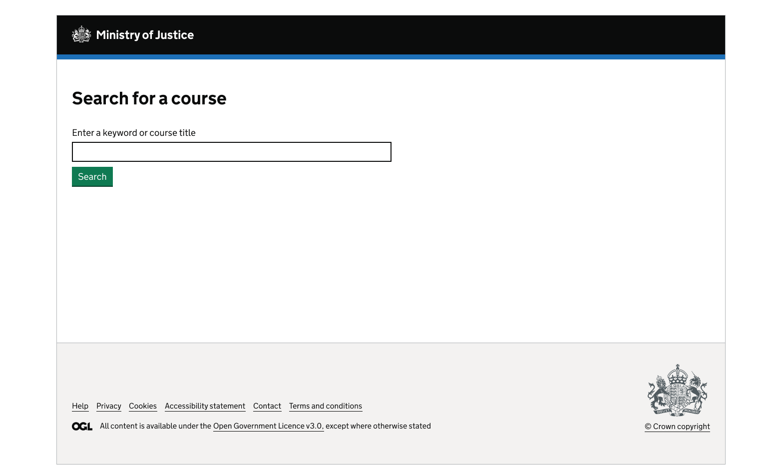
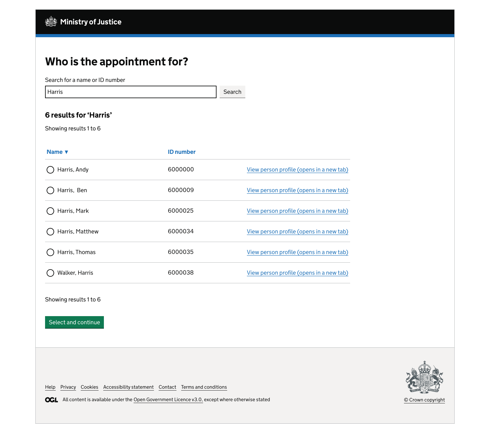
Searching a case list in a linear service
1. Before the user carries out their search
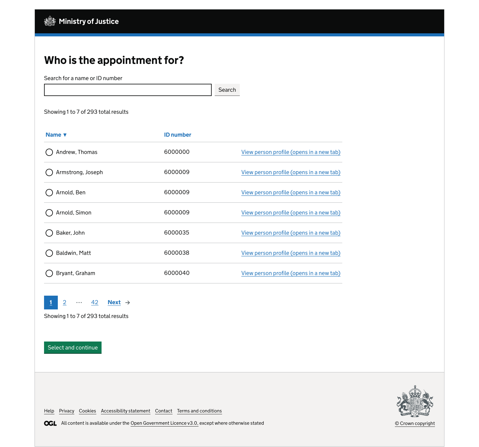
2. After the search
Get help and contribute
Get help
You can contact the MOJ Design System team for help or support using this component.
Help improve this component
The MOJ Design System team would like to hear:
- how you have used this component in your service
- any feedback you have about its usage, for example accessibility or ideas for improvement
Add these comments to the search discussion on GitHub.