Pagination
Status: OfficialHow to use ‘official’ components
Contents
- HTML (Pagination controls and results count (example))
- Nunjucks (Pagination controls and results count (example))
<div class="moj-pagination">
<nav class="govuk-pagination moj-pagination__pagination " aria-label="Pagination">
<div class="govuk-pagination__prev">
<a class="govuk-link govuk-pagination__link" href="#" rel="prev">
<svg class="govuk-pagination__icon govuk-pagination__icon--prev" xmlns="http://www.w3.org/2000/svg" height="13" width="15" aria-hidden="true" focusable="false" viewBox="0 0 15 13">
<path d="m6.5938-0.0078125-6.7266 6.7266 6.7441 6.4062 1.377-1.449-4.1856-3.9768h12.896v-2h-12.984l4.2931-4.293-1.414-1.414z"></path>
</svg>
<span class="govuk-pagination__link-title">
Previous
</span>
</a>
</div>
<ul class="govuk-pagination__list">
<li class="govuk-pagination__item">
<a class="govuk-link govuk-pagination__link" href="#" aria-label="Page 1">
1
</a>
</li>
<li class="govuk-pagination__item govuk-pagination__item--current">
<a class="govuk-link govuk-pagination__link" href="#" aria-label="Page 2" aria-current="page">
2
</a>
</li>
<li class="govuk-pagination__item">
<a class="govuk-link govuk-pagination__link" href="#" aria-label="Page 3">
3
</a>
</li>
<li class="govuk-pagination__item govuk-pagination__item--ellipsis">
⋯
</li>
<li class="govuk-pagination__item">
<a class="govuk-link govuk-pagination__link" href="#" aria-label="Page 7">
7
</a>
</li>
</ul>
<div class="govuk-pagination__next">
<a class="govuk-link govuk-pagination__link" href="#" rel="next">
<span class="govuk-pagination__link-title">
Next
</span>
<svg class="govuk-pagination__icon govuk-pagination__icon--next" xmlns="http://www.w3.org/2000/svg" height="13" width="15" aria-hidden="true" focusable="false" viewBox="0 0 15 13">
<path d="m8.107-0.0078125-1.4136 1.414 4.2926 4.293h-12.986v2h12.896l-4.1855 3.9766 1.377 1.4492 6.7441-6.4062-6.7246-6.7266z"></path>
</svg>
</a>
</div>
</nav>
<p class="moj-pagination__results">Showing 26 to 50 of 157 total results</p>
</div>
Nunjucks macro options
| Name | Type | Required | Description |
|---|---|---|---|
| items | array | Yes | An array of pages to display. See items. |
| previous | object | No | A link to the previous page. See link. |
| next | object | No | A link to the next page. See link. |
| results | object | No | Optional object describing the total number of results and which ones are on the current page. See results. |
| landmarkLabel | string | No | The label for the navigation landmark that wraps the pagination. Defaults to "Pagination". |
| classes | string | No | Any additional classes that you want to add to the pagination. |
items
| Name | Type | Required | Description |
|---|---|---|---|
| text | string | No | The link text - usually a page number. |
| href | string | No | The link URL. |
| selected | boolean | No | Set to true to indicate the currently selected page. |
| visuallyHiddenText | string | No | The visually hidden label for the pagination item, which will be applied to an aria-label and announced by screen readers on the pagination item link. Should include page number. Defaults to “Page 1”. |
| type | string | No | Set to "dots" to show ellipses instead of a page number. |
| attributes | object | No | The HTML attributes (for example, data attributes) you want to add to the anchor. |
results
| Name | Type | Required | Description |
|---|---|---|---|
| count | number | Yes | The total number of items. |
| from | number | Yes | The number of the first item on the page. |
| to | number | Yes | The number of the last item on the page. |
| text | string | No | A label describing the items. Defaults to "results". |
| pages | object | No | If present, the results will show page information. See pages. |
pages
| Name | Type | Required | Description |
|---|---|---|---|
| count | number | Yes | The total number of pages. |
| current | number | Yes | The current page number. |
link
| Name | Type | Required | Description |
|---|---|---|---|
| text | string | No | The link text - usually a page number. |
| href | string | No | The link URL. |
{%- from "moj/components/pagination/macro.njk" import mojPagination -%}
{% from "govuk/components/pagination/macro.njk" import govukPagination %}


{{ mojPagination({
  items: [{
    text: "1",
    href: "#"
  }, {
    text: "2",
    href: "#",
    selected: true
  }, {
    text: "3",
    href: "#"
  }, {
    type: "dots"
  }, {
    text: "7",
    href: "#"
  }],
  results: {
    count: 157,
    from: 26,
    to: 50,
    text: "results"
  },
  previous: {
    text: "Previous",
    href: "#"
  },
  next: {
    text: "Next",
    href: "#"
  }
}) }}
Overview
The pagination component enables users to:
- navigate long lists of results
- identify how many results there are
- know where they are in the results
It can also reduce the page load for long tables and lists (including search results and filtered lists).
The component parts
The component has 2 parts:
- the GOV.UK pagination component (the ‘pagination controls’)
- a results count
You can read guidance on choosing a results count.
When to use
Use pagination instead of automatically loading more results when the user reaches the bottom of the page (infinite scroll). Infinite scroll introduces usability problems, including making it hard for users to reach the page footer.
When not to use
Do not use this component:
- to help users navigate between content pages – use the GOV.UK ‘block’ style of pagination instead
- if the results count is not needed – just use the GOV.UK pagination component on its own
Things to consider
You’ll probably need to combine pagination with other ways of helping users find items from very long lists. Consider the:
People with dyscalculia may find pagination difficult to use, especially when it’s used to display a large amount of results. Try:
- having more results per page (to reduce the number of pages)
- creating context by giving ‘results’ a more meaningful name, such as cases, people or referrals
Please add any feedback on improving this component for people with dyscalculia to the pagination discussion on Github.
Similar or linked components
How to use
The component has 2 parts:
- the GOV.UK pagination component (the ‘pagination controls’)
- a results count
The pagination controls will not show if there’s only 1 page of results, but you can still set the results count to show.
Using the pagination controls
You can read guidance on using the GOV.UK pagination component or ‘pagination controls’. This is a part of this component.
Using the results count
You can choose how to display the results using 1 of the 4 result count variants.
Results range for the current page, and total results
- HTML (Pagination controls, with results range for current page and total (example))
- Nunjucks (Pagination controls, with results range for current page and total (example))
<div class="moj-pagination">
<nav class="govuk-pagination moj-pagination__pagination " aria-label="Pagination">
<div class="govuk-pagination__prev">
<a class="govuk-link govuk-pagination__link" href="#" rel="prev">
<svg class="govuk-pagination__icon govuk-pagination__icon--prev" xmlns="http://www.w3.org/2000/svg" height="13" width="15" aria-hidden="true" focusable="false" viewBox="0 0 15 13">
<path d="m6.5938-0.0078125-6.7266 6.7266 6.7441 6.4062 1.377-1.449-4.1856-3.9768h12.896v-2h-12.984l4.2931-4.293-1.414-1.414z"></path>
</svg>
<span class="govuk-pagination__link-title">
Previous
</span>
</a>
</div>
<ul class="govuk-pagination__list">
<li class="govuk-pagination__item">
<a class="govuk-link govuk-pagination__link" href="#" aria-label="Page 1">
1
</a>
</li>
<li class="govuk-pagination__item govuk-pagination__item--current">
<a class="govuk-link govuk-pagination__link" href="#" aria-label="Page 2" aria-current="page">
2
</a>
</li>
<li class="govuk-pagination__item">
<a class="govuk-link govuk-pagination__link" href="#" aria-label="Page 3">
3
</a>
</li>
<li class="govuk-pagination__item govuk-pagination__item--ellipsis">
⋯
</li>
<li class="govuk-pagination__item">
<a class="govuk-link govuk-pagination__link" href="#" aria-label="Page 7">
7
</a>
</li>
</ul>
<div class="govuk-pagination__next">
<a class="govuk-link govuk-pagination__link" href="#" rel="next">
<span class="govuk-pagination__link-title">
Next
</span>
<svg class="govuk-pagination__icon govuk-pagination__icon--next" xmlns="http://www.w3.org/2000/svg" height="13" width="15" aria-hidden="true" focusable="false" viewBox="0 0 15 13">
<path d="m8.107-0.0078125-1.4136 1.414 4.2926 4.293h-12.986v2h12.896l-4.1855 3.9766 1.377 1.4492 6.7441-6.4062-6.7246-6.7266z"></path>
</svg>
</a>
</div>
</nav>
<p class="moj-pagination__results">Showing 11 to 20 of 66 total results</p>
</div>
Nunjucks macro options
| Name | Type | Required | Description |
|---|---|---|---|
| items | array | Yes | An array of pages to display. See items. |
| previous | object | No | A link to the previous page. See link. |
| next | object | No | A link to the next page. See link. |
| results | object | No | Optional object describing the total number of results and which ones are on the current page. See results. |
| landmarkLabel | string | No | The label for the navigation landmark that wraps the pagination. Defaults to "Pagination". |
| classes | string | No | Any additional classes that you want to add to the pagination. |
items
| Name | Type | Required | Description |
|---|---|---|---|
| text | string | No | The link text - usually a page number. |
| href | string | No | The link URL. |
| selected | boolean | No | Set to true to indicate the currently selected page. |
| visuallyHiddenText | string | No | The visually hidden label for the pagination item, which will be applied to an aria-label and announced by screen readers on the pagination item link. Should include page number. Defaults to “Page 1”. |
| type | string | No | Set to "dots" to show ellipses instead of a page number. |
| attributes | object | No | The HTML attributes (for example, data attributes) you want to add to the anchor. |
results
| Name | Type | Required | Description |
|---|---|---|---|
| count | number | Yes | The total number of items. |
| from | number | Yes | The number of the first item on the page. |
| to | number | Yes | The number of the last item on the page. |
| text | string | No | A label describing the items. Defaults to "results". |
| pages | object | No | If present, the results will show page information. See pages. |
pages
| Name | Type | Required | Description |
|---|---|---|---|
| count | number | Yes | The total number of pages. |
| current | number | Yes | The current page number. |
link
| Name | Type | Required | Description |
|---|---|---|---|
| text | string | No | The link text - usually a page number. |
| href | string | No | The link URL. |
{%- from "moj/components/pagination/macro.njk" import mojPagination -%}
{% from "govuk/components/pagination/macro.njk" import govukPagination %}

{{ mojPagination({
  items: [{
    text: "1",
    href: "#"
  }, {
    text: "2",
    href: "#",
    selected: true
  }, {
    text: "3",
    href: "#"
  }, {
    type: "dots"
  }, {
    text: "7",
    href: "#"
  }],
  previous: {
    text: "Previous",
    href: "#"
  },
  next: {
    text: "Next",
    href: "#"
  },
  results: {
    count: 66,
    from: 11,
    to: 20,
    text: "results"
  }
}) }}
Results range for the current page
- HTML (Pagination controls, with results range for current page (example))
- Nunjucks (Pagination controls, with results range for current page (example))
<div class="moj-pagination">
<nav class="govuk-pagination moj-pagination__pagination " aria-label="Pagination">
<div class="govuk-pagination__prev">
<a class="govuk-link govuk-pagination__link" href="#" rel="prev">
<svg class="govuk-pagination__icon govuk-pagination__icon--prev" xmlns="http://www.w3.org/2000/svg" height="13" width="15" aria-hidden="true" focusable="false" viewBox="0 0 15 13">
<path d="m6.5938-0.0078125-6.7266 6.7266 6.7441 6.4062 1.377-1.449-4.1856-3.9768h12.896v-2h-12.984l4.2931-4.293-1.414-1.414z"></path>
</svg>
<span class="govuk-pagination__link-title">
Previous
</span>
</a>
</div>
<ul class="govuk-pagination__list">
<li class="govuk-pagination__item">
<a class="govuk-link govuk-pagination__link" href="#" aria-label="Page 1">
1
</a>
</li>
<li class="govuk-pagination__item govuk-pagination__item--current">
<a class="govuk-link govuk-pagination__link" href="#" aria-label="Page 2" aria-current="page">
2
</a>
</li>
<li class="govuk-pagination__item">
<a class="govuk-link govuk-pagination__link" href="#" aria-label="Page 3">
3
</a>
</li>
<li class="govuk-pagination__item govuk-pagination__item--ellipsis">
⋯
</li>
<li class="govuk-pagination__item">
<a class="govuk-link govuk-pagination__link" href="#" aria-label="Page 7">
7
</a>
</li>
</ul>
<div class="govuk-pagination__next">
<a class="govuk-link govuk-pagination__link" href="#" rel="next">
<span class="govuk-pagination__link-title">
Next
</span>
<svg class="govuk-pagination__icon govuk-pagination__icon--next" xmlns="http://www.w3.org/2000/svg" height="13" width="15" aria-hidden="true" focusable="false" viewBox="0 0 15 13">
<path d="m8.107-0.0078125-1.4136 1.414 4.2926 4.293h-12.986v2h12.896l-4.1855 3.9766 1.377 1.4492 6.7441-6.4062-6.7246-6.7266z"></path>
</svg>
</a>
</div>
</nav>
<p class="moj-pagination__results">Showing results 11 to 20</p>
</div>
Nunjucks macro options
| Name | Type | Required | Description |
|---|---|---|---|
| items | array | Yes | An array of pages to display. See items. |
| previous | object | No | A link to the previous page. See link. |
| next | object | No | A link to the next page. See link. |
| results | object | No | Optional object describing the total number of results and which ones are on the current page. See results. |
| landmarkLabel | string | No | The label for the navigation landmark that wraps the pagination. Defaults to "Pagination". |
| classes | string | No | Any additional classes that you want to add to the pagination. |
items
| Name | Type | Required | Description |
|---|---|---|---|
| text | string | No | The link text - usually a page number. |
| href | string | No | The link URL. |
| selected | boolean | No | Set to true to indicate the currently selected page. |
| visuallyHiddenText | string | No | The visually hidden label for the pagination item, which will be applied to an aria-label and announced by screen readers on the pagination item link. Should include page number. Defaults to “Page 1”. |
| type | string | No | Set to "dots" to show ellipses instead of a page number. |
| attributes | object | No | The HTML attributes (for example, data attributes) you want to add to the anchor. |
results
| Name | Type | Required | Description |
|---|---|---|---|
| count | number | Yes | The total number of items. |
| from | number | Yes | The number of the first item on the page. |
| to | number | Yes | The number of the last item on the page. |
| text | string | No | A label describing the items. Defaults to "results". |
| pages | object | No | If present, the results will show page information. See pages. |
pages
| Name | Type | Required | Description |
|---|---|---|---|
| count | number | Yes | The total number of pages. |
| current | number | Yes | The current page number. |
link
| Name | Type | Required | Description |
|---|---|---|---|
| text | string | No | The link text - usually a page number. |
| href | string | No | The link URL. |
{%- from "moj/components/pagination/macro.njk" import mojPagination -%}
{% from "govuk/components/pagination/macro.njk" import govukPagination %}

{{ mojPagination({
  items: [{
    text: "1",
    href: "#"
  }, {
    text: "2",
    href: "#",
    selected: true
  }, {
    text: "3",
    href: "#"
  }, {
    type: "dots"
  }, {
    text: "7",
    href: "#"
  }],
  previous: {
    text: "Previous",
    href: "#"
  },
  next: {
    text: "Next",
    href: "#"
  },
  results: {
    from: 11,
    to: 20,
    text: "results"
  }
}) }}
Total results
- HTML (Pagination controls, with total results (example))
- Nunjucks (Pagination controls, with total results (example))
<div class="moj-pagination">
<nav class="govuk-pagination moj-pagination__pagination " aria-label="Pagination">
<div class="govuk-pagination__prev">
<a class="govuk-link govuk-pagination__link" href="#" rel="prev">
<svg class="govuk-pagination__icon govuk-pagination__icon--prev" xmlns="http://www.w3.org/2000/svg" height="13" width="15" aria-hidden="true" focusable="false" viewBox="0 0 15 13">
<path d="m6.5938-0.0078125-6.7266 6.7266 6.7441 6.4062 1.377-1.449-4.1856-3.9768h12.896v-2h-12.984l4.2931-4.293-1.414-1.414z"></path>
</svg>
<span class="govuk-pagination__link-title">
Previous
</span>
</a>
</div>
<ul class="govuk-pagination__list">
<li class="govuk-pagination__item">
<a class="govuk-link govuk-pagination__link" href="#" aria-label="Page 1">
1
</a>
</li>
<li class="govuk-pagination__item govuk-pagination__item--current">
<a class="govuk-link govuk-pagination__link" href="#" aria-label="Page 2" aria-current="page">
2
</a>
</li>
<li class="govuk-pagination__item">
<a class="govuk-link govuk-pagination__link" href="#" aria-label="Page 3">
3
</a>
</li>
<li class="govuk-pagination__item govuk-pagination__item--ellipsis">
⋯
</li>
<li class="govuk-pagination__item">
<a class="govuk-link govuk-pagination__link" href="#" aria-label="Page 7">
7
</a>
</li>
</ul>
<div class="govuk-pagination__next">
<a class="govuk-link govuk-pagination__link" href="#" rel="next">
<span class="govuk-pagination__link-title">
Next
</span>
<svg class="govuk-pagination__icon govuk-pagination__icon--next" xmlns="http://www.w3.org/2000/svg" height="13" width="15" aria-hidden="true" focusable="false" viewBox="0 0 15 13">
<path d="m8.107-0.0078125-1.4136 1.414 4.2926 4.293h-12.986v2h12.896l-4.1855 3.9766 1.377 1.4492 6.7441-6.4062-6.7246-6.7266z"></path>
</svg>
</a>
</div>
</nav>
<p class="moj-pagination__results">66 total results</p>
</div>
Nunjucks macro options
| Name | Type | Required | Description |
|---|---|---|---|
| items | array | Yes | An array of pages to display. See items. |
| previous | object | No | A link to the previous page. See link. |
| next | object | No | A link to the next page. See link. |
| results | object | No | Optional object describing the total number of results and which ones are on the current page. See results. |
| landmarkLabel | string | No | The label for the navigation landmark that wraps the pagination. Defaults to "Pagination". |
| classes | string | No | Any additional classes that you want to add to the pagination. |
items
| Name | Type | Required | Description |
|---|---|---|---|
| text | string | No | The link text - usually a page number. |
| href | string | No | The link URL. |
| selected | boolean | No | Set to true to indicate the currently selected page. |
| visuallyHiddenText | string | No | The visually hidden label for the pagination item, which will be applied to an aria-label and announced by screen readers on the pagination item link. Should include page number. Defaults to “Page 1”. |
| type | string | No | Set to "dots" to show ellipses instead of a page number. |
| attributes | object | No | The HTML attributes (for example, data attributes) you want to add to the anchor. |
results
| Name | Type | Required | Description |
|---|---|---|---|
| count | number | Yes | The total number of items. |
| from | number | Yes | The number of the first item on the page. |
| to | number | Yes | The number of the last item on the page. |
| text | string | No | A label describing the items. Defaults to "results". |
| pages | object | No | If present, the results will show page information. See pages. |
pages
| Name | Type | Required | Description |
|---|---|---|---|
| count | number | Yes | The total number of pages. |
| current | number | Yes | The current page number. |
link
| Name | Type | Required | Description |
|---|---|---|---|
| text | string | No | The link text - usually a page number. |
| href | string | No | The link URL. |
{%- from "moj/components/pagination/macro.njk" import mojPagination -%}
{% from "govuk/components/pagination/macro.njk" import govukPagination %}

{{ mojPagination({
  items: [{
    text: "1",
    href: "#"
  }, {
    text: "2",
    href: "#",
    selected: true
  }, {
    text: "3",
    href: "#"
  }, {
    type: "dots"
  }, {
    text: "7",
    href: "#"
  }],
  previous: {
    text: "Previous",
    href: "#"
  },
  next: {
    text: "Next",
    href: "#"
  },
  results: {
    count: 66,
    text: "results"
  }
}) }}
Current and total pages
- HTML (Pagination controls, with current and total pages (example))
- Nunjucks (Pagination controls, with current and total pages (example))
<div class="moj-pagination">
<nav class="govuk-pagination moj-pagination__pagination " aria-label="Pagination">
<div class="govuk-pagination__prev">
<a class="govuk-link govuk-pagination__link" href="#" rel="prev">
<svg class="govuk-pagination__icon govuk-pagination__icon--prev" xmlns="http://www.w3.org/2000/svg" height="13" width="15" aria-hidden="true" focusable="false" viewBox="0 0 15 13">
<path d="m6.5938-0.0078125-6.7266 6.7266 6.7441 6.4062 1.377-1.449-4.1856-3.9768h12.896v-2h-12.984l4.2931-4.293-1.414-1.414z"></path>
</svg>
<span class="govuk-pagination__link-title">
Previous
</span>
</a>
</div>
<ul class="govuk-pagination__list">
<li class="govuk-pagination__item">
<a class="govuk-link govuk-pagination__link" href="#" aria-label="Page 1">
1
</a>
</li>
<li class="govuk-pagination__item govuk-pagination__item--current">
<a class="govuk-link govuk-pagination__link" href="#" aria-label="Page 2" aria-current="page">
2
</a>
</li>
<li class="govuk-pagination__item">
<a class="govuk-link govuk-pagination__link" href="#" aria-label="Page 3">
3
</a>
</li>
<li class="govuk-pagination__item govuk-pagination__item--ellipsis">
⋯
</li>
<li class="govuk-pagination__item">
<a class="govuk-link govuk-pagination__link" href="#" aria-label="Page 7">
7
</a>
</li>
</ul>
<div class="govuk-pagination__next">
<a class="govuk-link govuk-pagination__link" href="#" rel="next">
<span class="govuk-pagination__link-title">
Next
</span>
<svg class="govuk-pagination__icon govuk-pagination__icon--next" xmlns="http://www.w3.org/2000/svg" height="13" width="15" aria-hidden="true" focusable="false" viewBox="0 0 15 13">
<path d="m8.107-0.0078125-1.4136 1.414 4.2926 4.293h-12.986v2h12.896l-4.1855 3.9766 1.377 1.4492 6.7441-6.4062-6.7246-6.7266z"></path>
</svg>
</a>
</div>
</nav>
<p class="moj-pagination__results">Page 2 of 7</p>
</div>
Nunjucks macro options
| Name | Type | Required | Description |
|---|---|---|---|
| items | array | Yes | An array of pages to display. See items. |
| previous | object | No | A link to the previous page. See link. |
| next | object | No | A link to the next page. See link. |
| results | object | No | Optional object describing the total number of results and which ones are on the current page. See results. |
| landmarkLabel | string | No | The label for the navigation landmark that wraps the pagination. Defaults to "Pagination". |
| classes | string | No | Any additional classes that you want to add to the pagination. |
items
| Name | Type | Required | Description |
|---|---|---|---|
| text | string | No | The link text - usually a page number. |
| href | string | No | The link URL. |
| selected | boolean | No | Set to true to indicate the currently selected page. |
| visuallyHiddenText | string | No | The visually hidden label for the pagination item, which will be applied to an aria-label and announced by screen readers on the pagination item link. Should include page number. Defaults to “Page 1”. |
| type | string | No | Set to "dots" to show ellipses instead of a page number. |
| attributes | object | No | The HTML attributes (for example, data attributes) you want to add to the anchor. |
results
| Name | Type | Required | Description |
|---|---|---|---|
| count | number | Yes | The total number of items. |
| from | number | Yes | The number of the first item on the page. |
| to | number | Yes | The number of the last item on the page. |
| text | string | No | A label describing the items. Defaults to "results". |
| pages | object | No | If present, the results will show page information. See pages. |
pages
| Name | Type | Required | Description |
|---|---|---|---|
| count | number | Yes | The total number of pages. |
| current | number | Yes | The current page number. |
link
| Name | Type | Required | Description |
|---|---|---|---|
| text | string | No | The link text - usually a page number. |
| href | string | No | The link URL. |
{%- from "moj/components/pagination/macro.njk" import mojPagination -%}
{% from "govuk/components/pagination/macro.njk" import govukPagination %}

{{ mojPagination({
  items: [{
    text: "1",
    href: "#"
  }, {
    text: "2",
    href: "#",
    selected: true
  }, {
    text: "3",
    href: "#"
  }, {
    type: "dots"
  }, {
    text: "7",
    href: "#"
  }],
  previous: {
    text: "Previous",
    href: "#"
  },
  next: {
    text: "Next",
    href: "#"
  },
  results: {
    pages: {
      current: 2,
      count: 7
    },
    count: 46,
    text: "results"
  }
}) }}
When choosing a variant consider:
- information that’s already on the page, for example the number of results in a heading
- what’s relevant to the user, for example whether the results range means anything to them
The results count is aligned to the left under the pagination controls. Do not move it, because this may cause issues for magnifier users.
The number of results on each page
The number of results on each page is controlled by a table or list component, rather than by pagination. When choosing the amount per page consider:
- if research shows that users want to browse or compare results (rather than look for a particular one)
- the time users will have to spend navigating between pages
- the height of each result
- the page’s cognitive load
Results-only pages
If the results are the only content on the page, add the amount of results to the title and h1. This improves accessibility.
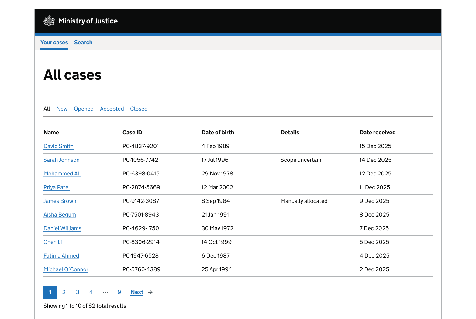
Examples
Paginated case management
Get help and contribute
Get help
You can contact the MOJ Design System team for help or support using this component.
Help improve this component
The MOJ Design System team would like to hear:
- how you have used this component in your service
- any feedback you have about its usage, for example accessibility or ideas for improvement
Add these comments to the pagination discussion on GitHub.