Filter
Status: To be reviewedHow to use ‘to be reviewed’ components
<div class="moj-filter" data-module="moj-filter">
  <div class="moj-filter__header">
    <div class="moj-filter__header-title">
      <h2 class="govuk-heading-m">Filter</h2>
    </div>
    <div class="moj-filter__header-action">
    </div>
  </div>
  <div class="moj-filter__content">
    <div class="moj-filter__selected">
      <div class="moj-filter__selected-heading">
        <div class="moj-filter__heading-title">
          <h2 class="govuk-heading-m">Selected filters</h2>
        </div>
        <div class="moj-filter__heading-action">
          <p><a class="govuk-link govuk-link--no-visited-state" href="">Clear filters</a></p>
        </div>
      </div>
      <h3 class="govuk-heading-s govuk-!-margin-bottom-0">Type</h3>
      <ul class="moj-filter-tags">
        <li><a class="moj-filter__tag" href="/path/to/remove/this"><span class="govuk-visually-hidden">Remove this filter</span> Blue</a></li>
        <li><a class="moj-filter__tag" href="/path/to/remove/this"><span class="govuk-visually-hidden">Remove this filter</span> Yellow</a></li>
      </ul>
      <h3 class="govuk-heading-s govuk-!-margin-bottom-0">Status</h3>
      <ul class="moj-filter-tags">
        <li><a class="moj-filter__tag" href="/path/to/remove/this"><span class="govuk-visually-hidden">Remove this filter</span> Completed</a></li>
      </ul>
    </div>
    <div class="moj-filter__options">
      <button type="submit" class="govuk-button" data-module="govuk-button" data-test-id="submit-button">
        Apply filters
      </button>
      <div class="govuk-form-group">
        <label class="govuk-label govuk-label--m" for="keywords">
          Keywords
        </label>
        <input class="govuk-input" id="keywords" name="keywords" type="text">
      </div>
      <div class="govuk-form-group">
        <fieldset class="govuk-fieldset">
          <legend class="govuk-fieldset__legend govuk-fieldset__legend--m">
            Type
          </legend>
          <div class="govuk-checkboxes govuk-checkboxes--small" data-module="govuk-checkboxes">
            <div class="govuk-checkboxes__item">
              <input class="govuk-checkboxes__input" id="type" name="type" type="checkbox" value="1" checked>
              <label class="govuk-label govuk-checkboxes__label" for="type">
                Blue (18)
              </label>
            </div>
            <div class="govuk-checkboxes__item">
              <input class="govuk-checkboxes__input" id="type-2" name="type" type="checkbox" value="2" checked>
              <label class="govuk-label govuk-checkboxes__label" for="type-2">
                Yellow (5)
              </label>
            </div>
            <div class="govuk-checkboxes__item">
              <input class="govuk-checkboxes__input" id="type-3" name="type" type="checkbox" value="3">
              <label class="govuk-label govuk-checkboxes__label" for="type-3">
                Red (2)
              </label>
            </div>
          </div>
        </fieldset>
      </div>
      <div class="govuk-form-group">
        <fieldset class="govuk-fieldset">
          <legend class="govuk-fieldset__legend govuk-fieldset__legend--m">
            Status
          </legend>
          <div class="govuk-checkboxes govuk-checkboxes--small" data-module="govuk-checkboxes">
            <div class="govuk-checkboxes__item">
              <input class="govuk-checkboxes__input" id="status" name="status" type="checkbox" value="complete" checked>
              <label class="govuk-label govuk-checkboxes__label" for="status">
                Completed (2)
              </label>
            </div>
            <div class="govuk-checkboxes__item">
              <input class="govuk-checkboxes__input" id="status-2" name="status" type="checkbox" value="incomplete">
              <label class="govuk-label govuk-checkboxes__label" for="status-2">
                Incomplete (5)
              </label>
            </div>
            <div class="govuk-checkboxes__item">
              <input class="govuk-checkboxes__input" id="status-3" name="status" type="checkbox" value="inprogress">
              <label class="govuk-label govuk-checkboxes__label" for="status-3">
                In progress (3)
              </label>
            </div>
          </div>
        </fieldset>
      </div>
    </div>
  </div>
</div>
{%- from "moj/components/filter/macro.njk" import mojFilter -%}
{%- from "govuk/components/checkboxes/macro.njk" import govukCheckboxes -%}
{%- from "govuk/components/input/macro.njk" import govukInput -%}

{%- set filterOptionsHtml %}

  {{ govukInput({
    id: "keywords",
    name: "keywords",
    label: {
      text: "Keywords",
      classes: "govuk-label--m"
    }
  }) }}

  {{ govukCheckboxes({
    idPrefix: "type",
    name: "type",
    classes: "govuk-checkboxes--small",
    fieldset: {
      legend: {
        text: "Type",
        classes: "govuk-fieldset__legend--m"
      }
    },
    items: [
      {
        value: "1",
        text: "Blue (18)",
        checked: true
      },
      {
        value: "2",
        text: "Yellow (5)",
        checked: true
      },
      {
        value: "3",
        text: "Red (2)"
      }
    ]
  }) }}

  {{ govukCheckboxes({
    idPrefix: "status",
    name: "status",
    classes: "govuk-checkboxes--small",
    fieldset: {
      legend: {
        text: "Status",
        classes: "govuk-fieldset__legend--m"
      }
    },
    items: [
      {
        value: "complete",
        text: "Completed (2)",
        checked: true
      },
      {
        value: "incomplete",
        text: "Incomplete (5)"
      },
      {
        value: "inprogress",
        text: "In progress (3)",
        checked: false
      }
    ]
  }) }}
{% endset -%}

{{ mojFilter({
  heading: {
    text: "Filter"
  },

  submit: {
    attributes: {
        "data-test-id": "submit-button"
    }
  },

  selectedFilters: {

    heading: {
      text: "Selected filters"
    },

    clearLink: {
      text: "Clear filters"
    },

    categories: [
      {
        heading: {
          text: "Type"
        },
        items: [{
          href: "/path/to/remove/this",
          text: "Blue"
        }, {
          href: "/path/to/remove/this",
          text: "Yellow"
        }]
      },
      {
        heading: {
          text: "Status"
        },
        items: [{
          href: "/path/to/remove/this",
          text: "Completed"
        }]
      }
    ]
  },
  optionsHtml: filterOptionsHtml
}) }}
When to use
Use the filter component to help users filter a list of items, such as a list of cases or search results.
You should only provide users with filters they really need.
Similar or linked components
There’s also a Filter component discussion in the GOV.UK Design System backlog.
How to use
You should use this component with the filter a list pattern to allow the component to be shown with a list.
Users can select 1 or more filters. When the user clicks ‘Apply filters’ the page refreshes to show the items that match the filters.
The selected filters are displayed at the top to let users see what they’ve selected and remove them easily. Clicking on a selected filter refreshes the page and removes the filter.
Types of filters
You can use form elements such as radios and checkboxes to let users filter the list. Follow guidance on how to ask users for dates.
User research will tell you the best order of filters.
Navigating filters
Reducing the list of filter options
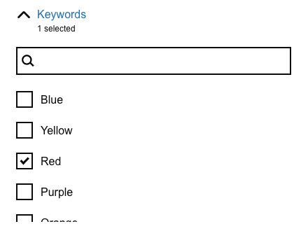
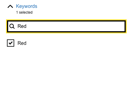
If a filter has a long list of options, use an accessible autocomplete (type ahead) to let users narrow down the options before making a selection.
You should only show options if they match what the user has typed, of if they are already selected.
You should make it easier for users to narrow the options by:
- making it case insensitive
- stripping out punctuation characters and duplicate whitespace
- seeing ‘&’ and ‘and’ as the same
|
|
Research
This component:
- has been usability tested
- is working in a live service (Sirius for Office of the Public Guardian)
Users don’t always see they can filter. Some users try to filter from the columns headings.
Things we don’t know enough about
-
Guidance on when to use an alternative to search, such as ‘search’ or ‘sort by’
-
How to alleviate confusion between filter and sorting columns.
-
When to use a horizontal layout for filters
-
More detailed guidance on accessibility
-
How to deal with inter-dependent filters
-
Technical implementation to ensure all pages are filtered not just the current page
-
Whether the ability to filter should be emphasised, for example changing the colour of the ‘open filter’ button, or having the filter open when the page is first loaded
-
Whether selected filters should be visible at all times above the list of items, like the GOV.UK search results
Accessibility issues
Users have to navigate to the top of the component to apply filters after selecting their options. This can make the component hard to use for a keyboard user. This is not a Web Content Accessibility Guidelines (WCAG) failure. It may be helpful to mention this in the accessibility statement.
Get help and contribute
Get help
You can contact the MOJ Design System team for help or support using this component.
Help improve this component
The MOJ Design System team would like to hear:
- how you have used this component in your service
- any feedback you have about its usage, for example accessibility or ideas for improvement
Add these comments to the filter discussion on GitHub.