Button menu
Status: OfficialHow to use ‘official’ components
Contents
<div class="moj-button-menu" data-module="moj-button-menu" data-button-text="Menu title">
  <button type="submit" class="govuk-button moj-button-menu__item govuk-button--secondary" data-module="govuk-button">
    Menu item 1
  </button>
  <button type="submit" class="govuk-button moj-button-menu__item govuk-button--secondary" data-module="govuk-button">
    Menu item 2
  </button>
  <button type="submit" class="govuk-button moj-button-menu__item govuk-button--secondary" data-module="govuk-button">
    Menu item 3
  </button>
</div>
Nunjucks macro options
Container
| Name | Type | Required | Description |
|---|---|---|---|
| items | Array | Yes | An array of button item objects. See items. |
| button | Object | No | Properties of the menu title button. See button. |
| attributes | Object | No | HTML attributes (for example data attributes) to add to the button menu container. |
Button
| Name | Type | Required | Description |
|---|---|---|---|
| text | String | Yes | Text for the menu title button. |
| classes | String | No | Classes to add to the menu title button. |
Items
See the button component in the GOV.UK Design System for more details.
| Name | Type | Required | Description |
|---|---|---|---|
| element | String | No | Whether to use a button or a element to create the button. In most cases you will not need to set this as it will be configured automatically if you use href or html. |
| text | String | Yes | If html is set, this is not required. Text for the button or link. If html is provided, the text argument will be ignored and element will be automatically set to button unless href is also set, or it has already been defined. |
| html | String | Yes | If text is set, this is not required. HTML for the button or link. If html is provided, the text argument will be ignored and element will be automatically set to button unless href is also set, or it has already been defined. |
| name | String | Yes | Name for the button. This has no effect on a elements. |
| type | String | Yes | Type of button. The options are button, submit or reset. This will always be button in the button menu component. This has no effect on a elements. |
| value | String | Yes | Value for the button tag. This has no effect on a elements. |
| disabled | Boolean | No | Whether the button should be disabled. For button elements, disabled and aria-disabled attributes will be set automatically. |
| href | String | No | The URL that the button should link to. If this is set, element will be automatically set to a if it has not already been defined. The a tag will be given the role of button. |
| classes | String | No | Classes to add to the button component. |
| attributes | Object | No | HTML attributes (for example data attributes) to add to the button. |
| preventDoubleClick | Boolean | No | Prevent accidental double clicks on submit buttons from submitting forms multiple times. |
Warning: If you’re using Nunjucks macros in production be aware that using HTML arguments, or ones ending with .html can be at risk from cross-site scripting attacks. More information about security vulnerabilities can be found in the Nunjucks documentation.
{%- from "moj/components/button-menu/macro.njk" import mojButtonMenu -%}

{{ mojButtonMenu({
  button: {
    text: "Menu title"
  },
  items: [
    {
      text: "Menu item 1"
    },
    {
      text: "Menu item 2"
    },
    {
      text: "Menu item 3"
    }
  ]
}) }}
This component is in the ‘Assets’ tab in the MOJ Figma Kit.
If you work for MOJ, you can view this component in the MOJ Figma Kit.
If you work outside MOJ, read the guidance on setting up Figma prototypes for non-MOJ staff.
Overview
Use the button menu to display multiple actions to a user. They open it with the menu title button.
When to use
To show multiple tasks to users, start with the GOV.UK Design System button group. This helps users to find what they need.
Consider the MOJ Design System button menu instead if the buttons:
- have long titles or there’s a lack of space to display them, for example in a complex interface
- are variations on a theme, for example ‘Print options’
- are for fairly unrelated tasks, for example ‘Actions’
- are lower priority and do not need visual prominence
- need to change in number, for example with new functionality or according to permissions
When not to use
Do not use the button menu:
- as navigation or to link to a page for the sole purpose of viewing it, for example a booking (this is an accessibility issue and counts as a WCAG failure)
- for items in a GOV.UK Design System summary list - add link text to each row
- to display options like on a GOV.UK Design System question page - list them as bullets
- for warning or inactive (disabled) buttons
Things to consider
When deciding on the menu length consider that:
- without JavaScript, all the menu items will appear as a row
- very long button menus can be a sign that the page needs to be simplified or the journey split over multiple pages
Similar or linked components
There’s also the:
How to use
Position on the page
Place the button menu near the heading that the tasks relate to. If you want to add it next to a heading, put it in the same container. To add it to an H1 use the page header actions component.
For tabbed content, adding it within the tabs may help users to understand:
- what the menu items relate to
- if (and how) the menu items change when the user moves between tabs
You can place it on the left or right. Match the alignment of the buttons with the menu: place them on the left of a left-aligned menu, and on the right of a right-aligned menu.
Screen magnification users may not find a right-aligned menu if:
- content is spread all over the page
- there’s a lot of whitespace around the menu
- the button menu is a long way from the heading
Placing the menu on the right may stop it from obscuring other items on the screen, such as a case list or side navigation.
Left-aligned menu items
<div class="moj-button-menu" data-module="moj-button-menu" data-button-text="Review" data-button-classes="govuk-button--secondary">
  <a href="#" role="button" draggable="false" class="govuk-button moj-button-menu__item govuk-button--secondary" data-module="govuk-button">
    Approve
  </a>
  <a href="#" role="button" draggable="false" class="govuk-button moj-button-menu__item govuk-button--secondary" data-module="govuk-button">
    Request more information
  </a>
  <a href="#" role="button" draggable="false" class="govuk-button moj-button-menu__item govuk-button--secondary" data-module="govuk-button">
    Reject with reason
  </a>
</div>
Nunjucks macro options
Container
| Name | Type | Required | Description |
|---|---|---|---|
| items | Array | Yes | An array of button item objects. See items. |
| button | Object | No | Properties of the menu title button. See button. |
| attributes | Object | No | HTML attributes (for example data attributes) to add to the button menu container. |
Button
| Name | Type | Required | Description |
|---|---|---|---|
| text | String | Yes | Text for the menu title button. |
| classes | String | No | Classes to add to the menu title button. |
Items
See the button component in the GOV.UK Design System for more details.
| Name | Type | Required | Description |
|---|---|---|---|
| element | String | No | Whether to use a button or a element to create the button. In most cases you will not need to set this as it will be configured automatically if you use href or html. |
| text | String | Yes | If html is set, this is not required. Text for the button or link. If html is provided, the text argument will be ignored and element will be automatically set to button unless href is also set, or it has already been defined. |
| html | String | Yes | If text is set, this is not required. HTML for the button or link. If html is provided, the text argument will be ignored and element will be automatically set to button unless href is also set, or it has already been defined. |
| name | String | Yes | Name for the button. This has no effect on a elements. |
| type | String | Yes | Type of button. The options are button, submit or reset. This will always be button in the button menu component. This has no effect on a elements. |
| value | String | Yes | Value for the button tag. This has no effect on a elements. |
| disabled | Boolean | No | Whether the button should be disabled. For button elements, disabled and aria-disabled attributes will be set automatically. |
| href | String | No | The URL that the button should link to. If this is set, element will be automatically set to a if it has not already been defined. The a tag will be given the role of button. |
| classes | String | No | Classes to add to the button component. |
| attributes | Object | No | HTML attributes (for example data attributes) to add to the button. |
| preventDoubleClick | Boolean | No | Prevent accidental double clicks on submit buttons from submitting forms multiple times. |
Warning: If you’re using Nunjucks macros in production be aware that using HTML arguments, or ones ending with .html can be at risk from cross-site scripting attacks. More information about security vulnerabilities can be found in the Nunjucks documentation.
{%- from "moj/components/button-menu/macro.njk" import mojButtonMenu -%}

{{ mojButtonMenu({
  button: {
    text: "Review",
    classes: "govuk-button--secondary"
  },
  items: [
    {
      text: "Approve",
      href: "#"
    },
    {
      text: "Request more information",
      href: "#"
    },
    {
      text: "Reject with reason",
      href: "#"
    }
  ]
}) }}
This component is in the ‘Assets’ tab in the MOJ Figma Kit.
If you work for MOJ, you can view this component in the MOJ Figma Kit.
If you work outside MOJ, read the guidance on setting up Figma prototypes for non-MOJ staff.
Right-aligned menu items
<div class="moj-button-menu" data-module="moj-button-menu" data-button-text="Review" data-button-classes="govuk-button--secondary" data-align-menu="right">
  <a href="#" role="button" draggable="false" class="govuk-button moj-button-menu__item govuk-button--secondary" data-module="govuk-button">
    Approve
  </a>
  <a href="#" role="button" draggable="false" class="govuk-button moj-button-menu__item govuk-button--secondary" data-module="govuk-button">
    Request more information
  </a>
  <a href="#" role="button" draggable="false" class="govuk-button moj-button-menu__item govuk-button--secondary" data-module="govuk-button">
    Reject with reason
  </a>
</div>
Nunjucks macro options
Container
| Name | Type | Required | Description |
|---|---|---|---|
| items | Array | Yes | An array of button item objects. See items. |
| button | Object | No | Properties of the menu title button. See button. |
| attributes | Object | No | HTML attributes (for example data attributes) to add to the button menu container. |
Button
| Name | Type | Required | Description |
|---|---|---|---|
| text | String | Yes | Text for the menu title button. |
| classes | String | No | Classes to add to the menu title button. |
Items
See the button component in the GOV.UK Design System for more details.
| Name | Type | Required | Description |
|---|---|---|---|
| element | String | No | Whether to use a button or a element to create the button. In most cases you will not need to set this as it will be configured automatically if you use href or html. |
| text | String | Yes | If html is set, this is not required. Text for the button or link. If html is provided, the text argument will be ignored and element will be automatically set to button unless href is also set, or it has already been defined. |
| html | String | Yes | If text is set, this is not required. HTML for the button or link. If html is provided, the text argument will be ignored and element will be automatically set to button unless href is also set, or it has already been defined. |
| name | String | Yes | Name for the button. This has no effect on a elements. |
| type | String | Yes | Type of button. The options are button, submit or reset. This will always be button in the button menu component. This has no effect on a elements. |
| value | String | Yes | Value for the button tag. This has no effect on a elements. |
| disabled | Boolean | No | Whether the button should be disabled. For button elements, disabled and aria-disabled attributes will be set automatically. |
| href | String | No | The URL that the button should link to. If this is set, element will be automatically set to a if it has not already been defined. The a tag will be given the role of button. |
| classes | String | No | Classes to add to the button component. |
| attributes | Object | No | HTML attributes (for example data attributes) to add to the button. |
| preventDoubleClick | Boolean | No | Prevent accidental double clicks on submit buttons from submitting forms multiple times. |
Warning: If you’re using Nunjucks macros in production be aware that using HTML arguments, or ones ending with .html can be at risk from cross-site scripting attacks. More information about security vulnerabilities can be found in the Nunjucks documentation.
{%- from "moj/components/button-menu/macro.njk" import mojButtonMenu -%}

{{ mojButtonMenu({
  button: {
    text: "Review",
    classes: "govuk-button--secondary"
  },
  alignMenu: "right",
  items: [
    {
      text: "Approve",
      href: "#"
    },
    {
      text: "Request more information",
      href: "#"
    },
    {
      text: "Reject with reason",
      href: "#"
    }
  ]
}) }}
This component is in the ‘Assets’ tab in the MOJ Figma Kit.
If you work for MOJ, you can view this component in the MOJ Figma Kit.
If you work outside MOJ, read the guidance on setting up Figma prototypes for non-MOJ staff.
Grouping buttons
You can add a button menu alongside a link or GOV.UK button. This code has correct spacing and creates a better user experience for people on mobile devices.
- HTML (Button menu with GOV.UK button (example))
- Nunjucks (Button menu with GOV.UK button (example))
- Figma
<div class="moj-button-group moj-button-group--inline">
  <button type="submit" class="govuk-button" data-module="govuk-button">
    Accept booking
  </button>
  <div class="moj-button-menu" data-module="moj-button-menu" data-button-text="Review booking" data-button-classes="govuk-button--secondary">
    <a href="#" role="button" draggable="false" class="govuk-button moj-button-menu__item govuk-button--secondary" data-module="govuk-button">
      Cancel
    </a>
    <a href="#" role="button" draggable="false" class="govuk-button moj-button-menu__item govuk-button--secondary" data-module="govuk-button">
      Put on hold
    </a>
    <a href="#" role="button" draggable="false" class="govuk-button moj-button-menu__item govuk-button--secondary" data-module="govuk-button">
      Request more information
    </a>
  </div>
</div>
Nunjucks macro options
Container
| Name | Type | Required | Description |
|---|---|---|---|
| items | Array | Yes | An array of button item objects. See items. |
| button | Object | No | Properties of the menu title button. See button. |
| attributes | Object | No | HTML attributes (for example data attributes) to add to the button menu container. |
Button
| Name | Type | Required | Description |
|---|---|---|---|
| text | String | Yes | Text for the menu title button. |
| classes | String | No | Classes to add to the menu title button. |
Items
See the button component in the GOV.UK Design System for more details.
| Name | Type | Required | Description |
|---|---|---|---|
| element | String | No | Whether to use a button or a element to create the button. In most cases you will not need to set this as it will be configured automatically if you use href or html. |
| text | String | Yes | If html is set, this is not required. Text for the button or link. If html is provided, the text argument will be ignored and element will be automatically set to button unless href is also set, or it has already been defined. |
| html | String | Yes | If text is set, this is not required. HTML for the button or link. If html is provided, the text argument will be ignored and element will be automatically set to button unless href is also set, or it has already been defined. |
| name | String | Yes | Name for the button. This has no effect on a elements. |
| type | String | Yes | Type of button. The options are button, submit or reset. This will always be button in the button menu component. This has no effect on a elements. |
| value | String | Yes | Value for the button tag. This has no effect on a elements. |
| disabled | Boolean | No | Whether the button should be disabled. For button elements, disabled and aria-disabled attributes will be set automatically. |
| href | String | No | The URL that the button should link to. If this is set, element will be automatically set to a if it has not already been defined. The a tag will be given the role of button. |
| classes | String | No | Classes to add to the button component. |
| attributes | Object | No | HTML attributes (for example data attributes) to add to the button. |
| preventDoubleClick | Boolean | No | Prevent accidental double clicks on submit buttons from submitting forms multiple times. |
Warning: If you’re using Nunjucks macros in production be aware that using HTML arguments, or ones ending with .html can be at risk from cross-site scripting attacks. More information about security vulnerabilities can be found in the Nunjucks documentation.
{%- from "govuk/components/button/macro.njk" import govukButton %}
{%- from "moj/components/button-menu/macro.njk" import mojButtonMenu -%}

<div class="moj-button-group moj-button-group--inline">
  {{ govukButton({
    text: "Accept booking"
  }) }}

  {{ mojButtonMenu({
    button: {
      text: "Review booking",
      classes: "govuk-button--secondary"
    },
    items: [
      {
        text: "Cancel",
        href: "#"
      },
      {
        text: "Put on hold",
        href: "#"
      },
      {
        text: "Request more information",
        href: "#"
      }
    ]
  }) }}
</div>
This component is in the ‘Assets’ tab in the MOJ Figma Kit.
If you work for MOJ, you can view this component in the MOJ Figma Kit.
If you work outside MOJ, read the guidance on setting up Figma prototypes for non-MOJ staff.
Button colour
All the menu items are grey. The colour of the menu title button follows the GOV.UK Design System guidance on button colours. It’s set to green (the default button colour) but you can change it.
Keep it green:
- if the user’s primary task on a page is to use the button menu
- to give it more visual prominence
Make it grey if:
- the menu items are less common tasks
- there’s already a green button on the screen
Colour on a dark background
Follow the GOV.UK Design System guidance on buttons on dark backgrounds.
Button content
Labelling the button menu accurately helps users to identify its contents. Group similar items together. Consider:
- ‘Print options’ or ‘Save options’ for variations on a theme
- ‘Actions’ to cover a diverse range of tasks
Users may believe that menu buttons with the same title (particularly generic titles like ‘Actions’) contain the same items.
Content can run into a second line.
Examples
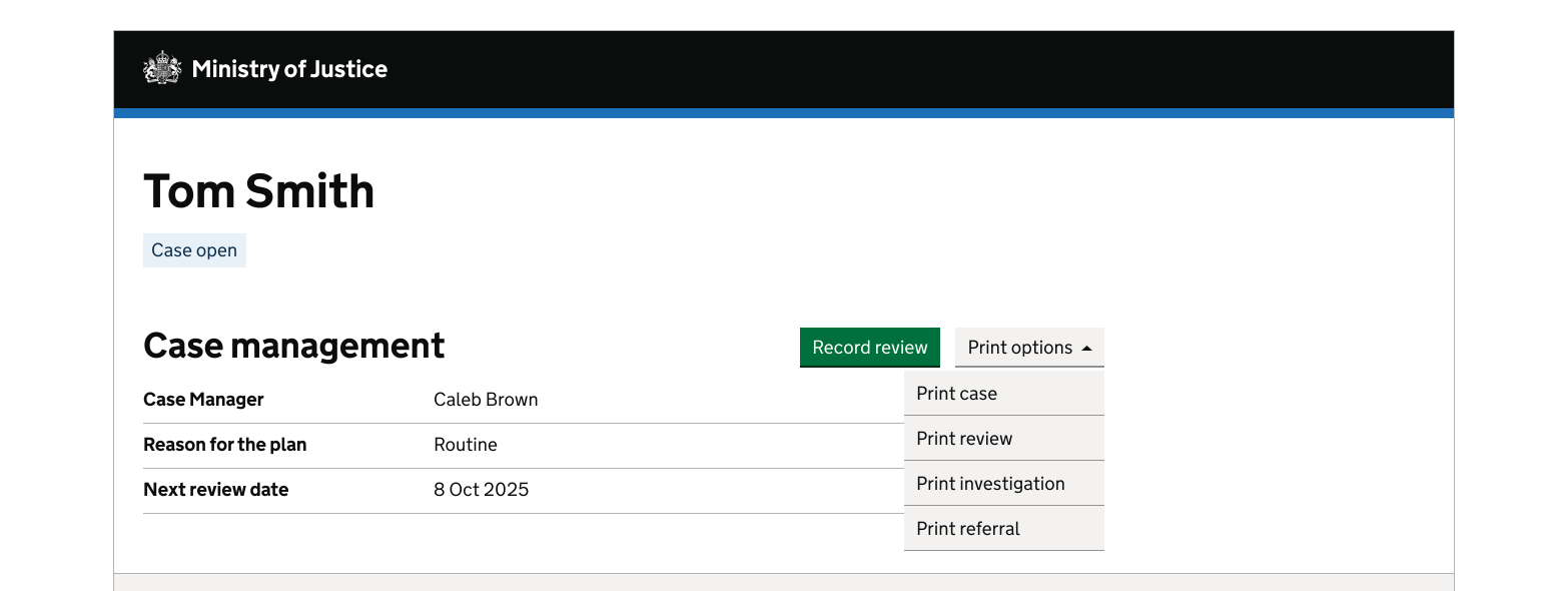
Within a case management system
The location of the buttons helps users to know what the tasks relate to.
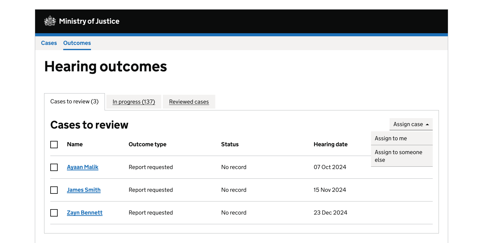
Within the multi select component
Adding a button menu to the multi select component helps users complete common tasks quickly, for example assigning cases.
Get help and contribute
Get help
You can contact the MOJ Design System team for help or support using this component.
Help improve this component
The MOJ Design System team would like to hear:
- how you have used this component in your service
- any feedback you have about its usage, for example accessibility or ideas for improvement
Add these comments to the button menu discussion on GitHub.