Add to a list
Status: To be reviewedHow to use ‘to be reviewed’ patterns

When to use
Use this pattern when users need to add similar information many times, and check and add more if needed.
When not to use
Do not use this pattern when users need to add different kinds of information that do not relate to each other.
If users only need to add information a couple of times, consider using the add another component.
How to use

Add things to the list

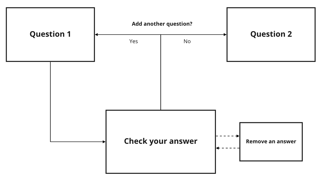
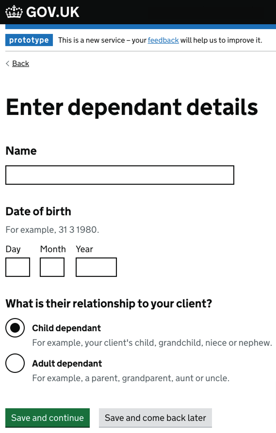
Use a GOV.UK ‘question page’ pattern to ask users for information you need within your service. This is the information that users may need to add many times.
View a summary of what they’ve added to the list

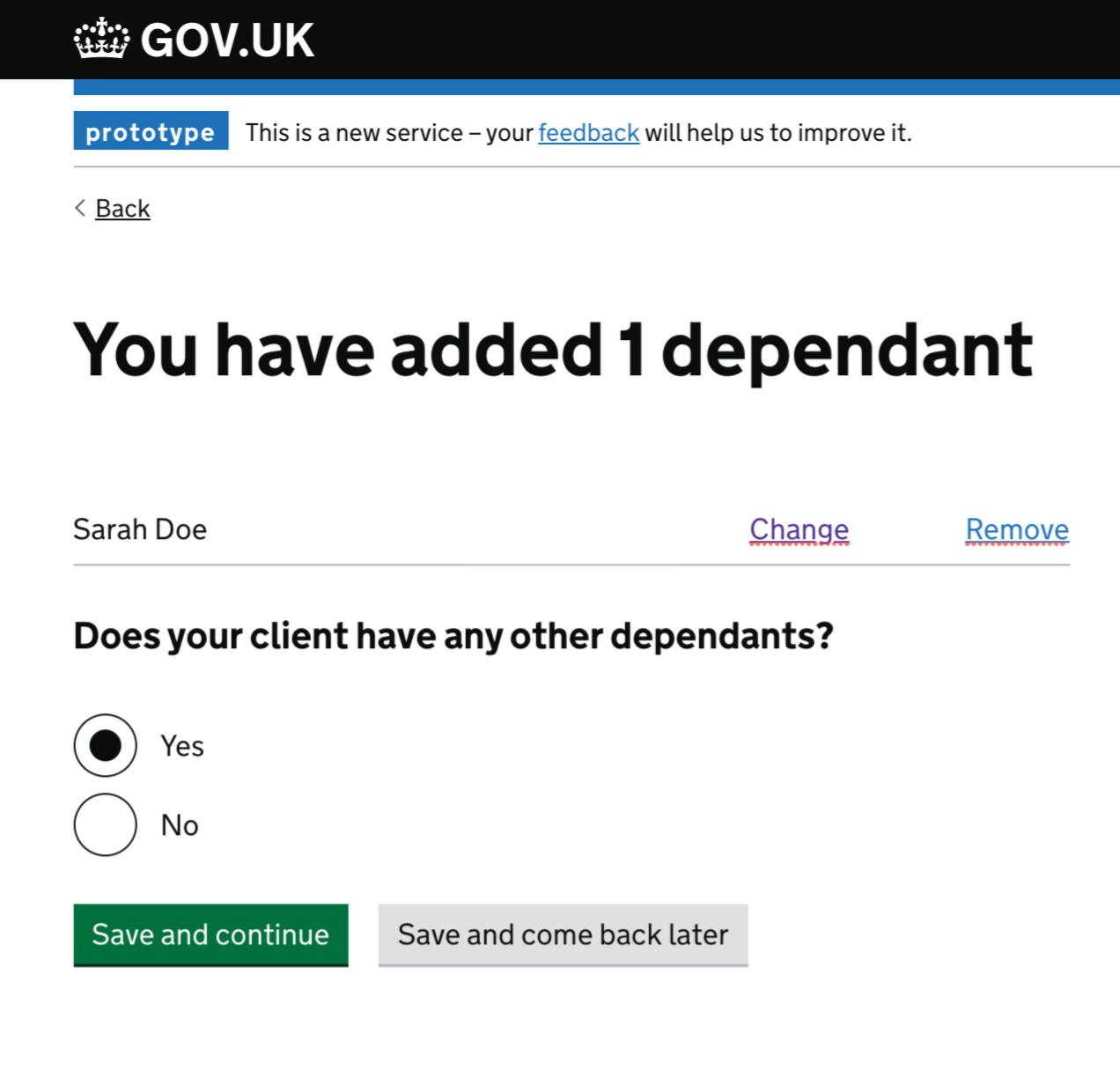
Use the GOV.UK summary list component to let users view a summary of what they’ve added to the list.
Use radios to ask users if they want to add more things to the list. Use their answer to take users to the original question page to add similar information, or move to the next question.
You may want to add ‘change’ and ‘remove’ links to the summary list.
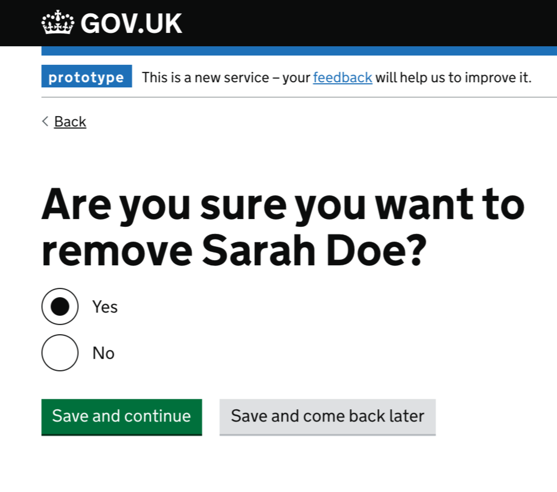
If you use a ‘remove’ link, you should ask the user to confirm they want to remove something from the list.

Research
This pattern:
- has been usability tested
- has had an external accessibility audit with Digital Accessibility Centre (DAC)
- is working in a live service (Apply for legal aid)
Things we don’t know enough about
- On the list page, should we have the page title large and the question small or the page title small and the question large.
Get help and contribute
Get help
You can contact the MOJ Design System team for help or support using this pattern.
Help improve this pattern
The MOJ Design System team would like to hear:
- how you have used this pattern in your service
- any feedback you have about its usage, for example accessibility or ideas for improvement
Add these comments to the add to a list discussion on GitHub.