Add another
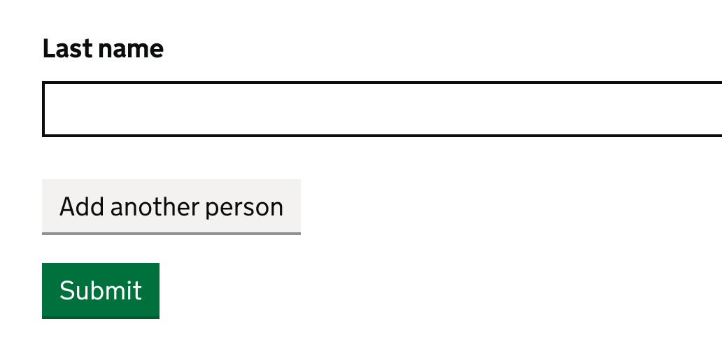
Use this component when users need to add similar information a couple of times, such as several names for a single application.
Components are reusable parts of a user interface that have been made to support a variety of applications. Individual components can be used in multiple different pages, patterns and context.

Use this component when users need to add similar information a couple of times, such as several names for a single application.
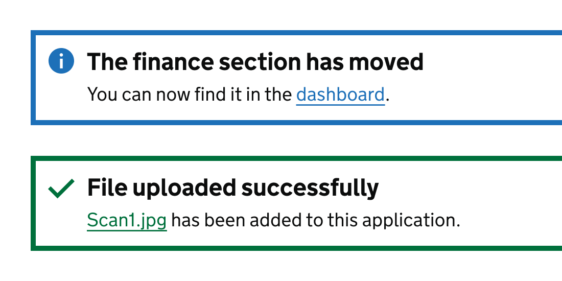
The alert component uses visual design to display a notification to users. It has a range of use cases.
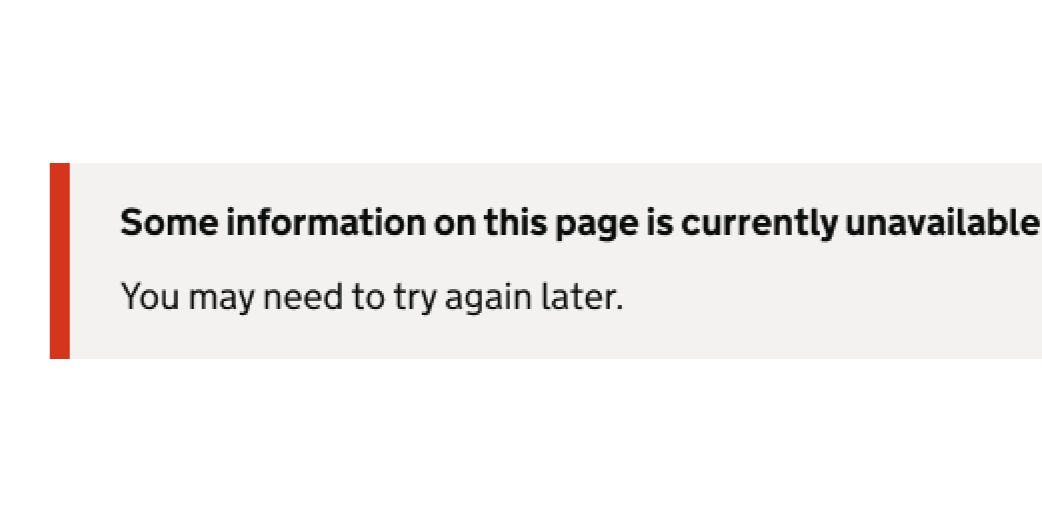
Use this component to tell users that information is missing because of an API error.
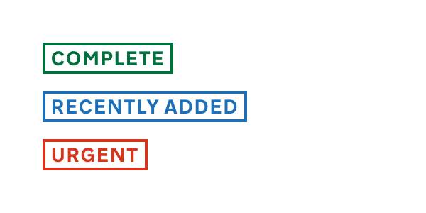
Use the badge component to highlight small details like an urgent case.
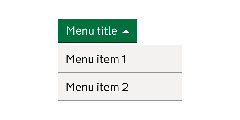
The button menu is a versatile component that allows users to view tasks as buttons in a collapsible menu.
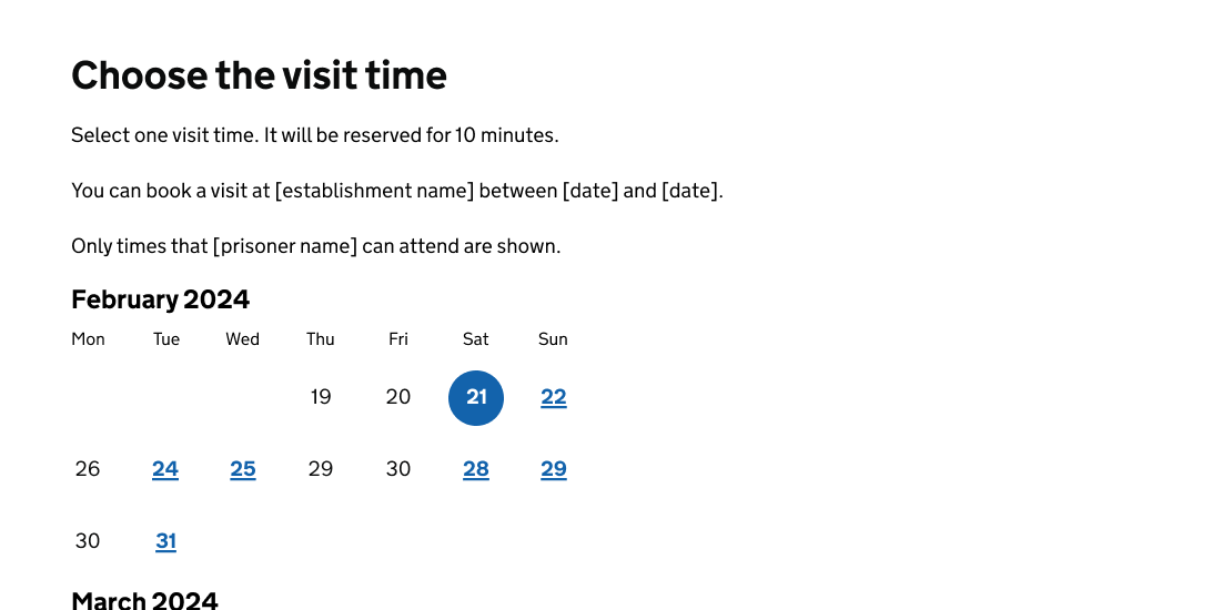
The calendar component enables users to select times from a calendar, for example to book an appointment.
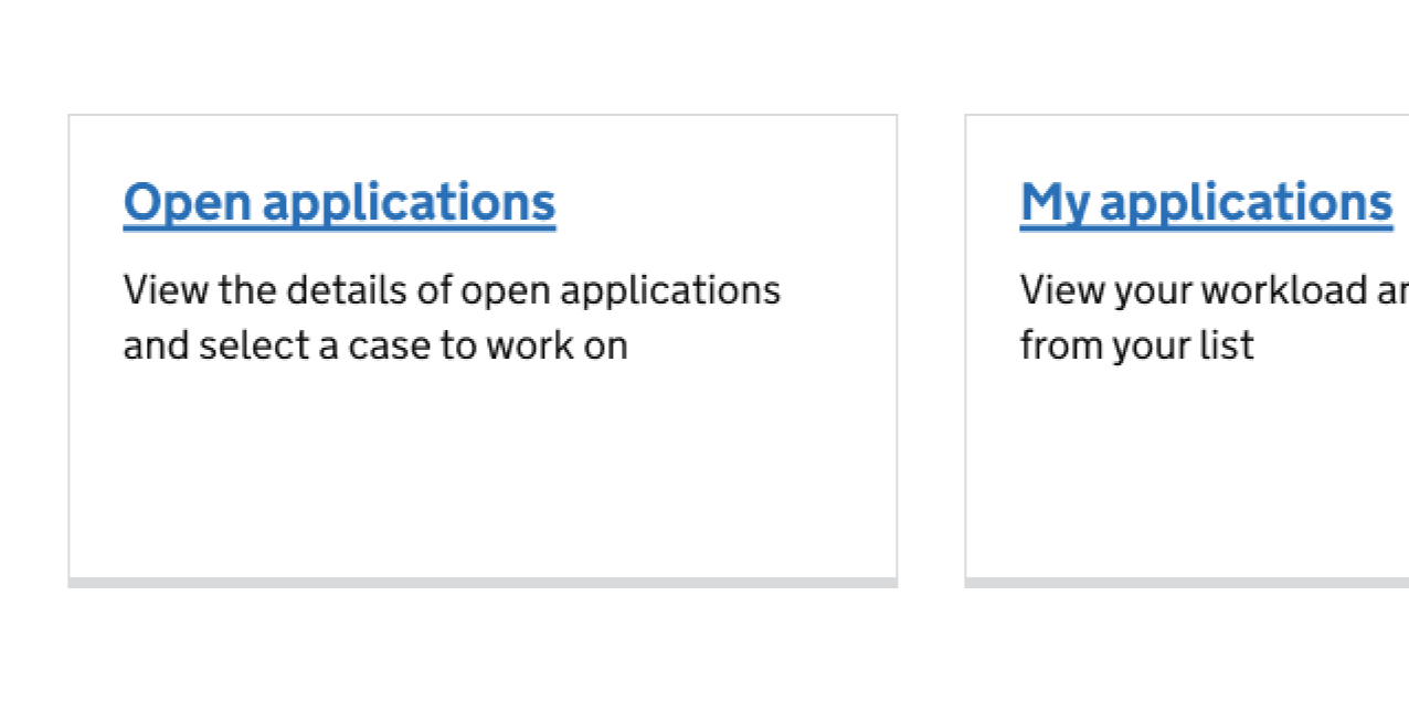
Use the card component to display links on a dashboard or home page.

The contextual date highlights important information about a date in a table.
The copy button works accessibly in panels and the interruption card.
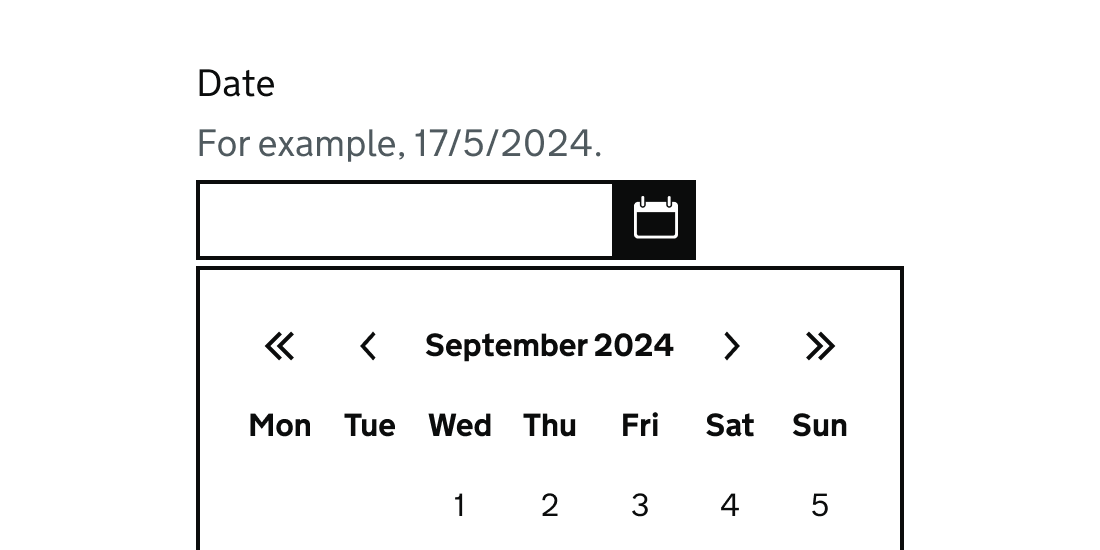
The date picker component enables users to select a date from a calendar.
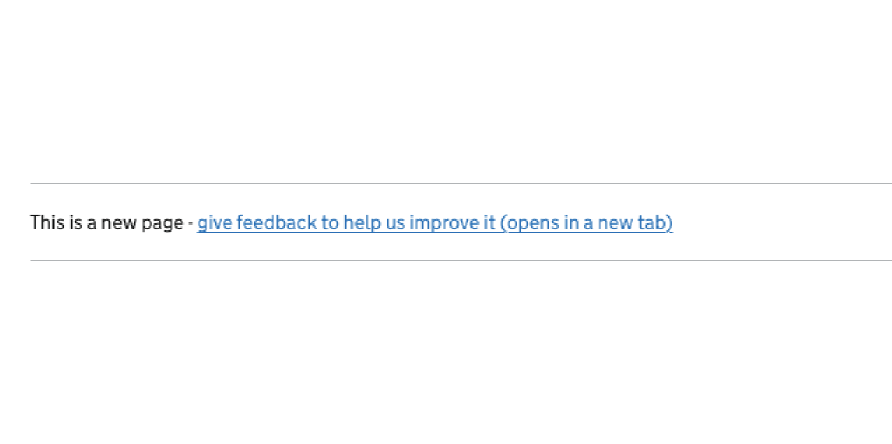
Use the feedback banner component to capture user feedback.
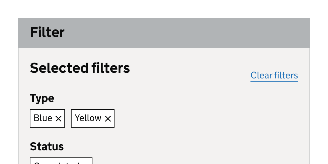
Use the filter component to help users filter a list of items, such as a list of cases or search results.
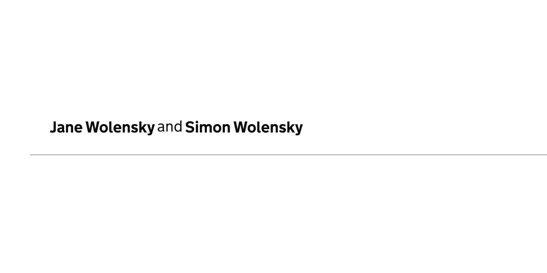
Use the identity bar component to give users context of where they are within a service such as viewing a case.
.png)
The inset text (highlighted) component emphasises guidance to busy internal users of a service.
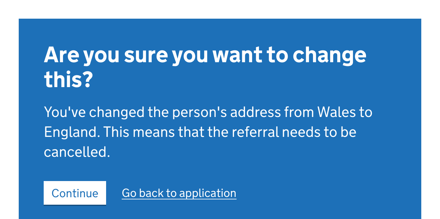
The interruption card component pauses a user’s journey with important information.
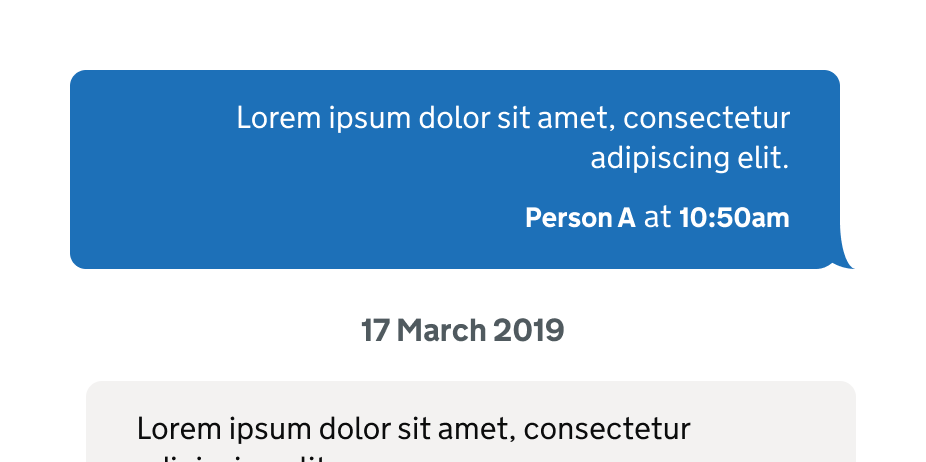
Use this component in your service to display a list of messages in chronological order between different people or systems.
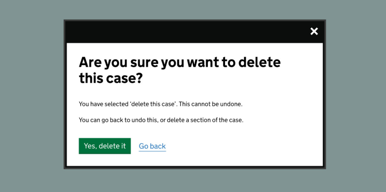
The modal dialog component interrupts a user with information that they must interact with.
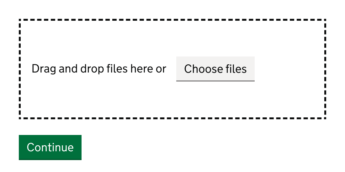
Use the multi file upload component to help users upload multiple files at the same time, on a regular basis.
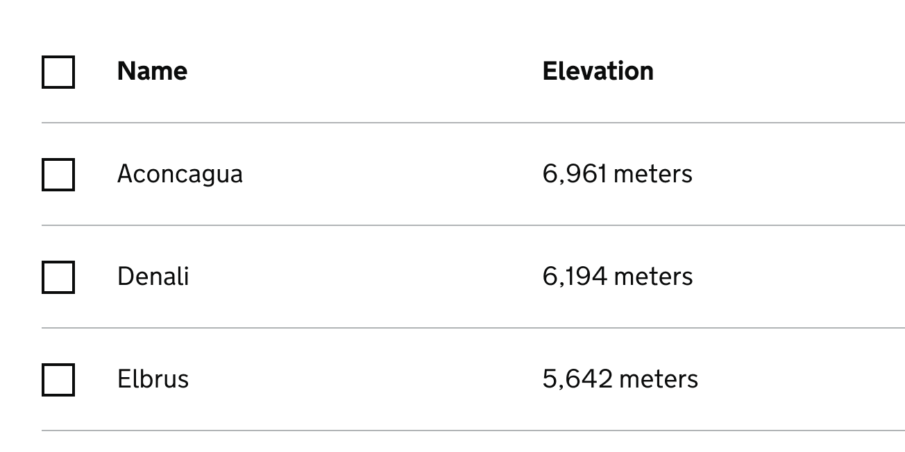
Use the multi select component to let users select multiple items in a list.
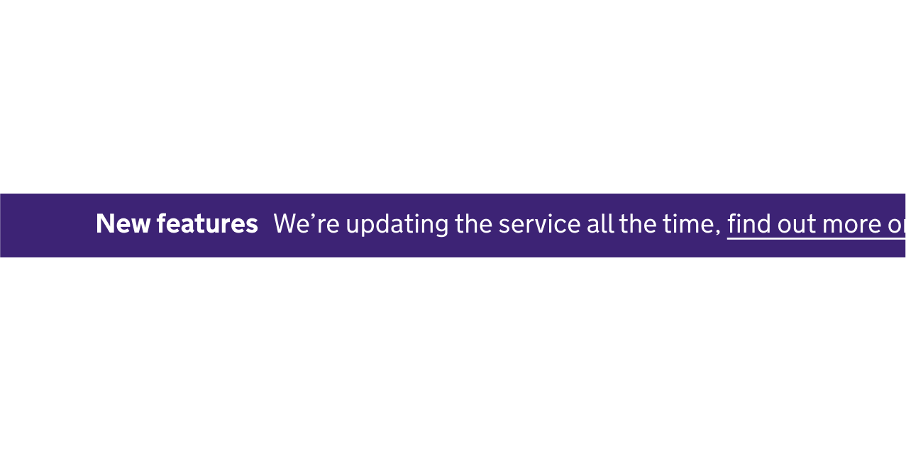
Use the new features banner component to highlight updates to a service, and link to a page with more information.

Use the notification badge to display an amount of new or unread items.
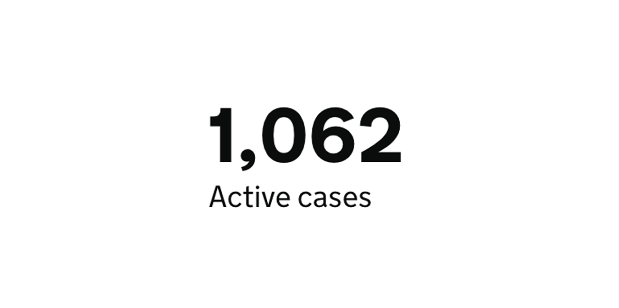
Use the numeric data component to make numbers more prominent.
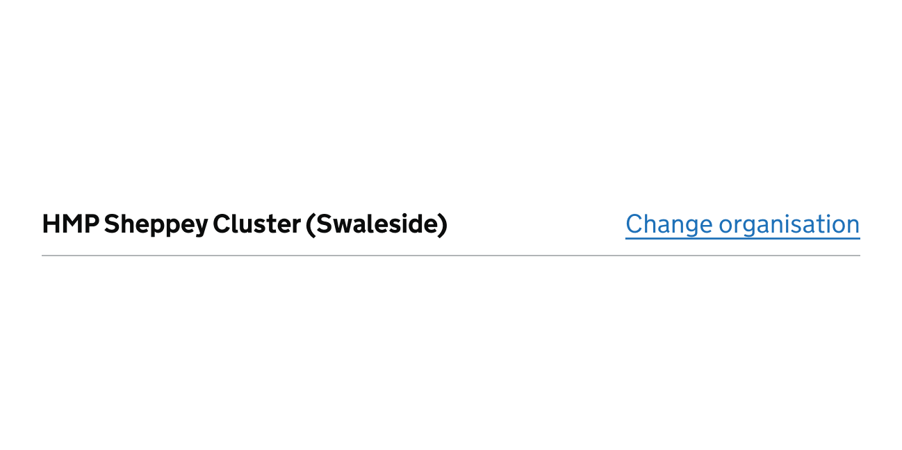
Use the organisation switcher component to let users navigate between different organisations or accounts, for example, switching between prisons.
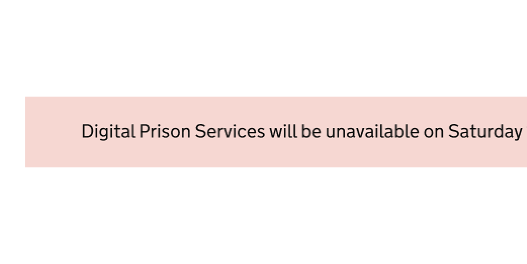
Add this component to a service before planned outage.

Use the page header actions component for certain actions.
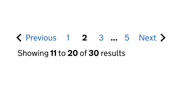
Use the pagination component to help people view and navigate long lists of items.
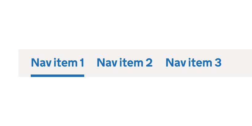
Use the primary navigation component to let users navigate and search your service.
The progress tracker component shows the status of a multi-step process.
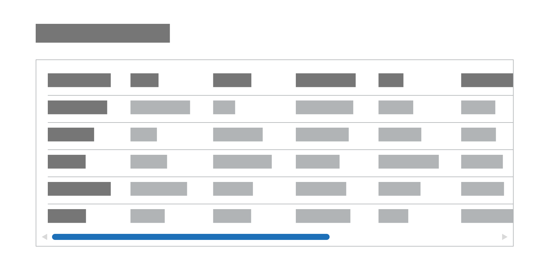
Use the scrollable pane component when you have content (typically a table) which unavoidably overflows the page.
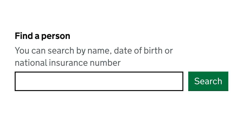
Use the search component to let users search by word or phrase.
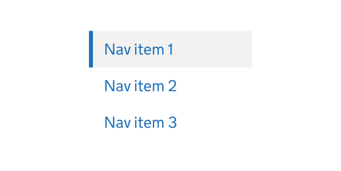
Use the side navigation component to let users navigate sub sections in a system or service.
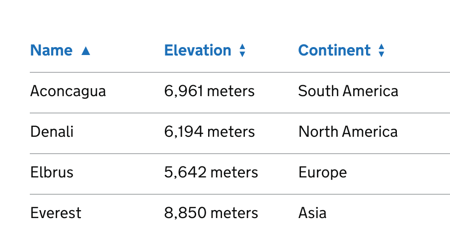
Use the sortable table component to let users sort columns in ascending or descending order.
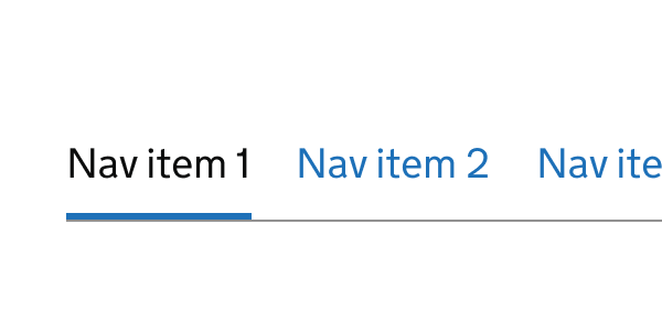
Use the sub navigation component to let users navigate sub sections in a system or service.
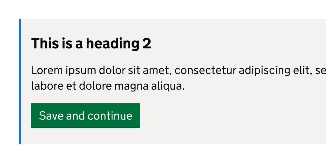
Break up content or actions into visually distinct groups of information.
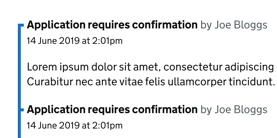
Use the timeline component to show a linear record of what’s happened.
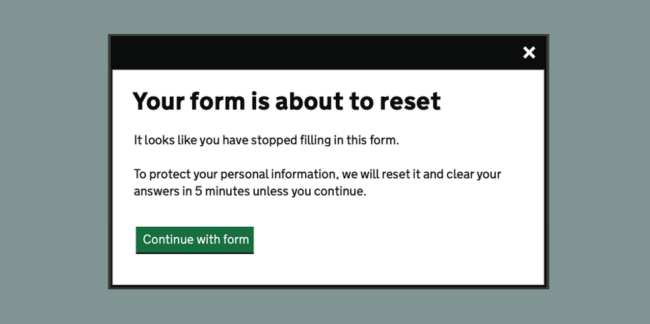
This component uses the modal dialog to show a timeout warning.