Interruption card
Status: OfficialHow to use ‘official’ components
Contents
<div class="moj-interruption-card">
      <div class="moj-interruption-card__content">
        <h1 class="moj-interruption-card__heading">Are you sure you want to change this?</h1>
        <div class="moj-interruption-card__body">
          <p>You've changed the person's address from Wales to England. This means that the referral needs to be cancelled.</p>
          <p>Previous home address: 1 Willow Lane, Newchurch, Kington, HR5 3QF</p>
          <p>New home address: 9 Elm Street, Whitney-on-Wye, Hereford, HR3 6EH</p>
          <p>You can go back to undo this change.</p>
        </div>
        <div class="govuk-button-group moj-interruption-card__actions">
          <a href="#" role="button" draggable="false" class="govuk-button govuk-button--inverse" data-module="govuk-button">
            Continue
          </a>
          <a class="govuk-link govuk-link--inverse" href="#">Go back to application</a>
        </div>
      </div>
    </div>
Nunjucks macro options
| Name | Type | Required | Description |
|---|---|---|---|
| heading | string | Yes | The heading for the component. |
| primaryAction | object | Yes | The properties for the primary action. See Primary action. |
| secondaryAction | object | No | The properties for the secondary action. See Secondary action. |
Primary action
| Name | Type | Required | Description |
|---|---|---|---|
| text | string | Yes | The label for the action. |
| href | string | Yes | The URL that the action should link to. |
| style | string | No | Provide "link" to have the action styled as a text link. Any other value will result in a visual button style. |
You can also pass any other arguments accepted by the button component from the GOV.UK Design System.
Secondary action
| Name | Type | Required | Description |
|---|---|---|---|
| text | string | Yes | The label for the action. |
| href | string | Yes | The URL that the action should link to. |
| style | string | No | Provide "button" to have the action styled as a button. Any other value will result in a text link style. |
You can also pass any other arguments accepted by the button component from the GOV.UK Design System.
{%- from "moj/components/interruption-card/macro.njk" import interruptionCard -%}

    {% call interruptionCard({
      heading: "Are you sure you want to change this?",
      primaryAction: {
        text: "Continue",
        href: "#"
      },
      secondaryAction: {
        text: "Go back to application",
        href: "#"
      }
      }) -%}
      <p>You've changed the person's address from Wales to England. This means that the referral needs to be cancelled.</p>
      <p>Previous home address: 1 Willow Lane, Newchurch, Kington, HR5 3QF</p>
      <p>New home address: 9 Elm Street, Whitney-on-Wye, Hereford, HR3 6EH</p>
      <p>You can go back to undo this change.</p>
    {%- endcall %}
This component is in the ‘Assets’ tab in the MOJ Figma Kit.
If you work for MOJ, you can view this component in the MOJ Figma Kit.
If you work outside MOJ, read the guidance on setting up Figma prototypes for non-MOJ staff.
Overview
The interruption card uses visual prominence to draw a user’s attention to something important. The user has to acknowledge it to continue.
When to use
The interruption card helps users to understand possible errors and avoid mistakes (especially serious ones).
This component should be used specifically and sparingly. It has 5 use cases:
- Possible errors
- ‘Are you sure?’ content
- Non-contextual errors
- More varied application outcomes
- Showing important content ahead of a task
1. Possible errors
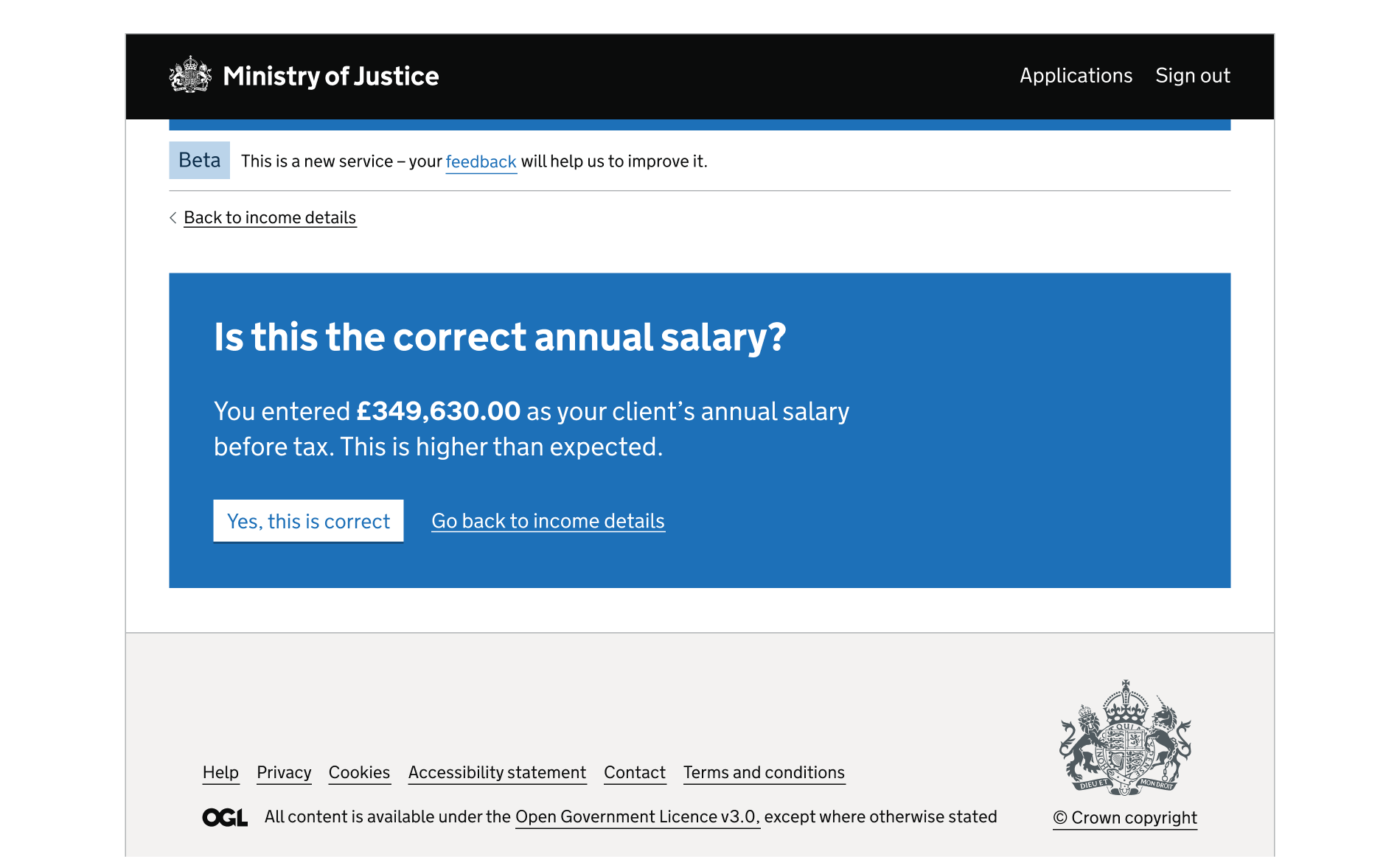
A possible error is something which is quite likely to be a mistake.
An interruption card gives the user more detailed or contextual information about why their answer is unexpected. They can continue without changing their answer, unlike with a validation error.
Example of a possible error:
2. ‘Are you sure?’ content
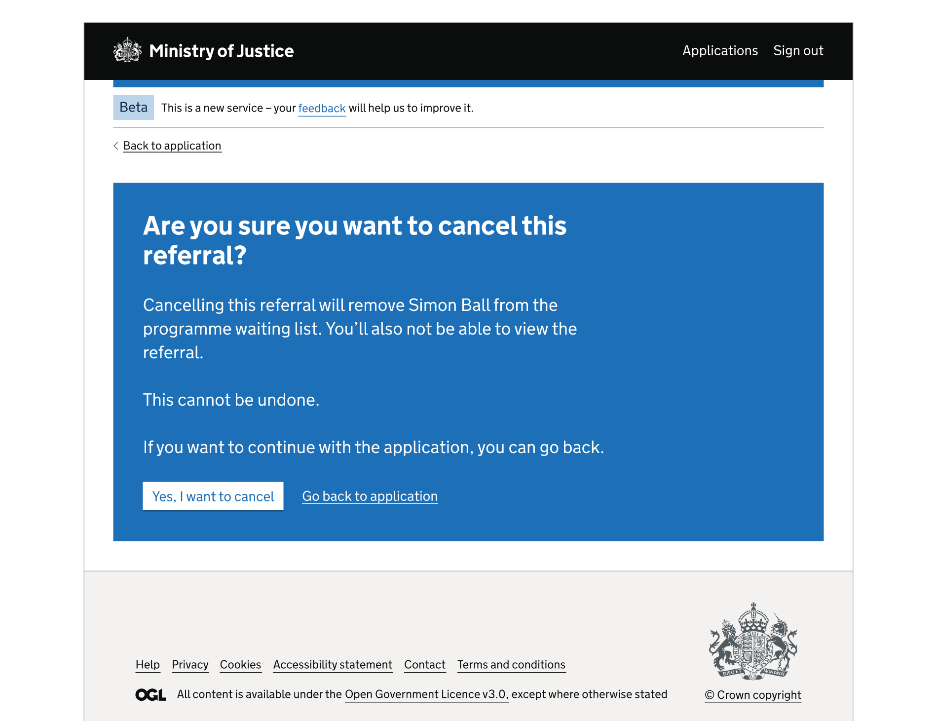
Sometimes a user needs to know something important about a task they’ve started, and confirm that they want to continue. This can stop them from doing something serious by accident, such as a deletion or cancellation.
This type of interruption card is shown to everyone on a particular user journey, because it’s about the task itself.
If the outcome is less serious, and the information is just ‘good to know’, consider removing the content from the interruption card and using standard colour styling.
Example of ‘Are you sure?’ content:
3. Non-contextual errors
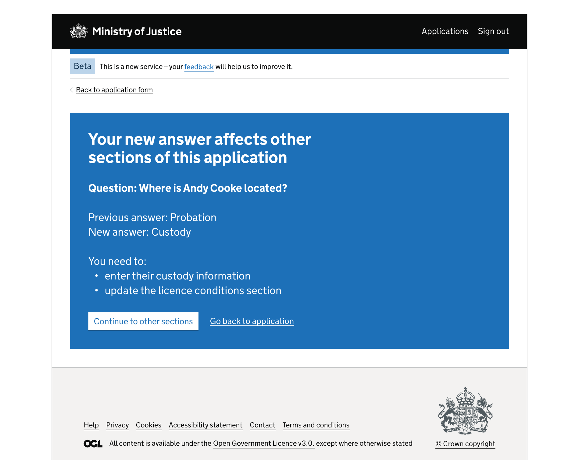
A non-contextual error happens when there’s a conflict between 2 or more parts of a service. The error is with the application as a whole, not a specific part. This means that a message cannot be shown next to the source of the error, such as with a GOV.UK Design System error message.
Service design should prevent these errors. However, they can happen if a user edits an early part of a form (via a GOV.UK Design System Check answers pattern page) in a way that affects later parts. For example, if a person’s income has changed since an application was started, they might need to answer different sections.
The interruption card tells users how to resolve the error, for example by answering some sections again or agreeing to delete sections. The user may also want to copy the answers they’ve given before they’re deleted.
Example of a non-contextual error:
4. More varied application outcomes
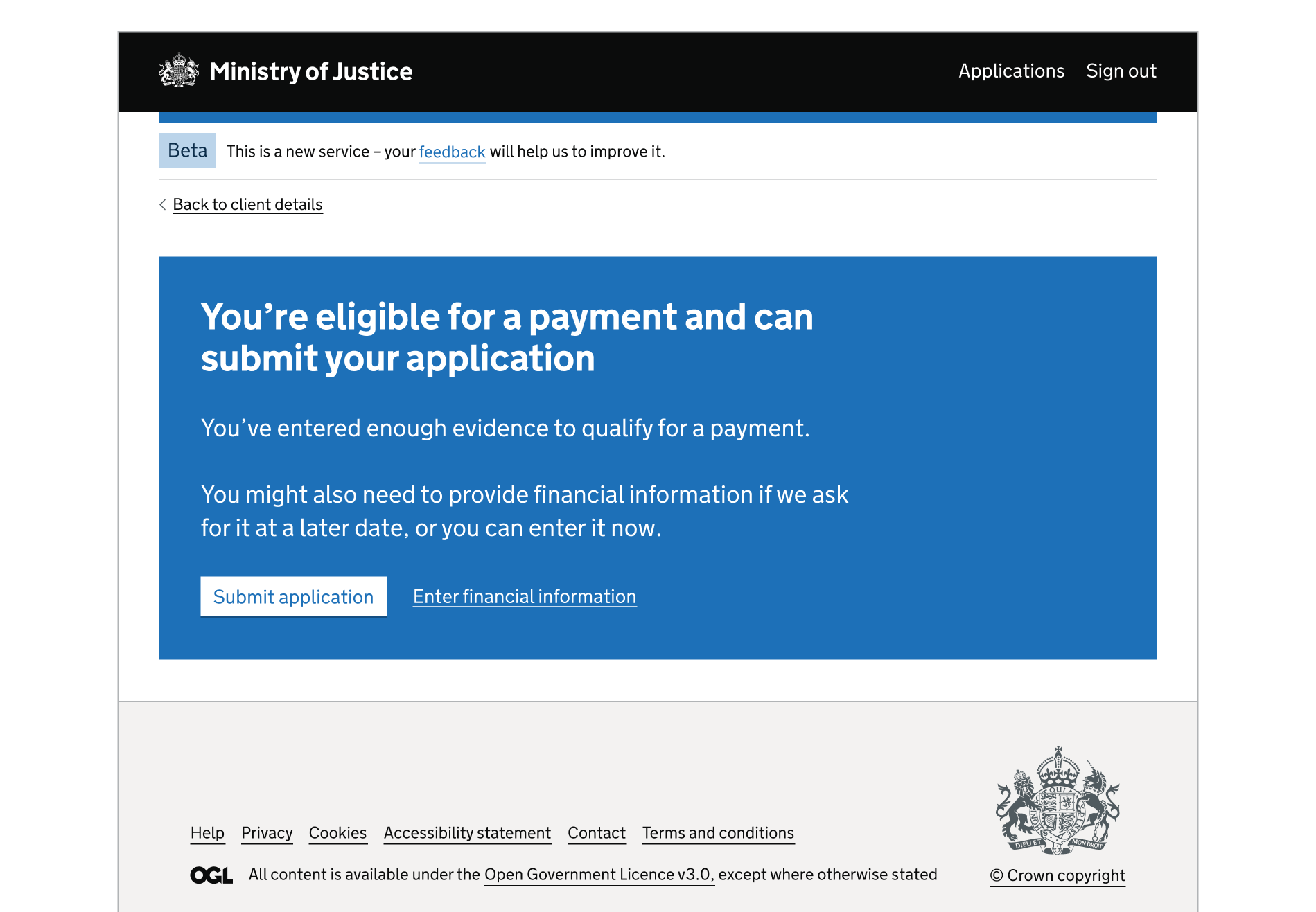
The interruption card can be used for application outcomes which are different to a straightforward success, rejection or completion.
This might be needed when the user:
- has met all the success criteria, and can finish the rest of the application later
- needs to do something else after the application, for example contact a solicitor
- needs to go to another service for a task
Example of a more varied application outcome:
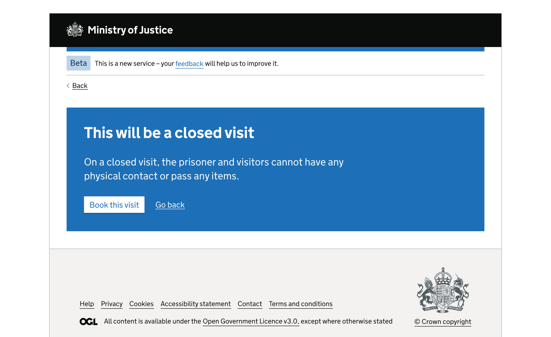
5. Showing important content ahead of a task
It can be helpful to show a user important information before they start a task, particularly if the content has been missed elsewhere (for example, on a start page).
To prevent the interruption card being overused, start with the GOV.UK Design System inset text component or the GOV.UK Design System warning text component. If neither work (or something is very important) try the interruption card.
The user can continue once they have acknowledged the content in the interruption card. They are not declaring anything, though. Declarations are for users to confirm that they’ve understood information they’ve been given or agree to something. This is not an interruption because it’s part of the flow.
Example of showing important content ahead of a task:
When not to use
Do not use the interruption card for anything outside of the 5 use cases. It should also not be used to:
- emphasise large amounts of content on a page (as the impact will be lost)
- show form elements such as radio buttons (a red error message on the blue background is not accessible)
- make a heading more visually prominent
- display an empty state for the user to resolve (if it’s within a list) – use the GOV.UK Design System tasklist component instead
Things to consider
The card is not announced to screen reader users when they interact with the page, so the heading needs to clearly convey that the user is being interrupted. This can be done with content such as ‘Before you continue’.
The interruption card uses a non-standard colour palette for emphasis in a user journey. Other blue parts of a page, such as a header, person identifier or phase banner, will affect how much impact it has.
Similar or linked components
There’s also the:
How to use
What to add to it
The interruption card should only contain:
- a heading
- paragraph content (with bullets but no other styling)
- 1 button (or link) to continue
- 1 button (or link) to go back
The only button that can be used is the GOV.UK Design System button on a dark background.
Do not add form elements (such as radio buttons). A red error message would appear on the blue background, which is not accessible.
There’s not enough research on the use of images in interruption cards. The GOV.UK Design System guidance on images may help with this.
Colours
The component follows the GOV.UK Design System colour palette:
- the background is
govuk-colour("blue") - the text is
govuk-colour("white") - links use the inverse modifier class
- buttons use the inverse modifier class
No other button colours should be used. Do not use the GOV.UK Design System secondary or warning buttons, for example.
Height and width
The interruption card has no minimum or maximum height – it resizes to the contents. It works well with fairly short, concise content. Adding a lot of content will reduce its impact.
The component is set to full width on desktop and mobile and should not be changed. The content width will automatically adjust for readability.
Other parts of the page
The interruption card should be the only body content on a page. The only other elements can be the header, footer, phase banner, person profile, breadcrumb or back link (which are all persistent).
Do not add form elements (such as radio buttons) underneath the component.
How often to use it
This interruption card works well when used sparingly. This is to keep it significant, and distinct from standard service pattern pages.
When considering it in a specific case, think about:
- how many other interruption cards there are in the service
- the maximum number of cards a user might view in a single journey
- whether a user would ever view 2 cards in a row (and how that could be prevented)
If a lot of interruption cards are emerging in a service, it might be a sign that the journey needs redesigning.
Repetitive journeys
Users completing the same journey multiple times in a service will become overexposed to a particular interruption card. This could be a poor user experience if the card is used to highlight something important and the user has already seen it several times.
Consider limiting the amount of times a particular interruption card is shown to users at the same stage of the journey.
Get help and contribute
Get help
You can contact the MOJ Design System team for help or support using this component.
Help improve this component
The MOJ Design System team would like to hear:
- how you have used this component in your service
- any feedback you have about its usage, for example accessibility or ideas for improvement
Add these comments to the interruption card discussion on GitHub.