Date picker
Status: OfficialHow to use ‘official’ components
Contents
<div class="moj-datepicker" data-module="moj-date-picker">
      <div class="govuk-form-group">
        <label class="govuk-label" for="date">
          Date
        </label>
        <div id="date-hint" class="govuk-hint">
          For example, 17/5/2024.
        </div>
        <input class="govuk-input moj-js-datepicker-input " id="date" name="date" type="text" aria-describedby="date-hint" autocomplete="off">
      </div>
    </div>
Nunjucks macro options
| Name | Type | Required | Description |
|---|---|---|---|
| id | string | Yes | The ID of the input. |
| name | string | Yes | The name of the input, which is submitted with the form data. |
| value | string | No | Optional initial value of the input. |
| formGroup | object | No | Additional options for the form group containing the text input component. See GOV.UK text input documentation for formGroup options. |
| label | object | Yes | The label used by the text input component. See GOV.UK text input documentation for label options. |
| hint | object | No | Can be used to add a hint to a text input component. See GOV.UK text input documentation for hint options. |
| errorMessage | object | No | Can be used to add an error message to the text input component. The error message component will not display if you use a falsy value for errorMessage, for example false or null. See GOV.UK text input documentation for errorMessage options. |
| minDate | string | No | Earliest date that can be selected (format dd/mm/yyyy). |
| maxDate | string | No | Latest date that can be selected (format dd/mm/yyyy). |
| excludedDates | string | No | String of space-separated dates that cannot be selected. |
| excludedDays | string | No | String of space-separated days of the week that cannot be selected. |
| weekStartDay | string | No | Day of the week the calendar starts on. Either 'monday' or 'sunday'. Defaults to 'monday'. |
{%- from "moj/components/date-picker/macro.njk" import mojDatePicker -%}

    {{ mojDatePicker({
      id: "date",
      name: "date",
      label: {
        text: "Date"
      },
      hint: {
        text: "For example, 17/5/2024."
      }
    }) }}
This component is in the ‘Assets’ tab in the MOJ Figma Kit.
If you work for MOJ, you can view this component in the MOJ Figma Kit.
If you work outside MOJ, read the guidance on setting up Figma prototypes for non-MOJ staff.
Overview
When users first open the date picker’s calendar it’ll show today’s date. Users do not have to use this calendar view to select a date — they can also enter one directly into the text field.
When to use
Users might want to use the calendar view:
- for a relative date or one they need to look up, for example last Thursday or next Wednesday
- to enter today’s date more quickly
- for available dates only, such as for prison visits
When not to use
Do not use the date picker:
- for a memorable date, such as a user’s date of birth
- for a date that users know or can easily look up, like an appointment date on a letter
- when only a rough date is needed, for example just a month and year
Use the GOV.UK Design System’s date input component instead.
Things to consider
Date pickers are fully navigable using a keyboard, but can be slow for keyboard-only and screen reader users.
Similar or linked components
There’s also the ‘Ask users for dates’ pattern in the GOV.UK Design System.
How to use
Hint text
The date picker hint text is set to 17/5/2024. This can be changed to a more helpful date, for example the start of a scheme or a future date. Add a full stop at the end.
Excluding dates
You can exclude (or disable) options from the date picker, such as:
- days of the week or every weekend
- specific dates, such as bank holidays
- past or future dates
- HTML (Date picker with excluded dates (example))
- Nunjucks (Date picker with excluded dates (example))
- Figma
<div class="moj-datepicker" data-module="moj-date-picker" data-min-date="01/04/2025" data-max-date="30/04/2025" data-excluded-dates="02/04/2025 18/04/2025 21/04/2025" data-excluded-days="saturday sunday">
      <div class="govuk-form-group">
        <label class="govuk-label" for="date">
          Date
        </label>
        <div id="date-hint" class="govuk-hint">
          For example, 17/5/2024.
        </div>
        <input class="govuk-input moj-js-datepicker-input " id="date" name="date" type="text" value="10/04/2025" aria-describedby="date-hint" autocomplete="off">
      </div>
    </div>
Nunjucks macro options
| Name | Type | Required | Description |
|---|---|---|---|
| id | string | Yes | The ID of the input. |
| name | string | Yes | The name of the input, which is submitted with the form data. |
| value | string | No | Optional initial value of the input. |
| formGroup | object | No | Additional options for the form group containing the text input component. See GOV.UK text input documentation for formGroup options. |
| label | object | Yes | The label used by the text input component. See GOV.UK text input documentation for label options. |
| hint | object | No | Can be used to add a hint to a text input component. See GOV.UK text input documentation for hint options. |
| errorMessage | object | No | Can be used to add an error message to the text input component. The error message component will not display if you use a falsy value for errorMessage, for example false or null. See GOV.UK text input documentation for errorMessage options. |
| minDate | string | No | Earliest date that can be selected (format dd/mm/yyyy). |
| maxDate | string | No | Latest date that can be selected (format dd/mm/yyyy). |
| excludedDates | string | No | String of space-separated dates that cannot be selected. |
| excludedDays | string | No | String of space-separated days of the week that cannot be selected. |
| weekStartDay | string | No | Day of the week the calendar starts on. Either 'monday' or 'sunday'. Defaults to 'monday'. |
{%- from "moj/components/date-picker/macro.njk" import mojDatePicker -%}

    {{ mojDatePicker({
      id: "date",
      name: "date",
      label: {
        text: "Date"
      },
      hint: {
        text: "For example, 17/5/2024."
      },
      value: "10/04/2025",
      minDate: "01/04/2025",
      maxDate: "30/04/2025",
      excludedDates: "02/04/2025 18/04/2025 21/04/2025",
      excludedDays: "saturday sunday"
    }) }}
This component is in the ‘Assets’ tab in the MOJ Figma Kit.
If you work for MOJ, you can view this component in the MOJ Figma Kit.
If you work outside MOJ, read the guidance on setting up Figma prototypes for non-MOJ staff.
You need to add server-side validation for when users enter an unavailable date directly into the text field (rather than use the calendar). This will show them an error message.
Excluded dates have the correct colour contrast ratio with the date text and calendar background. This is WCAG 2.2 compliant. However, these dates may be harder to view for users with low vision or colour blindness, so there’s also a strikethrough. Numbers with a strikethrough can be harder for people with dyscalculia to read, which may be an issue if there are lots of excluded dates.
If there are not many available dates, users will have to navigate a lot to find one. Consider showing these dates in a list with radio buttons instead.
Error messages
Follow the GOV.UK Design System guidance on error messages.
- HTML (Date picker with error message (example))
- Nunjucks (Date picker with error message (example))
- Figma
<div class="moj-datepicker" data-module="moj-date-picker">
      <div class="govuk-form-group govuk-form-group--error">
        <label class="govuk-label" for="date">
          Date
        </label>
        <div id="date-hint" class="govuk-hint">
          For example, 17/5/2024.
        </div>
        <p id="date-error" class="govuk-error-message">
          <span class="govuk-visually-hidden">Error:</span> Enter or select a date
        </p>
        <input class="govuk-input moj-js-datepicker-input  govuk-input--error" id="date" name="date" type="text" aria-describedby="date-hint date-error" autocomplete="off">
      </div>
    </div>
Nunjucks macro options
| Name | Type | Required | Description |
|---|---|---|---|
| id | string | Yes | The ID of the input. |
| name | string | Yes | The name of the input, which is submitted with the form data. |
| value | string | No | Optional initial value of the input. |
| formGroup | object | No | Additional options for the form group containing the text input component. See GOV.UK text input documentation for formGroup options. |
| label | object | Yes | The label used by the text input component. See GOV.UK text input documentation for label options. |
| hint | object | No | Can be used to add a hint to a text input component. See GOV.UK text input documentation for hint options. |
| errorMessage | object | No | Can be used to add an error message to the text input component. The error message component will not display if you use a falsy value for errorMessage, for example false or null. See GOV.UK text input documentation for errorMessage options. |
| minDate | string | No | Earliest date that can be selected (format dd/mm/yyyy). |
| maxDate | string | No | Latest date that can be selected (format dd/mm/yyyy). |
| excludedDates | string | No | String of space-separated dates that cannot be selected. |
| excludedDays | string | No | String of space-separated days of the week that cannot be selected. |
| weekStartDay | string | No | Day of the week the calendar starts on. Either 'monday' or 'sunday'. Defaults to 'monday'. |
{%- from "moj/components/date-picker/macro.njk" import mojDatePicker -%}

    {{ mojDatePicker({
      id: "date",
      name: "date",
      label: {
        text: "Date"
      },
      hint: {
        text: "For example, 17/5/2024."
      },
      errorMessage: {
        text: "Enter or select a date"
      }
    }) }}
This component is in the ‘Assets’ tab in the MOJ Figma Kit.
If you work for MOJ, you can view this component in the MOJ Figma Kit.
If you work outside MOJ, read the guidance on setting up Figma prototypes for non-MOJ staff.
| Error state | Error message |
|---|---|
| No date is entered or selected from the calendar | Enter or select a date |
| The date is in the wrong format | Enter the date in the correct format, for example, 17/5/2024 |
| The date does not exist | Enter a real date |
| The date is incomplete | Enter a full date, for example 17/5/2024 |
| The date is excluded | Select an available date from the calendar |
Using multiple date pickers
If you’re using more than one date picker, give each text field its own error summary and message (even if the error is the same).
Examples
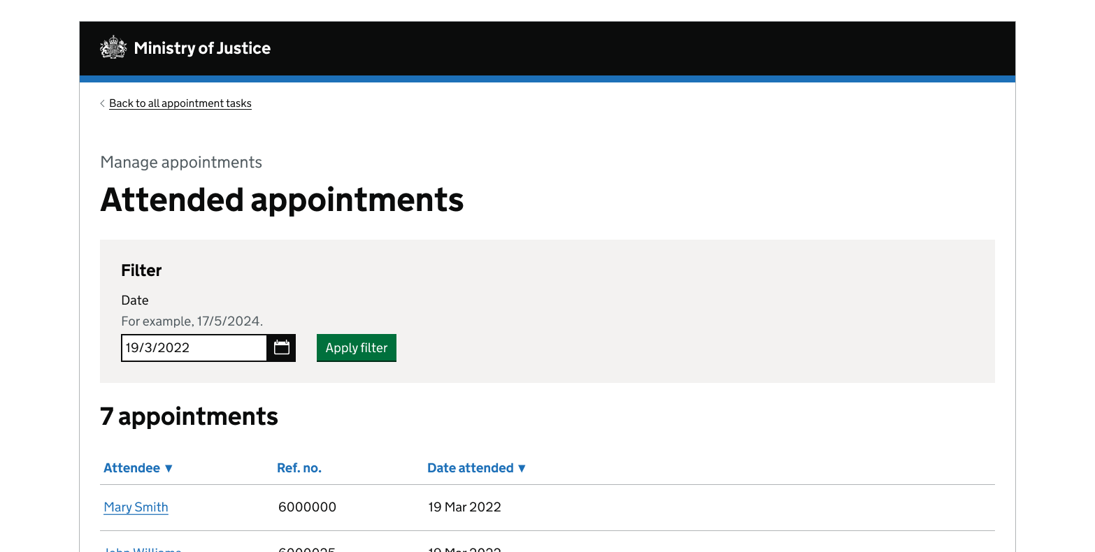
Filtering information with a date picker

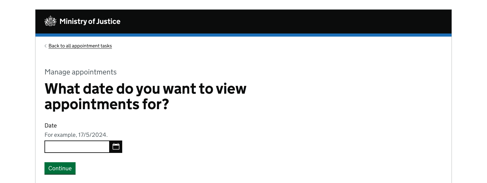
Asking a question with a date picker

Get help and contribute
Get help
You can contact the MOJ Design System team for help or support using this component.
Help improve this component
The MOJ Design System team would like to hear:
- how you have used this component in your service
- any feedback you have about its usage, for example accessibility or ideas for improvement
Add these comments to the date picker discussion on GitHub.