Card
Status: ExperimentalHow to use ‘experimental’ components
Contents
Overview
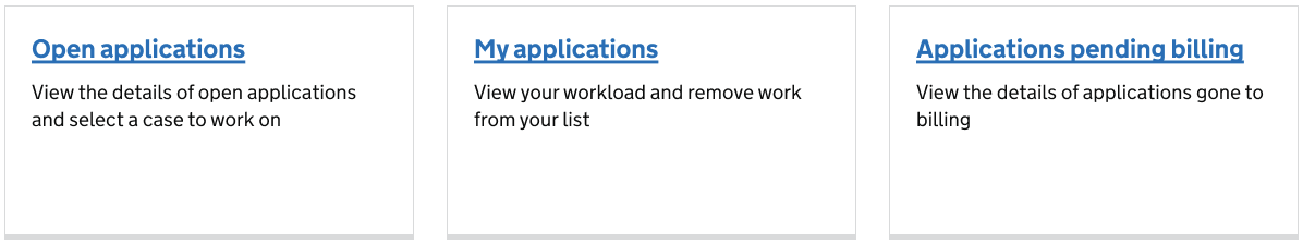
A basic card with a link and explanatory text underneath.
How the component is currently used
Use the card on a dashboard or home screen to present links and a description of the link to users.
Contribute to this component
You can help develop this component by adding information to the ‘card’ Github discussion. This helps other people to use it in their service.
Designs
A Figma design has been added for this component. There may be more links and resources in the ‘card’ Github discussion.
Figma
If you work for MOJ, view the ‘card’ component in the MOJ Figma Kit.
If you work outside MOJ, go to the MOJ Figma Kit on the Figma community platform.
Contribute prototypes and Figma links
If you have design files that are relevant to this component you can add them to the Github discussion. This helps other people to use it in their service.
Accessibility
No accessibility findings were included when this component was added. There may be more information in the ‘card’ Github discussion.
Contribute accessibility findings
If you have accessibility findings that are relevant to this component you can add them to the Github discussion. This helps other people to use it in their service.
Code
Code has been added for this component. There may be other code blocks in the ‘card’ Github discussion.
Code block 1: HTML
    <div class="govuk-width-container">
        <ul class="govuk-grid-row card-group">
            <li class="govuk-grid-column-one-third card-group__item">
                <div class="card card--clickable" data-test="global-search">
                    <h2 class="govuk-heading-m card__heading">
                        <a class="govuk-link card__link govuk-link--no-visited-state" href="#" onclick="showAlert()">Global search</a>
                    </h2>
                    <p class="govuk-body card__description">Search for someone in any establishment, or who has been released.</p>
                </div>
            </li>
            <li class="govuk-grid-column-one-third card-group__item">
                <div class="card card--clickable" data-test="manage-prisoner-whereabouts">
                    <h2 class="govuk-heading-m card__heading">
                        <a class="govuk-link card__link govuk-link--no-visited-state" href="#" onclick="showAlert()">Manage prisoner whereabouts</a>
                    </h2>
                    <p class="govuk-body card__description">View unlock lists and manage attendance.</p>
                </div>
            </li>
            <li class="govuk-grid-column-one-third card-group__item">
                <div class="card card--clickable" data-test="use-of-force">
                    <h2 class="govuk-heading-m card__heading">
                        <a class="govuk-link card__link govuk-link--no-visited-state" href="#" onclick="showAlert()">Use of force incidents</a>
                    </h2>
                    <p class="govuk-body card__description">Manage and view incident reports and statements.</p>
                </div>
            </li>
        </ul>
    </div>
Code block 2: CSS
    .card {
      margin-bottom: 40px;
      background: #fff;
      border: 1px solid #d9dadb;
      position: relative;
      width: 100%;
      padding: 25px
    }

    .card__heading {
      margin-top: 0;
      margin-bottom: 15px
    }

    .card__description {
      margin-bottom: 0
    }

    .card--clickable {
      border-bottom-width: 5px
    }

    .card--clickable:hover,.card--clickable:active {
      cursor: pointer
    }

    .card--clickable:hover .card__heading a,.card--clickable:hover .card__link,.card--clickable:active .card__heading a,.card--clickable:active .card__link {
      color: #003078;
      text-decoration: none
    }

    .card--clickable:hover .card__heading a:focus,.card--clickable:hover .card__link:focus,.card--clickable:active .card__heading a:focus,.card--clickable:active .card__link:focus {
      outline: 3px solid transparent;
      color: #0b0c0c;
      background-color: #fd0;
      box-shadow: 0 -2px #fd0,0 4px #0b0c0c;
      text-decoration: none
    }

    .card--clickable:hover {
      border-color: #b1b4b6
    }

    .card--clickable:active {
      border-color: #b1b4b6;
      bottom: -1px
    }

    .card-group {
      display: flex;
      flex-wrap: wrap;
      margin-bottom: 15px;
      padding: 0
    }

    @media(max-width: 48.0525em) {
      .card-group {
        margin-bottom:30px
      }
    }

    .card-group__item {
      display: flex;
      list-style-type: none;
      margin-bottom: 0
    }

    @media(max-width: 48.0525em) {
      .card-group__item {
        flex:0 0 100%
      }
    }

    .card-group__item .card {
      margin-bottom: 25px
    }

    @media(max-width: 48.0525em) {
      .card-group__item .card {
        margin-bottom:15px
      }

      .card-group__item:last-child .card {
        margin-bottom: 0
      }
    }
Contribute code for this component
If you have code that is relevant to this component you can add it to the Github discussion. This helps other people to use it in their service.