Alert
Status: OfficialHow to use ‘official’ components
Contents
<div role="region" class="moj-alert moj-alert--information moj-alert--with-heading" aria-label="information: The finance section has moved" data-module="moj-alert">
      <div>
        <svg class="moj-alert__icon" role="presentation" focusable="false" xmlns="http://www.w3.org/2000/svg" viewBox="0 0 30 30" height="30" width="30">
          <path fill-rule="evenodd" clip-rule="evenodd" d="M10.2165 3.45151C11.733 2.82332 13.3585 2.5 15 2.5C16.6415 2.5 18.267 2.82332 19.7835 3.45151C21.3001 4.07969 22.6781 5.00043 23.8388 6.16117C24.9996 7.3219 25.9203 8.69989 26.5485 10.2165C27.1767 11.733 27.5 13.3585 27.5 15C27.5 18.3152 26.183 21.4946 23.8388 23.8388C21.4946 26.183 18.3152 27.5 15 27.5C13.3585 27.5 11.733 27.1767 10.2165 26.5485C8.69989 25.9203 7.3219 24.9996 6.16117 23.8388C3.81696 21.4946 2.5 18.3152 2.5 15C2.5 11.6848 3.81696 8.50537 6.16117 6.16117C7.3219 5.00043 8.69989 4.07969 10.2165 3.45151ZM16.3574 22.4121H13.6621V12.95H16.3574V22.4121ZM13.3789 9.20898C13.3789 8.98763 13.4212 8.7793 13.5059 8.58398C13.5905 8.38216 13.7044 8.20964 13.8477 8.06641C13.9974 7.91667 14.1699 7.79948 14.3652 7.71484C14.5605 7.63021 14.7721 7.58789 15 7.58789C15.2214 7.58789 15.4297 7.63021 15.625 7.71484C15.8268 7.79948 15.9993 7.91667 16.1426 8.06641C16.2923 8.20964 16.4095 8.38216 16.4941 8.58398C16.5788 8.7793 16.6211 8.98763 16.6211 9.20898C16.6211 9.43685 16.5788 9.64844 16.4941 9.84375C16.4095 10.0391 16.2923 10.2116 16.1426 10.3613C15.9993 10.5046 15.8268 10.6185 15.625 10.7031C15.4297 10.7878 15.2214 10.8301 15 10.8301C14.7721 10.8301 14.5605 10.7878 14.3652 10.7031C14.1699 10.6185 13.9974 10.5046 13.8477 10.3613C13.7044 10.2116 13.5905 10.0391 13.5059 9.84375C13.4212 9.64844 13.3789 9.43685 13.3789 9.20898Z" fill="currentColor" />
        </svg>
      </div>
      <div class="moj-alert__content">
        <h2 class="moj-alert__heading">The finance section has moved
        </h2>You can now find it in the <a href="#">dashboard</a>.
      </div>
      <div class="moj-alert__action">
        <button class="moj-alert__dismiss" hidden>Dismiss</button>
      </div>
    </div>
    <div role="region" class="moj-alert moj-alert--success moj-alert--with-heading" aria-label="success: File uploaded successfully" data-module="moj-alert">
      <div>
        <svg class="moj-alert__icon" role="presentation" focusable="false" xmlns="http://www.w3.org/2000/svg" viewBox="0 0 30 30" height="30" width="30">
          <path d="M11.2869 24.6726L2.00415 15.3899L4.62189 12.7722L11.2869 19.4186L25.3781 5.32739L27.9958 7.96369L11.2869 24.6726Z" fill="currentColor" />
        </svg>
      </div>
      <div class="moj-alert__content">
        <h2 class="moj-alert__heading">File uploaded successfully
        </h2><a href="#">Scan1.jpg</a> has been added to this application.
      </div>
      <div class="moj-alert__action">
        <button class="moj-alert__dismiss" hidden>Dismiss</button>
      </div>
    </div>
    <div role="region" class="moj-alert moj-alert--warning moj-alert--with-heading" aria-label="warning: Some information could not be imported" data-module="moj-alert">
      <div>
        <svg class="moj-alert__icon" role="presentation" focusable="false" xmlns="http://www.w3.org/2000/svg" viewBox="0 0 30 30" height="30" width="30">
          <path fill-rule="evenodd" clip-rule="evenodd" d="M15 2.44922L28.75 26.1992H1.25L15 2.44922ZM13.5107 9.49579H16.4697L16.2431 17.7678H13.7461L13.5107 9.49579ZM13.1299 21.82C13.1299 21.5661 13.1787 21.3285 13.2764 21.1071C13.374 20.8793 13.5075 20.6807 13.6768 20.5114C13.8525 20.3421 14.0544 20.2087 14.2822 20.111C14.5101 20.0134 14.7542 19.9645 15.0146 19.9645C15.2686 19.9645 15.5062 20.0134 15.7275 20.111C15.9554 20.2087 16.154 20.3421 16.3232 20.5114C16.4925 20.6807 16.626 20.8793 16.7236 21.1071C16.8213 21.3285 16.8701 21.5661 16.8701 21.82C16.8701 22.0804 16.8213 22.3246 16.7236 22.5524C16.626 22.7803 16.4925 22.9789 16.3232 23.1481C16.154 23.3174 15.9554 23.4509 15.7275 23.5485C15.5062 23.6462 15.2686 23.695 15.0146 23.695C14.7542 23.695 14.5101 23.6462 14.2822 23.5485C14.0544 23.4509 13.8525 23.3174 13.6768 23.1481C13.5075 22.9789 13.374 22.7803 13.2764 22.5524C13.1787 22.3246 13.1299 22.0804 13.1299 21.82Z" fill="currentColor" />
        </svg>
      </div>
      <div class="moj-alert__content">
        <h2 class="moj-alert__heading">Some information could not be imported
        </h2>Enter the information manually in <a href="#">case details</a>.
      </div>
      <div class="moj-alert__action">
        <button class="moj-alert__dismiss" hidden>Dismiss</button>
      </div>
    </div>
    <div role="region" class="moj-alert moj-alert--error moj-alert--with-heading" aria-label="error: This case has been assigned to someone else" data-module="moj-alert">
      <div>
        <svg class="moj-alert__icon" role="presentation" focusable="false" xmlns="http://www.w3.org/2000/svg" viewBox="0 0 30 30" height="30" width="30">
          <path fill-rule="evenodd" clip-rule="evenodd" d="M20.1777 2.5H9.82233L2.5 9.82233V20.1777L9.82233 27.5H20.1777L27.5 20.1777V9.82233L20.1777 2.5ZM10.9155 8.87769L15.0001 12.9623L19.0847 8.87771L21.1224 10.9154L17.0378 15L21.1224 19.0846L19.0847 21.1222L15.0001 17.0376L10.9155 21.1223L8.87782 19.0846L12.9624 15L8.87783 10.9153L10.9155 8.87769Z" fill="currentColor" />
        </svg>
      </div>
      <div class="moj-alert__content">
        <h2 class="moj-alert__heading">This case has been assigned to someone else
        </h2>You can no longer make changes.
      </div>
      <div class="moj-alert__action">
        <button class="moj-alert__dismiss" hidden>Dismiss</button>
      </div>
    </div>
Nunjucks macro options
| Name | Type | Required | Description |
|---|---|---|---|
| text | string | Yes | The text that displays in the alert. Any string can be used. If you set html, this option is not required and is ignored. |
| html | string | Yes | The HTML to use in the alert. Any string can be used. If you set html, text is not required and is ignored. |
| title | string | Yes | A short title for each alert, used as a unique accessible label. Can be displayed as a heading in the alert using showTitleAsHeading. |
| showTitleAsHeading | boolean | No | Set to true to display the title as a heading. The default is false. |
| headingTag | string | No | The HTML tag used for the heading if showTitleAsHeading is true. You can only use the values "h2", "h3", or "h4". The default is "h2". |
| variant | string | No | The alert variant being used. It's "information", "success", "warning" or "error". The default is "information". |
| role | string | No | Overrides the value of the role attribute for the alert. Defaults to "region". |
| disableAutoFocus | boolean | No | If role is set to "alert", JavaScript moves the keyboard focus to the alert when the page loads. To disable this behaviour, set disableAutoFocus to true. |
| dismissible | boolean | No | Set to true to allow the alert to be dismissed. The default is false. |
| dismissText | string | No | The text label for the dismiss button. The default is "Dismiss". |
| focusOnDismissSelector | string | No | A CSS selector for an element to place focus on when the alert is dismissed |
| classes | string | No | The classes that you want to add to the alert. |
| attributes | object | No | The HTML attributes that you want to add to the alert, for example data attributes. |
{%- from "moj/components/alert/macro.njk" import mojAlert -%}

    {{ mojAlert({
      variant: "information",
      title: "The finance section has moved",
      showTitleAsHeading: true,
      dismissible: false,
      html: 'You can now find it in the <a href="#">dashboard</a>.'
    }) }}

    {{ mojAlert({
      variant: "success",
      title: "File uploaded successfully",
      showTitleAsHeading: true,
      dismissible: false,
      html: '<a href="#">Scan1.jpg</a> has been added to this application.'
    }) }}

    {{ mojAlert({
      variant: "warning",
      title: "Some information could not be imported",
      showTitleAsHeading: true,
      dismissible: false,
      html: 'Enter the information manually in <a href="#">case details</a>.'
    }) }}

    {{ mojAlert({
      variant: "error",
      title: "This case has been assigned to someone else",
      showTitleAsHeading: true,
      dismissible: false,
      text: "You can no longer make changes."
    }) }}
This component is in the ‘Assets’ tab in the MOJ Figma Kit.
If you work for MOJ, you can view this component in the MOJ Figma Kit.
If you work outside MOJ, read the guidance on setting up Figma prototypes for non-MOJ staff.
Overview
The alert component presents 1 of 4 types of alerts to a user. It can stay on the page or be dismissed by the user.
As a leaner component, it’s ideal for internal services and complex user interfaces (such as dashboards and case management systems).
There are 4 variants of the alert:
Information alert
<div role="region" class="moj-alert moj-alert--information" aria-label="information: A section has moved" data-module="moj-alert">
      <div>
        <svg class="moj-alert__icon" role="presentation" focusable="false" xmlns="http://www.w3.org/2000/svg" viewBox="0 0 30 30" height="30" width="30">
          <path fill-rule="evenodd" clip-rule="evenodd" d="M10.2165 3.45151C11.733 2.82332 13.3585 2.5 15 2.5C16.6415 2.5 18.267 2.82332 19.7835 3.45151C21.3001 4.07969 22.6781 5.00043 23.8388 6.16117C24.9996 7.3219 25.9203 8.69989 26.5485 10.2165C27.1767 11.733 27.5 13.3585 27.5 15C27.5 18.3152 26.183 21.4946 23.8388 23.8388C21.4946 26.183 18.3152 27.5 15 27.5C13.3585 27.5 11.733 27.1767 10.2165 26.5485C8.69989 25.9203 7.3219 24.9996 6.16117 23.8388C3.81696 21.4946 2.5 18.3152 2.5 15C2.5 11.6848 3.81696 8.50537 6.16117 6.16117C7.3219 5.00043 8.69989 4.07969 10.2165 3.45151ZM16.3574 22.4121H13.6621V12.95H16.3574V22.4121ZM13.3789 9.20898C13.3789 8.98763 13.4212 8.7793 13.5059 8.58398C13.5905 8.38216 13.7044 8.20964 13.8477 8.06641C13.9974 7.91667 14.1699 7.79948 14.3652 7.71484C14.5605 7.63021 14.7721 7.58789 15 7.58789C15.2214 7.58789 15.4297 7.63021 15.625 7.71484C15.8268 7.79948 15.9993 7.91667 16.1426 8.06641C16.2923 8.20964 16.4095 8.38216 16.4941 8.58398C16.5788 8.7793 16.6211 8.98763 16.6211 9.20898C16.6211 9.43685 16.5788 9.64844 16.4941 9.84375C16.4095 10.0391 16.2923 10.2116 16.1426 10.3613C15.9993 10.5046 15.8268 10.6185 15.625 10.7031C15.4297 10.7878 15.2214 10.8301 15 10.8301C14.7721 10.8301 14.5605 10.7878 14.3652 10.7031C14.1699 10.6185 13.9974 10.5046 13.8477 10.3613C13.7044 10.2116 13.5905 10.0391 13.5059 9.84375C13.4212 9.64844 13.3789 9.43685 13.3789 9.20898Z" fill="currentColor" />
        </svg>
      </div>
      <div class="moj-alert__content">The finance section has moved to the <a href="#">dashboard</a>.</div>
      <div class="moj-alert__action">
        <button class="moj-alert__dismiss" hidden>Dismiss</button>
      </div>
    </div>
Nunjucks macro options
| Name | Type | Required | Description |
|---|---|---|---|
| text | string | Yes | The text that displays in the alert. Any string can be used. If you set html, this option is not required and is ignored. |
| html | string | Yes | The HTML to use in the alert. Any string can be used. If you set html, text is not required and is ignored. |
| title | string | Yes | A short title for each alert, used as a unique accessible label. Can be displayed as a heading in the alert using showTitleAsHeading. |
| showTitleAsHeading | boolean | No | Set to true to display the title as a heading. The default is false. |
| headingTag | string | No | The HTML tag used for the heading if showTitleAsHeading is true. You can only use the values "h2", "h3", or "h4". The default is "h2". |
| variant | string | No | The alert variant being used. It's "information", "success", "warning" or "error". The default is "information". |
| role | string | No | Overrides the value of the role attribute for the alert. Defaults to "region". |
| disableAutoFocus | boolean | No | If role is set to "alert", JavaScript moves the keyboard focus to the alert when the page loads. To disable this behaviour, set disableAutoFocus to true. |
| dismissible | boolean | No | Set to true to allow the alert to be dismissed. The default is false. |
| dismissText | string | No | The text label for the dismiss button. The default is "Dismiss". |
| focusOnDismissSelector | string | No | A CSS selector for an element to place focus on when the alert is dismissed |
| classes | string | No | The classes that you want to add to the alert. |
| attributes | object | No | The HTML attributes that you want to add to the alert, for example data attributes. |
{%- from "moj/components/alert/macro.njk" import mojAlert -%}

    {{ mojAlert({
      variant: "information",
      title: "A section has moved",
      dismissible: false,
      html: 'The finance section has moved to the <a href="#">dashboard</a>.'
    }) }}
This component is in the ‘Assets’ tab in the MOJ Figma Kit.
If you work for MOJ, you can view this component in the MOJ Figma Kit.
If you work outside MOJ, read the guidance on setting up Figma prototypes for non-MOJ staff.
The information alert draws a user’s attention to something important about a page or service. It has a blue border, and an information icon made up of a blue circle with a white letter ‘i’.
When to use
Use the information alert sparingly. This makes users more likely to notice and engage with it. If a lot of information alerts are emerging in a service, it might be a sign that a journey needs redesigning.
The information alert can tell a user about:
- unfinished tasks, linking to where to complete them
- a major change to a service, until it becomes familiar
- service downtime
The information alert can be combined with other alert variants. For linear services, or to display the ‘Important’ heading, use the GOV.UK notification banner component.
If you want to add your message to the body copy or do not want a coloured border and icon, use the GOV.UK inset text component.
When not to use
Do not use this component for a serious issue or to prevent something going wrong. Use the warning alert for this.
Success alert
<div role="region" class="moj-alert moj-alert--success" aria-label="success: Upload successful" data-module="moj-alert">
      <div>
        <svg class="moj-alert__icon" role="presentation" focusable="false" xmlns="http://www.w3.org/2000/svg" viewBox="0 0 30 30" height="30" width="30">
          <path d="M11.2869 24.6726L2.00415 15.3899L4.62189 12.7722L11.2869 19.4186L25.3781 5.32739L27.9958 7.96369L11.2869 24.6726Z" fill="currentColor" />
        </svg>
      </div>
      <div class="moj-alert__content"><a href="#">Scan1.jpg</a> uploaded successfully.</div>
      <div class="moj-alert__action">
        <button class="moj-alert__dismiss" hidden>Dismiss</button>
      </div>
    </div>
Nunjucks macro options
| Name | Type | Required | Description |
|---|---|---|---|
| text | string | Yes | The text that displays in the alert. Any string can be used. If you set html, this option is not required and is ignored. |
| html | string | Yes | The HTML to use in the alert. Any string can be used. If you set html, text is not required and is ignored. |
| title | string | Yes | A short title for each alert, used as a unique accessible label. Can be displayed as a heading in the alert using showTitleAsHeading. |
| showTitleAsHeading | boolean | No | Set to true to display the title as a heading. The default is false. |
| headingTag | string | No | The HTML tag used for the heading if showTitleAsHeading is true. You can only use the values "h2", "h3", or "h4". The default is "h2". |
| variant | string | No | The alert variant being used. It's "information", "success", "warning" or "error". The default is "information". |
| role | string | No | Overrides the value of the role attribute for the alert. Defaults to "region". |
| disableAutoFocus | boolean | No | If role is set to "alert", JavaScript moves the keyboard focus to the alert when the page loads. To disable this behaviour, set disableAutoFocus to true. |
| dismissible | boolean | No | Set to true to allow the alert to be dismissed. The default is false. |
| dismissText | string | No | The text label for the dismiss button. The default is "Dismiss". |
| focusOnDismissSelector | string | No | A CSS selector for an element to place focus on when the alert is dismissed |
| classes | string | No | The classes that you want to add to the alert. |
| attributes | object | No | The HTML attributes that you want to add to the alert, for example data attributes. |
{%- from "moj/components/alert/macro.njk" import mojAlert -%}

    {{ mojAlert({
      variant: "success",
      title: "Upload successful",
      dismissible: false,
      html: '<a href="#">Scan1.jpg</a> uploaded successfully.'
    }) }}
This component is in the ‘Assets’ tab in the MOJ Figma Kit.
If you work for MOJ, you can view this component in the MOJ Figma Kit.
If you work outside MOJ, read the guidance on setting up Figma prototypes for non-MOJ staff.
The success alert displays a single message after a user has completed a task. It has a green border, and a success icon made up of a green tick.
This alert can be displayed at the top of the page or on the next page (if their task moves them through the service). Adding the alert to existing pages shortens the user journey. This is useful in non-linear services and services where users complete repetitive tasks.
When to use
The success banner can be used to show that something has:
- been uploaded or added, such as a file or record
- changed status, for example allocated to someone or moved to another stage in an application process
- been cancelled, deleted or another type of destructive (negative) action
- been changed or deleted from a table using the multi select component
If you need to display more information or want a more prominent component, consider the success variation of the GOV.UK notification banner.
When not to use
Do not show the success alert to a user who has completed something more significant (such as a whole application) or reached the end of a service. Select the GOV.UK confirmation page instead.
You may not need to display the alert if something else confirms success, for example the GOV.UK task list component or the user progressing to another page.
Warning alert
<div role="region" class="moj-alert moj-alert--warning" aria-label="warning: Some information could not be imported" data-module="moj-alert">
      <div>
        <svg class="moj-alert__icon" role="presentation" focusable="false" xmlns="http://www.w3.org/2000/svg" viewBox="0 0 30 30" height="30" width="30">
          <path fill-rule="evenodd" clip-rule="evenodd" d="M15 2.44922L28.75 26.1992H1.25L15 2.44922ZM13.5107 9.49579H16.4697L16.2431 17.7678H13.7461L13.5107 9.49579ZM13.1299 21.82C13.1299 21.5661 13.1787 21.3285 13.2764 21.1071C13.374 20.8793 13.5075 20.6807 13.6768 20.5114C13.8525 20.3421 14.0544 20.2087 14.2822 20.111C14.5101 20.0134 14.7542 19.9645 15.0146 19.9645C15.2686 19.9645 15.5062 20.0134 15.7275 20.111C15.9554 20.2087 16.154 20.3421 16.3232 20.5114C16.4925 20.6807 16.626 20.8793 16.7236 21.1071C16.8213 21.3285 16.8701 21.5661 16.8701 21.82C16.8701 22.0804 16.8213 22.3246 16.7236 22.5524C16.626 22.7803 16.4925 22.9789 16.3232 23.1481C16.154 23.3174 15.9554 23.4509 15.7275 23.5485C15.5062 23.6462 15.2686 23.695 15.0146 23.695C14.7542 23.695 14.5101 23.6462 14.2822 23.5485C14.0544 23.4509 13.8525 23.3174 13.6768 23.1481C13.5075 22.9789 13.374 22.7803 13.2764 22.5524C13.1787 22.3246 13.1299 22.0804 13.1299 21.82Z" fill="currentColor" />
        </svg>
      </div>
      <div class="moj-alert__content">Some information could not be imported. Enter <a href="#">client details</a> manually instead.</div>
      <div class="moj-alert__action">
        <button class="moj-alert__dismiss" hidden>Dismiss</button>
      </div>
    </div>
Nunjucks macro options
| Name | Type | Required | Description |
|---|---|---|---|
| text | string | Yes | The text that displays in the alert. Any string can be used. If you set html, this option is not required and is ignored. |
| html | string | Yes | The HTML to use in the alert. Any string can be used. If you set html, text is not required and is ignored. |
| title | string | Yes | A short title for each alert, used as a unique accessible label. Can be displayed as a heading in the alert using showTitleAsHeading. |
| showTitleAsHeading | boolean | No | Set to true to display the title as a heading. The default is false. |
| headingTag | string | No | The HTML tag used for the heading if showTitleAsHeading is true. You can only use the values "h2", "h3", or "h4". The default is "h2". |
| variant | string | No | The alert variant being used. It's "information", "success", "warning" or "error". The default is "information". |
| role | string | No | Overrides the value of the role attribute for the alert. Defaults to "region". |
| disableAutoFocus | boolean | No | If role is set to "alert", JavaScript moves the keyboard focus to the alert when the page loads. To disable this behaviour, set disableAutoFocus to true. |
| dismissible | boolean | No | Set to true to allow the alert to be dismissed. The default is false. |
| dismissText | string | No | The text label for the dismiss button. The default is "Dismiss". |
| focusOnDismissSelector | string | No | A CSS selector for an element to place focus on when the alert is dismissed |
| classes | string | No | The classes that you want to add to the alert. |
| attributes | object | No | The HTML attributes that you want to add to the alert, for example data attributes. |
{%- from "moj/components/alert/macro.njk" import mojAlert -%}

    {{ mojAlert({
      variant: "warning",
      title: "Some information could not be imported",
      dismissible: false,
      html: 'Some information could not be imported. Enter <a href="#">client details</a> manually instead.'
    }) }}
This component is in the ‘Assets’ tab in the MOJ Figma Kit.
If you work for MOJ, you can view this component in the MOJ Figma Kit.
If you work outside MOJ, read the guidance on setting up Figma prototypes for non-MOJ staff.
The warning alert tells users about something to prevent them from making a mistake. Use it sparingly to avoid alert fatigue. It has an orange border, and a warning icon made up of an orange triangle with a white exclamation mark.
When to use
A warning alert can be used when something:
- is missing but the user can access it another way, for example in a legacy system or on paper
- has not been updated recently but may still be of use, for example an assessment
- has become more urgent or important, for example because a deadline is approaching
If you want to add your message to the body copy or do not want a coloured border and icon, use the GOV.UK inset text component or the GOV.UK warning text component.
When not to use
Do not use this component if the information is about something other than a warning. Select the information alert instead.
Error alert
<div role="region" class="moj-alert moj-alert--error" aria-label="error: This case has been assigned to someone else" data-module="moj-alert">
      <div>
        <svg class="moj-alert__icon" role="presentation" focusable="false" xmlns="http://www.w3.org/2000/svg" viewBox="0 0 30 30" height="30" width="30">
          <path fill-rule="evenodd" clip-rule="evenodd" d="M20.1777 2.5H9.82233L2.5 9.82233V20.1777L9.82233 27.5H20.1777L27.5 20.1777V9.82233L20.1777 2.5ZM10.9155 8.87769L15.0001 12.9623L19.0847 8.87771L21.1224 10.9154L17.0378 15L21.1224 19.0846L19.0847 21.1222L15.0001 17.0376L10.9155 21.1223L8.87782 19.0846L12.9624 15L8.87783 10.9153L10.9155 8.87769Z" fill="currentColor" />
        </svg>
      </div>
      <div class="moj-alert__content">This case has been assigned to someone else, so you can no longer make changes.</div>
      <div class="moj-alert__action">
        <button class="moj-alert__dismiss" hidden>Dismiss</button>
      </div>
    </div>
Nunjucks macro options
| Name | Type | Required | Description |
|---|---|---|---|
| text | string | Yes | The text that displays in the alert. Any string can be used. If you set html, this option is not required and is ignored. |
| html | string | Yes | The HTML to use in the alert. Any string can be used. If you set html, text is not required and is ignored. |
| title | string | Yes | A short title for each alert, used as a unique accessible label. Can be displayed as a heading in the alert using showTitleAsHeading. |
| showTitleAsHeading | boolean | No | Set to true to display the title as a heading. The default is false. |
| headingTag | string | No | The HTML tag used for the heading if showTitleAsHeading is true. You can only use the values "h2", "h3", or "h4". The default is "h2". |
| variant | string | No | The alert variant being used. It's "information", "success", "warning" or "error". The default is "information". |
| role | string | No | Overrides the value of the role attribute for the alert. Defaults to "region". |
| disableAutoFocus | boolean | No | If role is set to "alert", JavaScript moves the keyboard focus to the alert when the page loads. To disable this behaviour, set disableAutoFocus to true. |
| dismissible | boolean | No | Set to true to allow the alert to be dismissed. The default is false. |
| dismissText | string | No | The text label for the dismiss button. The default is "Dismiss". |
| focusOnDismissSelector | string | No | A CSS selector for an element to place focus on when the alert is dismissed |
| classes | string | No | The classes that you want to add to the alert. |
| attributes | object | No | The HTML attributes that you want to add to the alert, for example data attributes. |
{%- from "moj/components/alert/macro.njk" import mojAlert -%}

    {{ mojAlert({
      variant: "error",
      title: "This case has been assigned to someone else",
      dismissible: false,
      text: "This case has been assigned to someone else, so you can no longer make changes."
    }) }}
This component is in the ‘Assets’ tab in the MOJ Figma Kit.
If you work for MOJ, you can view this component in the MOJ Figma Kit.
If you work outside MOJ, read the guidance on setting up Figma prototypes for non-MOJ staff.
The error alert shows the user that something has gone wrong. It pauses the user without interrupting them. It can appear before or after a user input. It has a red border, and an error icon made up of a red octagon with a white ‘X’.
When to use
The error alert can be displayed when something:
- has changed significantly since the user’s last session, for example, a person has been released from prison or an appointment is now double-booked
- changed between the user opening the page and interacting with it, for example a case was deleted or assigned to someone else
- has to be done before this task, for example removing bookings from a property they’re archiving
If the user needs to resolve the error, the alert should help them understand how.
When not to use
This alert draws a user’s attention to a message, without preventing them from doing other tasks on the page. Use the interruption card component if the user needs to acknowledge something before they continue on their journey.
Things to consider
This alert pauses the user with a prominent message. This prioritisation should match the alert message and its relevance to the user.
An alert needs a title, which does not need to be displayed as a heading. The title gives each alert a unique label and helps screenreaders to identify the alert. It does not have to be read out.
How to use
The alert works best when it contains a single, succinct message.
Do not use it to display large amounts of content. This reduces the prominence of the component and pushes other content down the page. If you cannot communicate your message in under 3 sentences, use a different component.
What to add to it
The alert contains an icon and is surrounded by a border. It needs to contain body copy, with a full stop at the end of each sentence.
The alert needs a title, which does not need to be shown on the page. The title gives each alert a unique and accessible label, which can be read out to screenreader users.
You can add one heading (but no more) to the body copy. The heading level should follow its position on the page. For example, an alert heading would be an H2 if placed under a main page heading.
You can also add bullet points and links, if needed.
The alert content needs to make sense on its own. This ensures that the message does not rely on the colour and icon, as they’re not accessible to everyone.
Dismissing the alert
<div role="region" class="moj-alert moj-alert--success" aria-label="success: File uploaded successfully" data-module="moj-alert" data-dismissible="true">
      <div>
        <svg class="moj-alert__icon" role="presentation" focusable="false" xmlns="http://www.w3.org/2000/svg" viewBox="0 0 30 30" height="30" width="30">
          <path d="M11.2869 24.6726L2.00415 15.3899L4.62189 12.7722L11.2869 19.4186L25.3781 5.32739L27.9958 7.96369L11.2869 24.6726Z" fill="currentColor" />
        </svg>
      </div>
      <div class="moj-alert__content"><a href="#">Scan1.jpg</a> has been added to this application.</div>
      <div class="moj-alert__action">
        <button class="moj-alert__dismiss" hidden>Dismiss</button>
      </div>
    </div>
Nunjucks macro options
| Name | Type | Required | Description |
|---|---|---|---|
| text | string | Yes | The text that displays in the alert. Any string can be used. If you set html, this option is not required and is ignored. |
| html | string | Yes | The HTML to use in the alert. Any string can be used. If you set html, text is not required and is ignored. |
| title | string | Yes | A short title for each alert, used as a unique accessible label. Can be displayed as a heading in the alert using showTitleAsHeading. |
| showTitleAsHeading | boolean | No | Set to true to display the title as a heading. The default is false. |
| headingTag | string | No | The HTML tag used for the heading if showTitleAsHeading is true. You can only use the values "h2", "h3", or "h4". The default is "h2". |
| variant | string | No | The alert variant being used. It's "information", "success", "warning" or "error". The default is "information". |
| role | string | No | Overrides the value of the role attribute for the alert. Defaults to "region". |
| disableAutoFocus | boolean | No | If role is set to "alert", JavaScript moves the keyboard focus to the alert when the page loads. To disable this behaviour, set disableAutoFocus to true. |
| dismissible | boolean | No | Set to true to allow the alert to be dismissed. The default is false. |
| dismissText | string | No | The text label for the dismiss button. The default is "Dismiss". |
| focusOnDismissSelector | string | No | A CSS selector for an element to place focus on when the alert is dismissed |
| classes | string | No | The classes that you want to add to the alert. |
| attributes | object | No | The HTML attributes that you want to add to the alert, for example data attributes. |
{%- from "moj/components/alert/macro.njk" import mojAlert -%}

    {{ mojAlert({
      variant: "success",
      title: "File uploaded successfully",
      dismissible: true,
      html: '<a href="#">Scan1.jpg</a> has been added to this application.'
    }) }}
This component is in the ‘Assets’ tab in the MOJ Figma Kit.
If you work for MOJ, you can view this component in the MOJ Figma Kit.
If you work outside MOJ, read the guidance on setting up Figma prototypes for non-MOJ staff.
The alert can stay on the page (be persistent) or be dismissed by the user. Dismissing it helps users to manage tasks and keep their interfaces clear. It’s particularly helpful for the success alert, where there’s nothing more for the user to do.
When an alert is dismissed, the focus will go to one of the following:
- the heading above, if there are no more alerts on the page
- the previous or next alert, if there are any more on the page
- the
mainelement, if there’s no heading above the alert
If you want the focus to go somewhere else, use the focusOnDismissSelector Nunjucks macro option. If this does not work, the focus will go to 1 of the 3 options.
Height and width
The alert has no minimum or maximum height – it resizes to the contents. It should not be used to display a lot of content, though.
The alert will take the width of the container, and will automatically adjust for readability.
How often to use it
When considering an alert in a specific case, think about the maximum number of alerts or banners a user might view on a page and in a journey.
If a lot of information and warning alerts are emerging in a service (for example, on every page) it might be a sign of a wider problem. This could be fixed through service design.
Stacking alerts
It’s OK to present more than 1 alert on a page – they’ll stack. When developing your alert strategy, consider:
- separating alerts that do not involve anything further for a user do – these can be easily dismissed
- combining instances of the warning, error and information states to reduce the number of alerts
- that the ‘alert’ read out to screenreader users should only be applied to one alert
Where to add it
An alert can be displayed globally or in context, depending on the type of message.
A global alert is shown on all pages (or any page) and is about the service as a whole, for example service downtime. It can also be displayed on a homepage to draw the user’s attention to new and unknown issues. A contextual alert is shown in (and is about) a particular section.
Place alerts about a whole service or page at the top of the page above the main heading and below the back link (if there is one). An alert can also be positioned under a relevant heading, but should not be added to body copy.
Alert colours and icons
The link text colour is the same as the rest of the variant. Each alert has an icon, which must not be removed. Removing the icon makes an alert too reliant on colour, which cannot be accessed by everyone. Do not change the colours.
Alert usage on coloured backgrounds
The alert is accessible on a govuk-colour("white") or govuk-colour("light-grey") background.
An alert should not be placed on a coloured background because:
- the colour contrast between the border and page may not be accessible
- the background may distract from the border colour and change the emphasis of the message
Examples
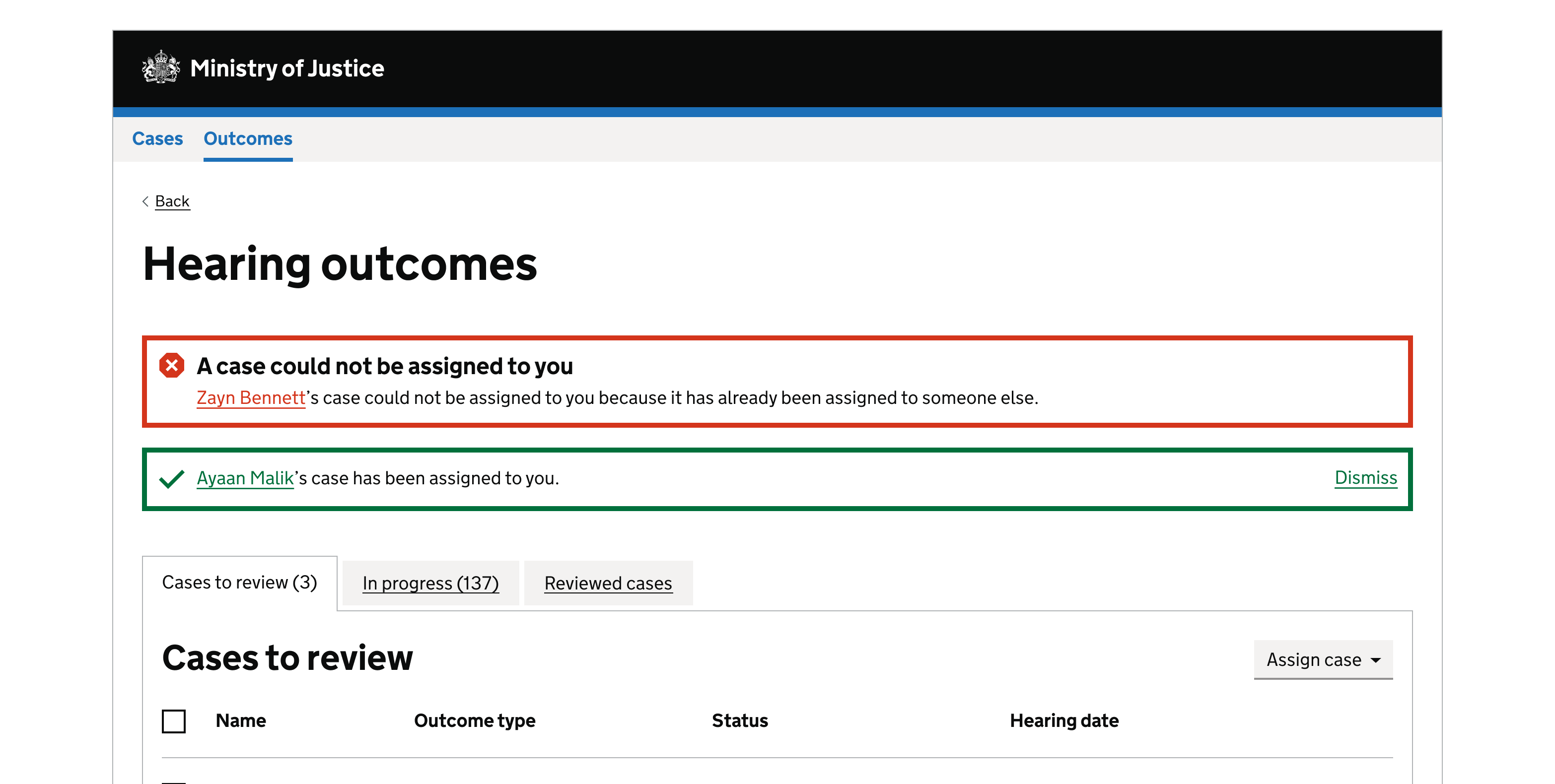
Alerts in a case management system
An error and success alert under an H1 shows a user that one of their tasks failed, and another was successful. It can be shown on the dashboard rather than another page.
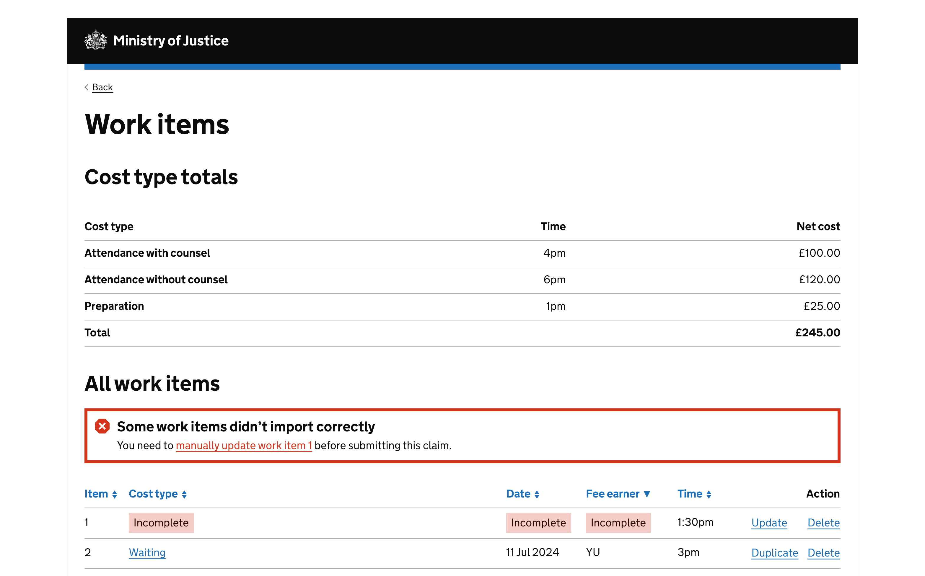
Error alert under a subheading
Alerts positioned inline with other content help people to understand what the message relates to. In this example the heading level of the alert component should be changed to H3 as it appears within an H2 heading.
Get help and contribute
Get help
You can contact the MOJ Design System team for help or support using this component.
Help improve this component
The MOJ Design System team would like to hear:
- how you have used this component in your service
- any feedback you have about its usage, for example accessibility or ideas for improvement
Add these comments to the alert discussion on GitHub.