Modal dialog
Status: ExperimentalHow to use ‘experimental’ components
Contents
Overview
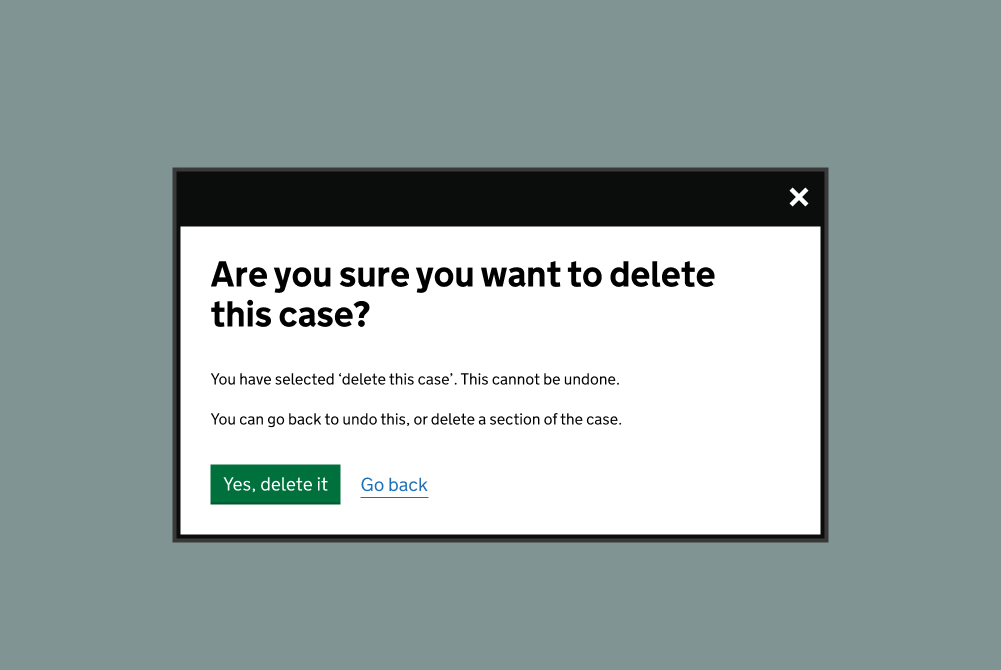
The component is used to present content in a modal dialog. It is used to interrupt a user with information that must be interacted with before continuing. When the dialog is open, the rest of the page is rendered inert and focus is trapped within the dialog.
How the component is currently used
The component was based on prototypes within the GOV.UK Design System discussion backlogs, and was developed for and used within the MOJ Forms platform for live forms.
Contribute to this component
You can help develop this component by adding information to the ‘modal dialog’ Github discussion. This helps other people to use it in their service.
A Figma link was not included when this component was added.
There may be more information in the ‘modal dialog’ Github discussion. You can also view the component image in the overview.
Contribute a Figma link
If you have a Figma link for this component (or a component like it) you can add it to Github discussion. This helps other people to use it in their service.
Accessibility findings have been added for this component. There may be more findings in the ‘modal dialog’ Github discussion.
External audit
- Conducted by: DAC
- Date: 20 May 2023
Audit findings
No issues discovered
Assistive Technology testing
Date: 15 April 2023
Testing details
No issues discovered
Contribute accessibility findings
If you have accessibility findings that are relevant to this component you can add them to the Github discussion. This helps other people to use it in their service.
Code has been added for this component. There may be other code blocks in the ‘modal dialog’ Github discussion.
Code block 1: HTML
    <body>
      <div class="govuk-modal-dialogue-inert-container">
         <!-- all your page content here -->
      </div>
      <div class="govuk-modal-dialogue" data-inert-container=".govuk-modal-dialogue-inert-container">
         <div class="govuk-modal-dialogue__wrapper" >
           <dialog class="govuk-modal-dialogue__box" aria-labelledby="modal-title" aria-modal="true" role="modal" tabindex="-1">
             <div class="govuk-modal-dialogue__header">
               <button type="button" class="govuk-button govuk-modal-dialogue__close" aria-label="close" data-element="govuk-modal-dialogue-close">x</button>
             </div>
             <div class="govuk-modal-dialogue__content">
               <h2 class="govuk-modal-dialogue__heading govuk-heading-l" id="modal-title">Title</h2>
               <div class="govuk-modal-dialogue__description govuk-body">
                  Content
               </div>
             </div>
           </dialog>
         </div>
         <div class="govuk-modal-dialogue__backdrop"></div>
      </div>
    </body>
How to use the code
All page content must be wrapped with the .govuk-modal-dialogue-inert-container. The dialog must be outside of this element otherwise it will be impossible to interact with as it will be made inert.
Code block 2: JavaScript
    /*
      Modal Dialog Component
      ----------------------
       Shows content in an accessible modal dialog

       Instantiate
       -----------
       var dialog = new ModalDialog(element).init(options)

       Options
       -------
       An object which can contain the following keys:
       triggerElement: node which will have a click event listener added to trigger opening of the modal
       focusElement: element that should gain focus when the dialog opens (defaults to the dialog itself)
       onOpen: a callback function which will be invoked when the modal is opened
       onClose: a callback function which will be invoked when the modal is closed
       onDialogNotSupported: a callback function that will be invoked if there is no native <dialog> or dialog polyfill support

    */

    import { nodeListForEach } from 'govuk-frontend/govuk/common.js'

    function ModalDialog ($module) {
      this.$module = $module
      this.$dialogBox = $module.querySelector('dialog')
      this.$container = document.documentElement

      // Allowed focussable elements
      this.focussable = [
        'button',
        '[href]',
        'input',
        'select',
        'textarea'
      ]

      this.open = this.handleOpen.bind(this)
      this.close = this.handleClose.bind(this)
      this.focus = this.handleFocus.bind(this)
      this.focusTrap = this.handleFocusTrap.bind(this)
      this.boundKeyDown = this.handleKeyDown.bind(this)

      // Modal elements
      this.$closeButtons = this.$dialogBox.querySelectorAll('[data-element="govuk-modal-dialogue-close"]')
      this.$focussable = this.$dialogBox.querySelectorAll(this.focussable.toString())
      this.$focusableLast = this.$focussable[this.$focussable.length - 1]
      this.$inertContainer = document.querySelector( this.$module.dataset.inertContainer || '.govuk-modal-dialogue-inert-container' )
    }

    // Initialize component
    ModalDialog.prototype.init = function (options) {
    // Check for module
      if (!this.$module) {
        return
      }

      this.options = options || {}

      this.$focusElement = this.options.focusElement || this.$dialogBox

      // Check for native dialog (or polyfill) support
      // if no support trigger a callback allowing us to show a fallback
      if (!this.dialogSupported()) {
        if (typeof this.options.onDialogNotSupported === 'function') {
          this.options.onDialogNotSupported.call()
        }
        return
      }

      if (this.$dialogBox.hasAttribute('open')) {
        this.open()
      }

      this.initEvents()

      return this
    }

    ModalDialog.prototype.dialogSupported = function () {
      if (typeof HTMLDialogElement === 'function') {
        // Native dialog is supported by browser
        return true
      } else {
        // Native dialog is not supported by browser so use polyfill
        try {
          window.dialogPolyfill.registerDialog(this.$dialog)
          return true
        } catch (error) {
          // Doesn't support polyfill (IE8)
          return false
        }
      }
    }
    // Initialize component events
    ModalDialog.prototype.initEvents = function (options) {
      if (this.options.triggerElement) {
        this.options.triggerElement.addEventListener('click', this.open)
      }

      // Close dialogue on close button click
      this.$closeButtons.forEach( function(element) {
        element.addEventListener('click', this.close.bind(this));
      }.bind(this));
    }

    // Open modal
    ModalDialog.prototype.handleOpen = function (event) {
      if (event) {
        event.preventDefault()
      }

      // Save last-focussed element
      this.$lastActiveElement = document.activeElement

      // Disable scrolling, show wrapper
      this.$container.classList.add('govuk-!-scroll-disabled')
      this.$module.classList.add('govuk-modal-dialogue--open')

      //make the content of the page inert
      this.$inertContainer.inert = true
      // hide content from screen readers in browsers that do not support inert
      this.$inertContainer.setAttribute('aria-hidden', 'true')

      // Close on escape key, trap focus
      document.addEventListener('keydown', this.boundKeyDown, true)

      // Optional 'onOpen' callback
      if (typeof this.options.onOpen === 'function') {
        this.options.onOpen.call(this)
      }

      // Skip open if already open
      if (this.$dialogBox.hasAttribute('open')) {
        return
      }

      // Show modal
      this.$dialogBox.setAttribute('open', '')

      // Handle focus
      this.focus()
    }

    // Close modal
    ModalDialog.prototype.handleClose = function (event) {
      if (event) {
        event.preventDefault()
      }

      // Skip close if already closed
      if (!this.$dialogBox.hasAttribute('open')) {
        return
      }

      // Hide modal
      this.$dialogBox.removeAttribute('open')

      // Hide wrapper, enable scrolling
      this.$module.classList.remove('govuk-modal-dialogue--open')
      this.$container.classList.remove('govuk-!-scroll-disabled')
      // make content active again, and un-hide from AT
      this.$inertContainer.inert = false
      this.$inertContainer.setAttribute('aria-hidden', 'false')

      // Restore focus to last active element
      this.$lastActiveElement.focus()

      // Optional 'onClose' callback
      if (typeof this.options.onClose === 'function') {
        this.options.onClose.call(this)
      }

      // Remove escape key and trap focus listener
      document.removeEventListener('keydown', this.boundKeyDown, true)
    }

    ModalDialog.prototype.isOpen = function() {
      return this.$dialogBox.hasAttribute('open');
    }

    // Lock scroll, focus modal
    ModalDialog.prototype.handleFocus = function () {
      this.$dialogBox.scrollIntoView()
      this.$focusElement.focus({ preventScroll: true })
    }

    // Ensure focus stays within modal
    ModalDialog.prototype.handleFocusTrap = function (event) {
      var $focusElement

      // Check for tabbing outside dialog
      var hasFocusEscaped = document.activeElement !== this.$dialogBox

      // Loop inner focussable elements
      if (hasFocusEscaped) {
        this.$focussable.forEach( function (element) {
          // Actually, focus is on an inner focussable element
          if (hasFocusEscaped && document.activeElement === element) {
            hasFocusEscaped = false
          }
        })

        // Wrap focus back to first element
        $focusElement = hasFocusEscaped
          ? this.$dialogBox
          : undefined
      }

      // Wrap focus back to first/last element
      if (!$focusElement) {
        if ((document.activeElement === this.$focusableLast && !event.shiftKey) || !this.$focussable.length) {
          $focusElement = this.$dialogBox
        } else if (document.activeElement === this.$dialogBox && event.shiftKey) {
          $focusElement = this.$focusableLast
        }
      }

      // Wrap focus
      if ($focusElement) {
        event.preventDefault()
        $focusElement.focus({ preventScroll: true })
      }
    }

    // Listen for key presses
    ModalDialog.prototype.handleKeyDown = function (event) {
      var KEY_TAB = 9
      var KEY_ESCAPE = 27

      switch (event.keyCode) {
        case KEY_TAB:
          this.focusTrap(event)
          break

        case KEY_ESCAPE:
          this.close()
          break
      }
    }

    export default ModalDialog
How to use the code
The code uses the native dialog element. If older browser support is needed a polyfill can be used.
Code block 3: CSS
      $govuk-dialogue-width: 640px;

      .govuk-modal-dialogue,
      .govuk-modal-dialogue__backdrop {
        position: fixed;
        z-index: 0;
        top: 0;
        left: 0;
        width: 100%;
        height: 100%;
      }

      // Hide dialogue when closed
      .govuk-modal-dialogue {
        display: none;
      }

      // Show dialogue when opened
      .govuk-modal-dialogue--open {
        display: block;
      }

      // Wrapper to handle overflow scrolling
      .govuk-modal-dialogue__wrapper {
        box-sizing: border-box;
        display: flex;
        height: 100%;
        @include govuk-responsive-padding(7, "top");
        @include govuk-responsive-padding(7, "bottom");
        overflow-y: auto;
        align-items: flex-start; // sass-lint:disable no-duplicate-properties
        align-items: safe center;
      }

      // HTML5 dialogue component
      .govuk-modal-dialogue__box {
        box-sizing: border-box;
        display: block;
        position: relative;
        z-index: 1;
        width: 90%;
        margin: auto;
        padding: 0;
        overflow-y: auto;
        border: $govuk-focus-width solid govuk-colour("black");
        background: govuk-colour("white");

        // Add focus outline to dialogue
        &:focus {
          outline: $govuk-focus-width solid $govuk-focus-colour;
        }

        // Hide browser backdrop
        &::backdrop {
          display: none;
        }
      }

      // Header with close button
      .govuk-modal-dialogue__header {
        @include govuk-clearfix;
        @include govuk-responsive-margin(5, "bottom");
        padding-bottom: $govuk-focus-width;
        color: govuk-colour("white");
        background-color: govuk-colour("black");
        text-align: right;
      }

      // Inner content
      .govuk-modal-dialogue__content {
        @include govuk-font($size: 16);
        @include govuk-responsive-padding(6);
        padding-top: 0;
      }

      .govuk-modal-dialogue__description {
        @include govuk-responsive-margin(4, "bottom");
      }

      // Remove bottom margins
      .govuk-modal-dialogue__description:last-child,
      .govuk-modal-dialogue__description > :last-child,
      .govuk-modal-dialogue__content > :last-child {
        margin-bottom: 0;
      }

      // Custom backdrop
      .govuk-modal-dialogue__backdrop {
        opacity: .8;
        background: govuk-colour("black");
        pointer-events: none;
        touch-action: none;
      }

      // Crown icon
      .govuk-modal-dialogue__crown {
        display: block;
        margin: 6px 0 0 6px;
        @include govuk-responsive-margin(5, "left");
        float: left;
      }

      // Heading
      .govuk-modal-dialogue__heading:last-child {
        margin-bottom: 0;
      }

      // Close button
      .govuk-modal-dialogue__close {
        $font-size: 36px;
        $line-height: 1;

        display: block;
        width: auto;
        min-width: 44px;
        margin: 0;
        padding: 2px 5px;
        float: right;
        color: govuk-colour("white");
        background-color: govuk-colour("black");
        box-shadow: none !important;
        font-size: $font-size;
        @if $govuk-typography-use-rem {
          font-size: govuk-px-to-rem($font-size);
        }
        @include govuk-typography-weight-bold;
        line-height: $line-height;

        &:hover {
          color: govuk-colour("black");
          background-color: govuk-colour("yellow");
        }

        &:active {
          top: 0;
        }
      }

      // New dialogue width, inline button + link
      @include govuk-media-query($from: tablet) {
        .govuk-modal-dialogue__content {
          padding-top: 0;
        }

        .govuk-modal-dialogue__box {
          width: percentage($govuk-dialogue-width / map-get($govuk-breakpoints, desktop));
        }
      }

      // Fixed width
      @include govuk-media-query($from: desktop) {
        .govuk-modal-dialogue__box {
          width: $govuk-dialogue-width;
        }
      }
Contribute code for this component
If you have code that is relevant to this component you can add it to the Github discussion. This helps other people to use it in their service.