Progress tracker
Status: ExperimentalHow to use ‘experimental’ components
Contents
Overview
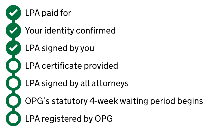
A visual representation of steps in a process that have and/or must be completed to achieve an outcome.
How the component is currently used
When a user is subject to steps in a process outside of their responsibility or control, a progress tracker supports or replaces a task list by giving a different overview on progress and outcomes.
This differs from a timeline in that it does not log events and grow. It is a pre-fixed set of finite steps. Steps may/may not be completed in any order depending on the process, but the order of the tracker stays fixed.
On the Make and register LPA product we support the tracker with banners above detailing connected events and directions to dated comms from Notify.
Contribute to this component
You can help develop this component by adding information to the progress tracker Github discussion. This helps other people to use it in their service.
Designs
A Figma design has been added for this component. There may be more links and resources in the progress tracker Github discussion.
Figma
If you work for MoJ, view the progress tracker component in the MoJ Figma Kit.
If you work outside MoJ, go to the MoJ Figma Kit on the Figma community platform.
Contribute prototypes and Figma links
If you have design files that are relevant to this component you can add them to the Github discussion. This helps other people to use it in their service.
Accessibility
Accessibility findings have been added for this component. There may be more findings in the progress tracker Github discussion.
External audit
- Conducted by: User Vision
- Date: 22 August 2024
Audit findings
No issues returned.
Internal review
- By: MOJ Accessibility team
- Date: 30 May 2024
Review findings
No issues returned.
Contribute accessibility findings
If you have accessibility findings that are relevant to this component you can add them to the Github discussion. This helps other people to use it in their service.
Code
Code has been added for this component. There may be other code blocks in the progress tracker Github discussion.
Code block 1: HTML
<div id="progress" class="app-progress-bar">
  <ol class="app-progress-bar__list">
    <li class="app-progress-bar__item">
      <span class="app-progress-bar__icon app-progress-bar__icon--complete"></span>
      <span class="app-progress-bar__label">
        First step<span class="govuk-visually-hidden"> completed</span>
      </span>
    </li>
    <li class="app-progress-bar__item">
      <span class="app-progress-bar__icon app-progress-bar__icon--complete"></span>
      <span class="app-progress-bar__label">
        Second step<span class="govuk-visually-hidden"> completed</span>
      </span>
    </li>
    <li class="app-progress-bar__item">
      <span class="app-progress-bar__icon"></span>
      <span class="app-progress-bar__label">
        Third step<span class="govuk-visually-hidden"> not completed</span>
      </span>
    </li>
  </ol>
</div>
Code block 2: CSS
$govuk-assets-path: "/static/assets/";

.app-progress-bar {
  margin-bottom: govuk-spacing(7);
}

.app-progress-bar__list {
  font-size: 0; // Stop the connecting line from extending past the last item
  list-style: none;
  padding: 0;
  position: relative;

  &::before {
    border-left: 6px solid govuk-colour("green");
    content: "";
    left: 13px;
    position: absolute;
    height: 100%;
  }

}

.app-progress-bar__item {
  @include govuk-font(19);
  display: flex;
  position: relative;
  flex-wrap: nowrap;
  padding-bottom: 0.3rem;

  &:first-child {
    &::before {
      border-left: 6px solid govuk-colour("green");
      content: "";
      position: absolute;
    }
  }

  &:last-child {
    &::before {
      border-left: 6px solid govuk-colour("white"); // Stop the connecting line from extending past the last item
      content: "";
      left: 13px;
      position: absolute;
      height: 100%;
    }
  }
}

.app-progress-bar__icon {
  position: relative;
  background-color: govuk-colour("white");
  border: 6px solid govuk-colour("green");
  border-radius: 50%;
  box-sizing: border-box;
  height: 32px;
  width: 32px;
  min-width: 32px;
  min-height: 32px;
  margin-right: 0.5rem;
}

.app-progress-bar__icon--complete {
  background-color: govuk-colour("green");
  background-image: url(#{$govuk-assets-path}images/icon-progress-tick.svg);
  background-position: 50% 50%;
  background-repeat: no-repeat;
}

.app-progress-bar__label {
  @include govuk-font(19);
  display: flex;
  font-weight: inherit;
  flex-wrap: wrap;
  align-content: center;
}
Code block 3: SVG
<svg xmlns="http://www.w3.org/2000/svg" width="18" height="15"><path fill="#fff" d="M5.9 9.6 2.5 6.1 0 8.7l5.9 6.1L18 2.7 15.5.2 5.9 9.6z"/></svg>Save the SVG to static/assets/images/icon-progress-tick.svg before using it in your project. If it’s saved somewhere else you’ll need to modify the path in the CSS code.
Contribute code for this component
If you have code that is relevant to this component you can add it to the Github discussion. This helps other people to use it in their service.